首先生成数据和 hist 对象:
set.seed(0)
g <- rnorm(2000, 5, 1)
h <- hist(g, breaks = 50, plot = FALSE)
我通过plot = FALSE暂时抑制了绘图。
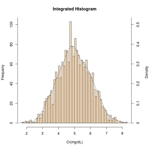
问题是,我们希望有两个y轴:
基本上,我们在两个轴上都添加密度值的刻度标记,但是
- 在左侧轴上显示相应的计数/频率;
- 在右侧轴上显示密度值。
hist对象中的密度值为h$density。为了得到漂亮的图形,我们应用pretty()来获取刻度标记位置:
pos <- pretty(h$density, n = 5)
# [1] 0.0 0.1 0.2 0.3 0.4 0.5 0.6
为了找到在
pos处相应的计数,我们需要执行以下操作:
freq <- round(pos * length(g) * with(h, breaks[2] - breaks[1]))
# [1]   0  20  40  60  80 100 120
这里使用的
round() 函数只是为了确保有限精度计算产生的小数被舍弃,以便获得整数。
现在我们可以开始制作集成直方图了。记得将右边距加大,以留出足够的空间给右轴的标识。以下代码中,我们将右边距设为与左边距相同。
new.mai <- old.mai <- par("mai")
new.mai[4] <- old.mai[2]
par(mai = new.mai)

graphics:::plot.histogram(h, freq = FALSE, col="bisque", main="Integrated Histogram",
                          xlab = paste0("Cr","(mg/dL)"), ylab="Frequeny",
                          border="black", yaxt='n')
Axis(side = 2, at = pos, labels = freq)
Axis(side = 4, at = pos, labels = pos)
mtext("Density", side = 4, line = 3)
lines(density(g), col="dimgray")

par(mai = old.mai)
注意我使用了
graphics:::plot.histogram来绘制一个
hist对象的直方图,并使用
mtext在边缘添加文本。阅读
?plot.histogram和
?mtext获取更多信息。