给直方图和累积直方图添加密度线

16

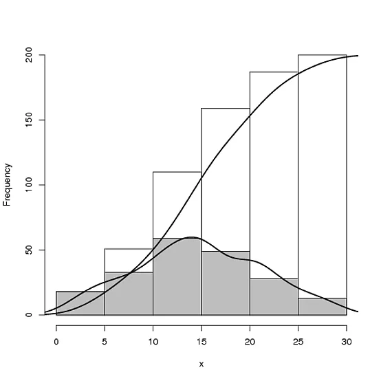
我想在直方图和累积直方图中加入密度曲线,效果如下:

enter image description here

这是我能做到的:

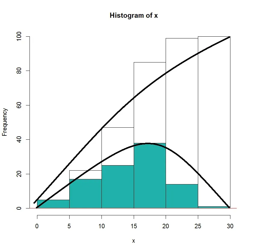
hist.cum <- function(x, plot=TRUE, ...){
  h <- hist(x, plot=FALSE, ...)
  h$counts <- cumsum(h$counts)
  h$density <- cumsum(h$density)
  h$itensities <- cumsum(h$itensities)
  if(plot)
    plot(h)
  h
}
 x <- rnorm(100, 15, 5)
hist.cum(x)
 hist(x, add=TRUE, col="lightseagreen")

 #
lines (density(x), add = TRUE, col="red")

“密度”与“频率”不在同一比例尺上。如果你再多搜索一下,我相信你会在 Stack Overflow 上找到一些实例。在发帖之前,你确实在 Stack Overflow 上进行了搜索,对吧? - IRTFM
你需要多少个重复项? https://dev59.com/RG025IYBdhLWcg3w_a-r http://stackoverflow.com/questions/9246040/axis-labeling-in-r-histogram-and-density-plots-multiple-overlays-of-density-plots https://dev59.com/7XI_5IYBdhLWcg3wK_s6 https://dev59.com/7mnWa4cB1Zd3GeqP3rxN - IRTFM
2
@DWin 谢谢您的建议,我已经看过它们了,但是我无法弄清楚如何叠加累积密度曲线和常规密度曲线... - jon
1个回答

23

无解释提供:

## Make some sample data
x <- sample(0:30, 200, replace=T, prob=15 - abs(15 - 0:30))

## Calculate and plot the two histograms
hcum <- h <- hist(x, plot=FALSE)
hcum$counts <- cumsum(hcum$counts)
plot(hcum, main="")
plot(h, add=T, col="grey")

## Plot the density and cumulative density
d <- density(x)
lines(x = d$x, y = d$y * length(x) * diff(h$breaks)[1], lwd = 2)
lines(x = d$x, y = cumsum(d$y)/max(cumsum(d$y)) * length(x), lwd = 2)

enter image description here


网页内容由stack overflow 提供, 点击上面的
可以查看英文原文,
原文链接