用经验密度和dnorm函数叠加直方图

3

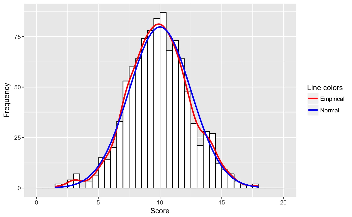
我想将一个ggplot直方图(y轴=计数)与经验密度曲线和正态密度曲线叠加。我尝试了:

library(ggplot2) 
set.seed(1234) 
v <- as_tibble(rnorm(1000, 10, 2.5)) 
ggplot(v, aes(x = value)) +
        geom_histogram(aes(y = ..density..), 
                       bins = 40,  colour = "black", fill = "white") +
        geom_line(aes(y = ..density.., color = 'Empirical'), stat = 'density') +     
        stat_function(fun = dnorm, aes(color = 'Normal'),
                         args = list(mean = 10, sd = 2.5)) +
        scale_colour_manual(name = "Colors", values = c("red", "blue"))

enter image description here

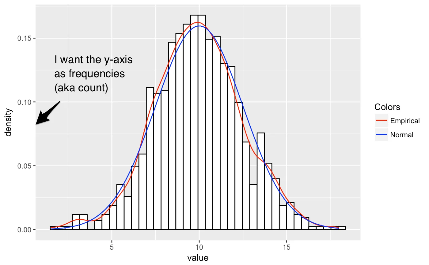
但是这张图的y轴是密度,我希望将频率作为y轴。

我的第二次尝试得到了一个y轴以频率(计数)为单位的图像,但只有经验密度。

library(ggplot2)
set.seed(1234)
v <- as_tibble(rnorm(1000, 10, 2.5))
b  <- seq(0, 20, by = 0.5)
p1 <- ggplot(v, aes(x = value)) +
    geom_histogram(aes(y = ..count..), 
                   breaks = b,
                   binwidth = 0.5,  
                   colour = "black", 
                   fill = "white") +
    geom_line(aes(y = ..density.. * (1000 * 0.5),
                    color = 'Empirical'),
                    stat = 'density') +
    scale_colour_manual(name = "Colors", values = c("red", "blue"))

我无法将 dnorm 曲线显示在同一图中,例如,当我尝试下面的代码时,只有密度曲线(蓝色线)显示在 x 轴上。

p2 <- p1 + stat_function(fun = dnorm, aes(color = 'Normal'),
                     args = list(mean = 10, sd = 2.5))
p2  

在此输入图片描述

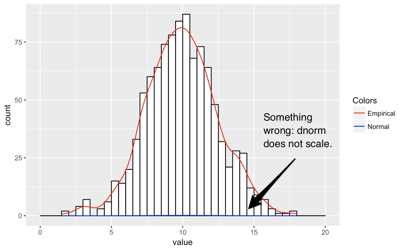
我想我需要根据binwidth(如经验线)调整曲线,但我不知道该如何做。

我在SO上搜索了这个问题,并找到了很多类似的问题。 但是它们都解决了我的第一次尝试(使用密度作为y轴),一个具有计数轴的经验叠加(我的第二次尝试)或使用其他(基础)绘图命令,我不熟悉。


实际上,ggplot2 支持第二个 y 轴。https://ggplot2.tidyverse.org/reference/sec_axis.html - Hack-R
1
https://dev59.com/0Ww05IYBdhLWcg3w41sp - user20650
1个回答

5
我按照 @user20650 的链接重写了我的代码,并应用了 @PatrickT 给出的答案来解决我的问题。
library(ggplot2)
n = 1000
mean = 10
sd = 2.5
binwidth = 0.5
set.seed(1234)
v <- as_tibble(rnorm(n, mean, sd))
b  <- seq(0, 20, by = binwidth)
ggplot(v, aes(x = value, mean = mean, sd = sd, binwidth = binwidth, n = n)) +
    geom_histogram(aes(y = ..count..), 
           breaks = b,
           binwidth = binwidth,  
           colour = "black", 
           fill = "white") +
    geom_line(aes(y = ..density.. * n * binwidth, colour = "Empirical"),
           size = 1, stat = 'density') +
    stat_function(fun = function(x) 
           {dnorm(x, mean = mean, sd = sd) * n * binwidth}, 
           aes(colour = "Normal"), size = 1) +
    labs(x = "Score", y = "Frequency") +
    scale_colour_manual(name = "Line colors", values = c("red", "blue"))

关键的变化在于stat-function行,提供了n和binwidth的必要适应。此外,我不知道可以将参数传递给aes()。

enter image description here


实际上,我不认为这是一个重复的问题,而是由不同的问题组成,主要包括这里这里和最后这里 - petzi

网页内容由stack overflow 提供, 点击上面的
可以查看英文原文,
原文链接