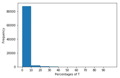
我正在尝试在Python中通过直方图来表示percT列。以下是我的输入文件:
programName,reqMethID,countT,countN,countU,totalcount,percT,percN,percU
chess,1-9,0,1,0,1,0.0,100.0,0.0
chess,1-16,1,1,0,2,50.0,50.0,0.0
chess,1-4,1,2,0,3,33.33,66.67,0.0
chess,2-9,1,3,0,4,25.0,75.0,0.0
chess,2-16,1,4,0,5,20.0,80.0,0.0
chess,2-4,1,5,0,6,16.67,83.33,0.0
chess,3-9,1,6,0,7,14.29,85.71,0.0
chess,3-16,1,7,0,8,12.5,87.5,0.0
chess,3-4,1,8,0,9,11.11,88.89,0.0
chess,4-9,1,9,0,10,10.0,90.0,0.0
chess,4-16,1,10,0,11,9.09,90.91,0.0
chess,4-4,2,10,0,12,16.67,83.33,0.0
chess,5-9,2,11,0,13,15.38,84.62,0.0
chess,5-16,2,12,0,14,14.29,85.71,0.0
chess,5-4,2,13,0,15,13.33,86.67,0.0
chess,6-9,3,13,0,16,18.75,81.25,0.0
chess,6-16,3,14,0,17,17.65,82.35,0.0
chess,6-4,3,15,0,18,16.67,83.33,0.0
chess,7-9,4,15,0,19,21.05,78.95,0.0
chess,7-16,4,16,0,20,20.0,80.0,0.0
chess,7-4,4,17,0,21,19.05,80.95,0.0
chess,8-9,4,18,0,22,18.18,81.82,0.0
chess,8-16,4,19,0,23,17.39,82.61,0.0
chess,8-4,4,20,0,24,16.67,83.33,0.0
chess,1-10,0,1,0,1,0.0,100.0,0.0
chess,1-17,1,1,0,2,50.0,50.0,0.0
chess,2-10,1,2,0,3,33.33,66.67,0.0
chess,2-17,1,3,0,4,25.0,75.0,0.0
chess,3-10,1,4,0,5,20.0,80.0,0.0
chess,3-17,1,5,0,6,16.67,83.33,0.0
chess,4-10,1,6,0,7,14.29,85.71,0.0
chess,4-17,1,7,0,8,12.5,87.5,0.0
chess,5-10,1,8,0,9,11.11,88.89,0.0
chess,5-17,1,9,0,10,10.0,90.0,0.0
chess,6-10,2,9,0,11,18.18,81.82,0.0
以下是我在Python中使用的代码,以直方图方式表示上述数据:
    dataset = pd.read_csv( 'TNUPercentages.txt', sep= ',', index_col=False)
X_ticks_array=[i for i in range(0, 100, 10)]
plt.xticks(X_ticks_array)


Tdata= dataset['percT']
print(Tdata.head())
plt.hist(Tdata);
plt.xlabel('Percentages of T')
plt.ylabel('Frequency')
plt.show()
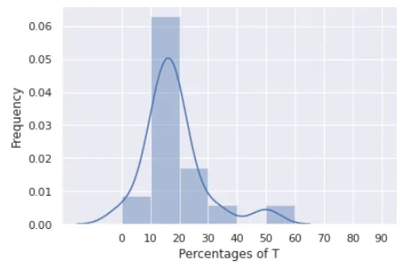
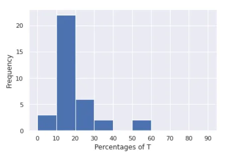
问题在于我获取了这个图形。x轴表示
percT列内的值,y轴表示这些值的出现频率。问题是很难区分x轴上值为0、值为5或值为10时数据的频率。我希望x轴有11个区间,每个区间代表以下每个区间:
0, (0-10], (10,20], (20-30], (30-40], (40-50], (50-60],(60-70], (70-80], (80-90], (90-100],这些区间对应于落在percT列中的值,y轴应表示数据集中可能出现这样的值的频率。我该怎么办?
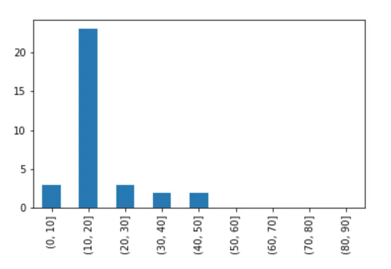
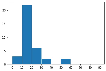
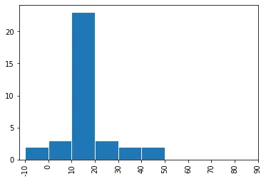
numpy.arange的调用中的bins参数来指定它。 - Paul H