我正在使用这个代码示例
from mpl_toolkits.mplot3d import Axes3D
import matplotlib.pyplot as plt
import numpy as np

data = np.array([
[0,1,0,2,0],
[0,3,0,2,0],
[6,1,1,7,0],
[0,5,0,2,9],
[0,1,0,4,0],
[9,1,3,4,2],
[0,0,2,1,3],
])

column_names = ['a','b','c','d','e']
row_names = ['Mon','Tue','Wed','Thu','Fri','Sat','Sun']

fig = plt.figure()
ax = Axes3D(fig)

lx= len(data[0])            # Work out matrix dimensions
ly= len(data[:,0])
xpos = np.arange(0,lx,1)    # Set up a mesh of positions
ypos = np.arange(0,ly,1)
xpos, ypos = np.meshgrid(xpos+0.25, ypos+0.25)

xpos = xpos.flatten()   # Convert positions to 1D array
ypos = ypos.flatten()
zpos = np.zeros(lx*ly)

dx = 0.5 * np.ones_like(zpos)
dy = dx.copy()
dz = data.flatten()

ax.bar3d(xpos,ypos,zpos, dx, dy, dz, color='b')

#sh()
ax.w_xaxis.set_ticklabels(column_names)
ax.w_yaxis.set_ticklabels(row_names)
ax.set_xlabel('Letter')
ax.set_ylabel('Day')
ax.set_zlabel('Occurrence')

plt.show()
我已经成功地根据我的需求进行了适应,现在我需要改变每一列的颜色,以使我的数据更易读,就像这个示例中所示http://matplotlib.org/examples/mplot3d/bars3d_demo.html。但是由于这些图表的构建方式完全不同,我无法弄清如何将一个应用到另一个上。
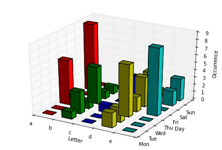
cs = ['r', 'r', 'r', 'r', 'r', 'g', 'g', 'g', 'g', 'g', 'b', 'b', 'b', 'b', 'b', 'y', 'y', 'y', 'y', 'y', 'c', 'c', 'c', 'c', 'c', 'k', 'k', 'k', 'k', 'k', 'grey', 'grey', 'grey', 'grey', 'grey']。当然,这仅适用于柱状图的数量始终相同的情况。否则,您将不得不编写程序来构建一个具有正确形状和正确颜色重复以匹配您的数据的数组。 - Diziet Asahi