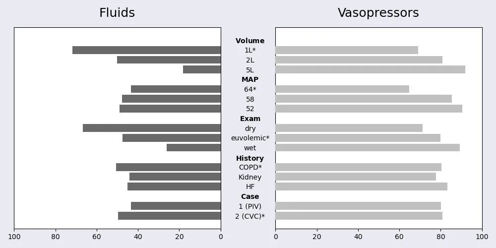
重新格式化双向条形图以匹配示例。

3

我已经生成了这个条形图

enter image description here

使用此代码:

s = """level,margins_fluid,margins_vp
Volume,0,0
1L*,0.718,0.690
2L,0.501,0.808
5L,0.181,0.920
MAP,0,0
64*,0.434,0.647
58,0.477,0.854
52,0.489,0.904
Exam,0,0
dry,0.668,0.713
euvolemic*,0.475,0.798
wet,0.262,0.893
History,0,0
COPD*,0.506,0.804
Kidney,0.441,0.778
HF,0.450,0.832
Case,0,0
1 (PIV),0.435,0.802
2 (CVC)*,0.497,0.809"""

data = np.array([a.split(',') for a in s.split("\n")])


fluid_vp_1_2 = pd.DataFrame(data[1:], columns=data[0])
fluid_vp_1_2['margins_fluid'] = fluid_vp_1_2['margins_fluid'].apply(float)
fluid_vp_1_2['margins_vp'] = fluid_vp_1_2['margins_vp'].apply(float)
fluid_vp_1_2

variableNames = {'Volume', 'MAP', 'Exam', 'History', 'Case'}

font_color = '#525252'
hfont = {'fontname':'DejaVu Sans'}
facecolor = '#eaeaf2'
index = fluid_vp_1_2.index#['level']
column0 = fluid_vp_1_2['margins_fluid']*100
column1 = fluid_vp_1_2['margins_vp']*100
title0 = 'Fluids'
title1 = 'Vasopressors'

fig, axes = plt.subplots(figsize=(10,5), facecolor=facecolor, ncols=2, sharey=True)
axes[0].barh(index, column0, align='center', color='dimgray', zorder=10)
axes[0].set_title(title0, fontsize=18, pad=15, color='black', **hfont)
axes[1].barh(index, column1, align='center', color='silver', zorder=10)
axes[1].set_title(title1, fontsize=18, pad=15, color='black', **hfont)
# If you have positive numbers and want to invert the x-axis of the left plot
axes[0].invert_xaxis() 
# To show data from highest to lowest
plt.gca().invert_yaxis()

axes[0].set(xlim = [100,0])
axes[1].set(xlim = [0,100])

axes[0].yaxis.tick_right()
axes[0].set_yticks(range(len(fluid_vp_1_2)))
maxWordLength = fluid_vp_1_2['level'].apply(lambda x: len(x)).max()

formattedyticklabels = [r'$\bf{'+f"{t}"+r'}$' 
                        if t in variableNames else t for t in fluid_vp_1_2['level']]
axes[0].set_yticklabels(formattedyticklabels, ha='center', position=(1.12, 0))

axes[0].tick_params(right = False)

axes[1].tick_params(left = False)
    
fig.tight_layout()
plt.savefig("fluid_vp_1_2.jpg")

plt.show()

然而,我想修改这个图表,使其更接近下面的示例,其中y轴标签位于左侧,双向条在中心接触,白色背景,形状更垂直(缩小x轴),添加x轴标签(“调整后的受访者比例”),但我仍然希望保持变量的顺序和粗体标题标签引起的条形间隙,如VolumeMAP等。

enter image description here

有什么建议吗?

2个回答

2

有一些简化/因式分解可以处理,使得样式绘图更容易。但你基本上已经接近成功了。只需设置刻度标签并使用fig.subplots_adjust(wspace=0)删除图之间的空格(必须删除fig.tight_layout()):

from io import StringIO
import matplotlib.pyplot as plt
import pandas as pd

s = """level,margins_fluid,margins_vp
Volume,0,0
1L*,0.718,0.690
2L,0.501,0.808
5L,0.181,0.920
MAP,0,0
64*,0.434,0.647
58,0.477,0.854
52,0.489,0.904
Exam,0,0
dry,0.668,0.713
euvolemic*,0.475,0.798
wet,0.262,0.893
History,0,0
COPD*,0.506,0.804
Kidney,0.441,0.778
HF,0.450,0.832
Case,0,0
1 (PIV),0.435,0.802
2 (CVC)*,0.497,0.809"""

# building df directly with pandas
fluid_vp_1_2 = pd.read_csv(StringIO(s))
fluid_vp_1_2['margins_fluid'] = fluid_vp_1_2['margins_fluid']*100
fluid_vp_1_2['margins_vp'] = fluid_vp_1_2['margins_vp']*100

# style parameters for all plots
title_format = dict(
    fontsize=18,
    pad=15,
    color='black',
    fontname='DejaVu Sans'
)

plot_params = dict(
    align='center',
    zorder=10,
    legend=None,
    width=0.9
)

grid_params = dict(
    zorder=0,
    axis='x'
)

tick_params = dict(
    left=False,
    which='both'
)

variableNames = {'Volume', 'MAP', 'Exam', 'History', 'Case'}

fig, axes = plt.subplots(figsize=(8,10), ncols=2, sharey=True, facecolor='#eaeaf2')
# removing spaces between plots
fig.subplots_adjust(wspace=0)

# plotting Fluids
fluid_vp_1_2.plot.barh(y='margins_fluid', ax=axes[0], color='dimgray', **plot_params)
axes[0].grid(**grid_params)
axes[0].set_title('Fluids', **title_format)
axes[0].tick_params(**tick_params)

# plotting Vasopressors
fluid_vp_1_2.plot.barh(y='margins_vp', ax=axes[1], color='silver', **plot_params)
axes[1].grid(**grid_params)
axes[1].set_title('Vasopressors', **title_format)
axes[1].tick_params(**tick_params)

# adjust axes
axes[0].invert_xaxis()
plt.gca().invert_yaxis()
axes[0].set(xlim = [100,0])
axes[1].set(xlim = [0,100])

# adding y labels
formattedyticklabels = [rf'$\bf{{{t}}}$' 
                        if t in variableNames else t for t in fluid_vp_1_2['level']]
axes[0].set_yticklabels(formattedyticklabels)

plt.show()

编辑:您可以通过更改figsize来获得“更长”的图表。 figsize =(8,10)的输出:

enter image description here


不错!我们能够将背景改为白色,添加x轴标签“调整比例的受访者”,并将条形颜色更改为一种愉悦的蓝色渐变吗? - hulio_entredas
1
当然可以。你是如何在问题中发布代码的?只需删除对
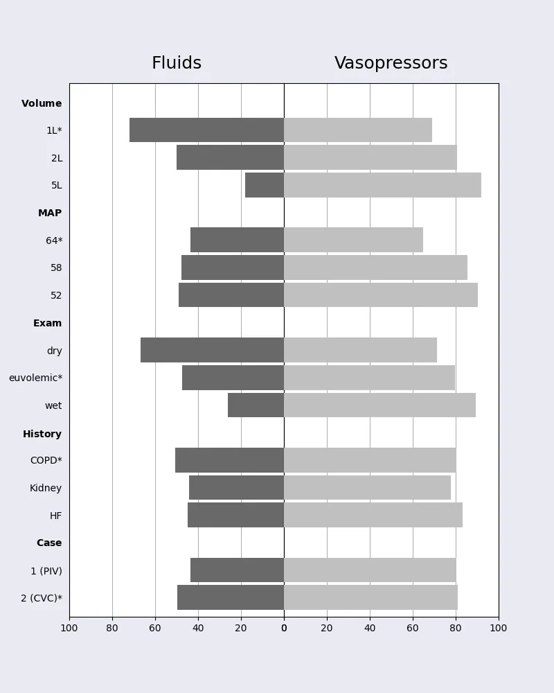
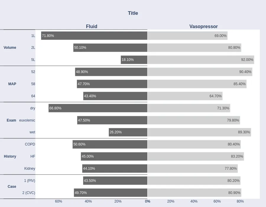
grid的调用并在barh中相应地设置颜色即可... 在此处查看可用颜色:https://matplotlib.org/stable/gallery/color/named_colors.html - Tranbi
1
不用谢。至于x轴标签 => fig.supxlabel("被调查者的调整比例") - Tranbi
fig.patch.set_facecolor('white')将灰色图表周围的背景变为白色。 - hulio_entredas
1
你应该花时间理解你要发布的代码。facecolor='#eaeaf2' 已经在你的代码中了。只需在创建你的子图时将它删除或将其设置为白色。 - Tranbi

1

就像这个答案中所示,我将使用plotly。

要实现您想要的大多数内容,您需要对数据框进行操作。

数据

import pandas as pd
import plotly.graph_objects as go
from plotly.subplots import make_subplots

data = {'variable': {0: 'volfluid',
  1: 'volfluid',
  2: 'volfluid',
  3: 'MAP',
  4: 'MAP',
  5: 'MAP',
  6: 'Exam',
  7: 'Exam',
  8: 'Exam',
  9: 'pmh',
  10: 'pmh',
  11: 'pmh',
  12: 'Case',
  13: 'Case'},
 'level': {0: '1L',
  1: '2L',
  2: '5L',
  3: '64',
  4: '58',
  5: '52',
  6: 'dry',
  7: 'euvolemic',
  8: 'wet',
  9: 'COPD',
  10: 'Kidney',
  11: 'HF',
  12: '1 (PIV)',
  13: '2 (CVC)'},
 'margins_fluid': {0: 0.718,
  1: 0.501,
  2: 0.181,
  3: 0.434,
  4: 0.477,
  5: 0.489,
  6: 0.668,
  7: 0.475,
  8: 0.262,
  9: 0.506,
  10: 0.441,
  11: 0.45,
  12: 0.435,
  13: 0.497},
 'margins_vp': {0: 0.69,
  1: 0.808,
  2: 0.92,
  3: 0.647,
  4: 0.854,
  5: 0.904,
  6: 0.713,
  7: 0.798,
  8: 0.893,
  9: 0.804,
  10: 0.778,
  11: 0.832,
  12: 0.802,
  13: 0.809}}

df = pd.DataFrame(data)

整理数据

首先,您想要更改volfuidpmh的名称。如果您愿意,可以为此创建单独的列。我将直接覆盖原始数据。

df["variable"] = df["variable"].str.replace("volfluid", "Volume")\
    .str.replace("pmh", "History")

如果您想保留给定的顺序,可以将此列设置为 category 数据类型。

df["variable"] = pd.Categorical(df["variable"],
    categories=["Volume", "MAP", "Exam", "History", "Case"])

输入中给定了排序的顺序categories。 我们按照 Plotly 中相反的顺序进行排序。

df = df.sort_values(
    ["variable", "level"],
    ascending=False)\
    .reset_index(drop=True)

最后我们将它加粗

df["variable"] = df["variable"].map(lambda x: f"<b>{x}</b>") 

图表

# create subplots
fig = make_subplots(
    rows=1,
    cols=2,
    shared_yaxes=True,
    horizontal_spacing=0,
    subplot_titles=['<b>Fluid</b>', '<b>Vasopressor</b>'])

fig.append_trace(
    go.Bar(
        x=df['margins_fluid'],
        y=[df['variable'], df["level"]], # here you want the two levels
        text=df["margins_fluid"].map(lambda x: f'{x*100:.2f}%'), # text as percentage
        textposition='inside', 
        orientation='h', 
        width=0.7, # space between bars
        showlegend=False, 
        marker_color='dimgray',), 
        1, 1) # 1,1 represents row 1 column 1 in the plot grid

fig.append_trace(
    go.Bar(
        x=df['margins_vp'],
        y=[df['variable'], df["level"]],
        text=df["margins_vp"],
        textposition='inside',
        texttemplate="%{x:.4p}",# text as percentage
        orientation='h', 
        width=0.7, # space between bars
        showlegend=False,
        marker_color='lightgray'), 
        1, 2) # 1,2 represents row 1 column 2 in the plot grid

fig.update_xaxes(
    tickformat=',.0%', 
    row=1,
    col=1,
    autorange='reversed'
)
fig.update_xaxes(
    tickformat=',.0%', 
    row=1,
    col=2)

fig.update_layout(
    title_text="<b>Title</b>",# html bold
    barmode="group", # stacked or grouped bar
    width=900, 
    height=700,
    title_x=0.5,
    paper_bgcolor='#eaeaf2',
    plot_bgcolor='white',
    # custom padding
    margin=dict(l=20,
                r=20, 
                #t=20,
                b=20),
    # xaxis1_range=[0, 1],
    # xaxis2_range=[0, 1],
)

fig.show()

enter image description here


太棒了!我们能把背景改成白色,添加x轴标签“调整后的受访者比例”,并将柱状图的颜色改为一种令人愉悦的蓝色渐变吗?另外,我不需要柱状图上的百分比标签,不过这个细节很好。 - hulio_entredas
1
条形图的颜色在 marker_color 下,背景颜色分别为 paper_bgcolorplot_bgcolor。对于 x 轴标签,您可以在每个 fig.update_xaxes 中添加 title_text 或使用 annotation - rpanai

网页内容由stack overflow 提供, 点击上面的
可以查看英文原文,
原文链接