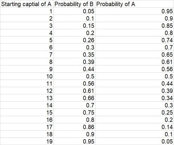
我有一个数据集,其中有三列:“初始条件”、“给定初始条件发生A的概率”和“给定初始条件发生B的概率”。我想在Python中制作一个条形图动画gif,以展示随着初始条件的变化,柱状图(代表A和B的概率)的进展情况。我尝试过这样做,但是表示条形图值的x轴只显示0或1。我无法将其格式化为两个小数位。如果有人能帮助我,那将非常有帮助。以下是数据样本。
这是我使用的代码。
import pandas as pd
import matplotlib.pyplot as plt
import bar_chart_race as bcr

# Load the data
data = pd.read_csv('data.csv')

# Set the index to the starting capital of A
data = data.set_index('Initial captial of A')

# Create the animated bar chart race
bcr.bar_chart_race(
    df=data,
    filename='race.gif',
    orientation='h',
    sort='desc',
    n_bars=3,
    steps_per_period=10,
    interpolate_period=False,
    label_bars=True,
    bar_size=.95,
    period_length=500,
    figsize=(6, 3),
    dpi=144,
    title='Race',
    writer='pillow'
)

plt.show()
