制作一个分组条形图

6

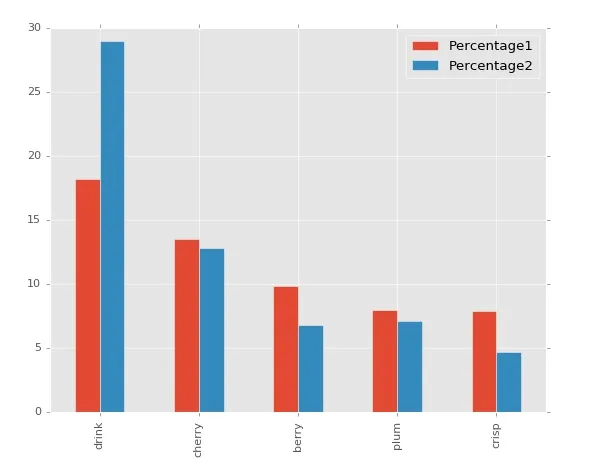
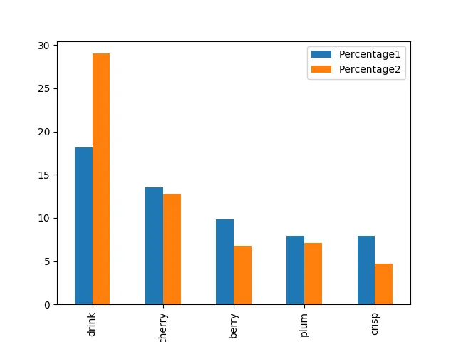
我有一个小的pandas数据帧,长这样:

import pandas as pd

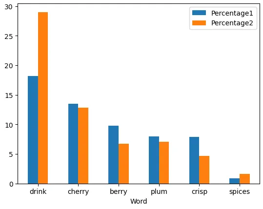
data = {'Word': ['drink', 'cherry', 'berry', 'plum', 'crisp', 'spices'],
        'Percentage1': [18.166654, 13.498262, 9.810123, 7.964429, 7.892941, 0.856775],
        'Percentage2': [29.014272, 12.802642, 6.775552, 7.105845, 4.715009, 1.663586]}

df = pd.DataFrame(data)

     Word  Percentage1  Percentage2
0   drink    18.166654    29.014272
1  cherry    13.498262    12.802642
2   berry     9.810123     6.775552
3    plum     7.964429     7.105845
4   crisp     7.892941     4.715009
5  spices     0.856775     1.663586

这段文字涉及到IT技术,需要翻译的内容为:每个单词后面都有两列数字,分别表示该单词出现的次数。我该如何制作一个聚类图表,以展示每个单词的两个数字之间的比较?我已经尝试了其他网站上提供的所有代码,但我不知道如何将这两个“百分比”列分组。

4个回答

5

如果我理解你的意思正确,你可以这样做:

df.plot(x="Word", y=["Percentage1", "Percentage2"], kind="bar")

enter image description here


5

请尝试这个:

df.set_index('Word').plot(kind='bar')

O/P

enter image description here

如果你不想为df中的所有值列绘制图表,可以使用这个方法。只需设置索引作为X,其余所有列均作为y

输入:

     Word  Percentage1  Percentage2  Percentage3  Percentage4
0   drink    18.166654    29.014272     7.105845    29.014272
1  cherry    13.498262    12.802642     4.715009    12.802642
2   berry     9.810123     6.775552     6.097997     3.408988
3    plum     7.964429     7.105845    12.802642    19.620618
4   crisp     7.892941     4.715009     6.775552    35.832248

输出

输入图像描述


1
你可以选择堆叠条形图:

# Given
df = pd.DataFrame({'word':['Alpha', 'Bravo', 'Charlie'],
                  'Percentage 1':[10, 3, 0],
                  'Percentage 2': [5, 6, 4]})

df.set_index('word').plot(kind='barh', stacked=True)

plt


0
  • 所有现有的选项都使用.set_index和/或指定y=。然而,最简单的解决方案是只为要放在x轴上的列指定x=
  • 只有当有许多列,并且只希望绘制选定的列时,才需要指定y=
  • python 3.10pandas 1.4.3matplotlib 3.5.2中进行了测试
ax = df.plot(kind='bar', x='Word', rot=0)

enter image description here


网页内容由stack overflow 提供, 点击上面的
可以查看英文原文,
原文链接