在gnuplot中制作分组条形图

23

我有一个简单的结果表格,想在gnuplot中绘制成一个聚类直方图。数据集包括网页内容类型的类别和相应的百分比份额,分别在两列中显示。我有两个浏览器的这种数据。例如:
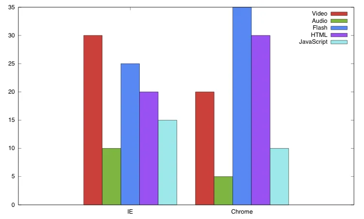
For IE,
    Content      Share
    Video         30%
    Audio         10%
    Flash         25%
    HTML          20%
    Javascript    15%

   For Chrome,
    Content      Share
    Video         20%
    Audio         5%
    Flash         35%
    HTML          30%
    Javascript    10%

现在我想将这两个数据绘制在同一张图上,x轴为内容类型,y轴为相应的份额,并带有图例。 我该如何做到这一点?


2
你已经尝试过这个了吗?http://www.codealias.info/technotes/gnuplot_cluster_histogram_example(是你问题的第三个谷歌搜索结果)你遇到了什么问题? - Tom
1个回答

42
如果将您的数据转换成表格,这将变得相对容易。 info.dat 应包含:
Broswer Video   Audio   Flash   HTML    JavaScript
IE      30%     10%     25%     20%     15%
Chrome  20%     5%      35%     30%     10%
然后使用类似下面这样的东西:
set terminal pdf enhanced
set output 'bar.pdf'

set style data histogram
set style histogram cluster gap 1

set style fill solid border rgb "black"
set auto x
set yrange [0:*]
plot 'info.dat' using 2:xtic(1) title col, \
        '' using 3:xtic(1) title col, \
        '' using 4:xtic(1) title col, \
        '' using 5:xtic(1) title col, \
        '' using 6:xtic(1) title col

要创建你的图表。这是我之前制作的一个:聚类条形图


网页内容由stack overflow 提供, 点击上面的
可以查看英文原文,
原文链接