按平均值排名的箱线图

3
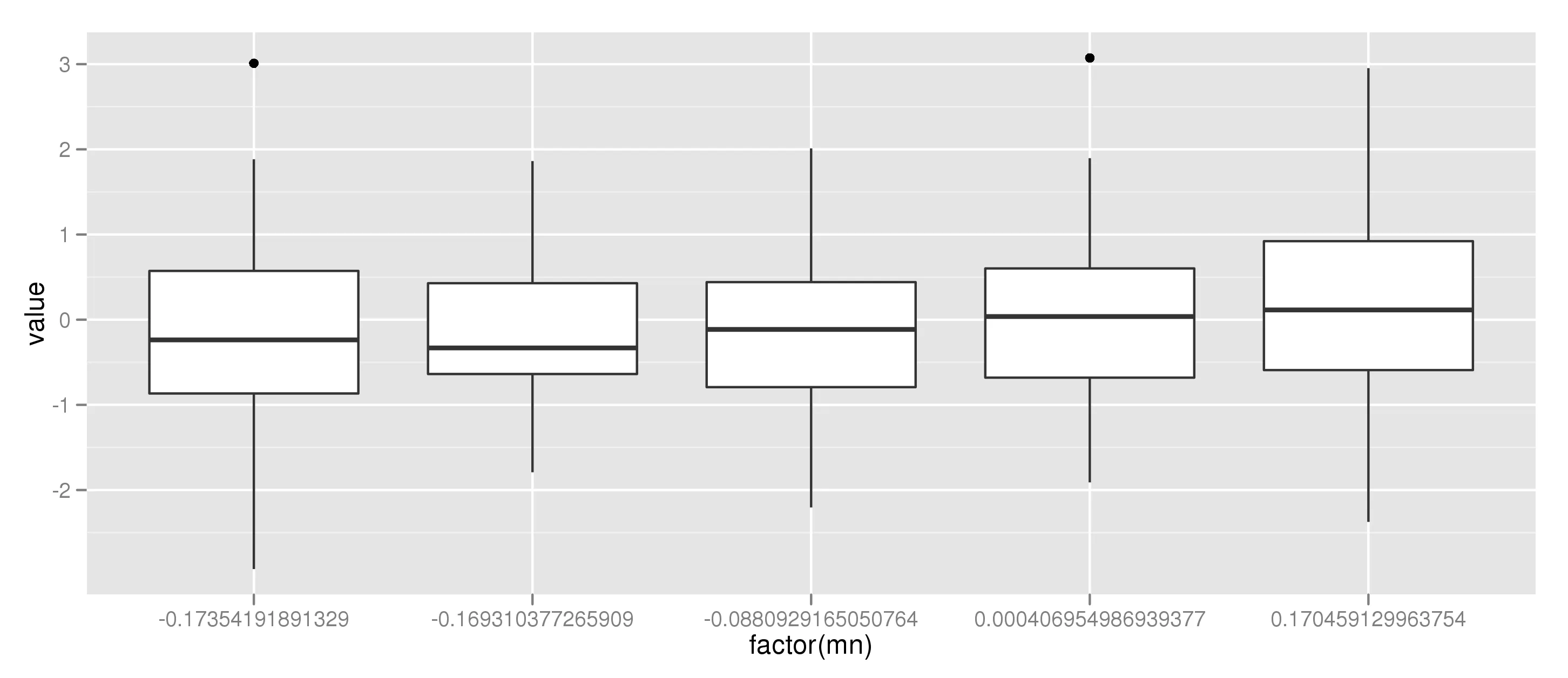
我希望能展示多个变量的箱线图,并按列均值降序排列,就像在Performance Analytics软件包中一样。我使用以下代码生成箱线图:
zx <- replicate (5, rnorm(50))
zx_means <- (colMeans(zx, na.rm = TRUE))
boxplot(zx, horizontal = FALSE, outline = FALSE)
points(zx_means, pch = 22, col = "darkgrey", lwd = 7)

目前为止,我还没有能够按照上述描述的方式对它们进行排名。我已经尝试使用sortorder,但是迄今为止没有令人满意的结果。

任何帮助将不胜感激。


有没有关于如何在水平箱线图中使用“points”的想法?当我将箱线图更改为“horizontal = TRUE”时,无法使点与箱线图对齐。 - kribys
如果您有新的问题,请发布一个新问题,而不是对现有问题进行评论。 - Paul Hiemstra
抱歉。我已经在这里发布了我的问题(https://dev59.com/f2HVa4cB1Zd3GeqPr_id)。 - kribys
谢谢,这使得单独的QA线程更易读。 - Paul Hiemstra
2个回答

3

order 对我来说很好用!?

colnames (zx) <- seq_len (ncol (zx))
boxplot(zx [, order (zx_means)], horizontal = FALSE, outline = FALSE)
points(zx_means [ order (zx_means)], pch = 22, col = "darkgrey", lwd = 7)

这产生了我想要的结果。我想在使用 order 时一定弄错了语法。非常感谢! - kribys
1
如果这个解决了你的问题,你可以使用投票计数器下面的勾选标记将其标记为正确答案吗? - Paul Hiemstra

3
使用ggplot2,使用您的示例数据可以完成此任务:
library(ggplot2)
library(reshape)

zx <- replicate (5, rnorm(50))

# ggplot2 uses long-shaped data.frame's, not matrices
zx_flat = melt(zx)[c(2,3)]
names(zx_flat) = c("cat","value")

# Here I calculate the mean per category
zx_flat = ddply(zx_flat, .(cat), mutate, mn = mean(value))
zx_flat = sort_df(zx_flat, "mn") # Order according to mean
# Here I manually set the order of the levels
# as this is the order ggplot2 uses
zx_flat$cat = factor(zx_flat$cat, levels = unique(zx_flat$mn))

# make the plot
ggplot(aes(factor(mn), value), data = zx_flat) + geom_boxplot()

我们得到以下结果:

在此输入图片描述


我一直在研究使用ggplot2,但一直没有弄清楚如何格式化数据。我一定会进一步研究的。谢谢。 - kribys

网页内容由stack overflow 提供, 点击上面的
可以查看英文原文,
原文链接