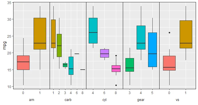
我正在尝试使用ggplot2在一个图表中绘制几个箱线图。我有一个连续变量和几个因子。我想要一个单一的Y轴,每对箱线图都有自己的X轴和因子水平。到目前为止,我尝试使用
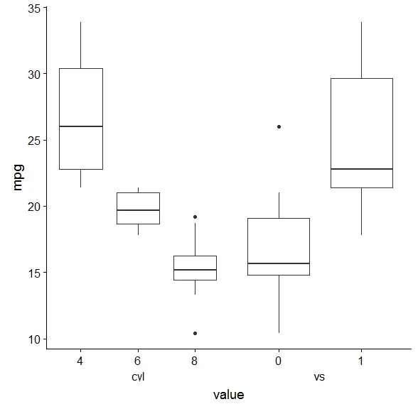
这是我想要的效果以及我迄今为止想出的解决方案:charts 以下是我的脚本:
cowplot::plot_grid将我分别制作的图表与用于Y轴的空图表连接起来。我试图通过隐藏边距和调整图表大小使图表融合得很好,但我仍然无法得到合理的结果,而且这种方法涉及太多手动调整。这是我想要的效果以及我迄今为止想出的解决方案:charts 以下是我的脚本:
library(ggplot2)
library(cowplot)
library(dplyr)

# make a dataset:
DF <- mtcars
DF$cyl <- as.factor(DF$cyl)
DF$vs <- as.factor(DF$vs)
DF$am <- as.factor(DF$am)
DF$gear <- as.factor(DF$gear)
DF$carb <- as.factor(DF$carb)
#str(DF)

# fisrt boxplot
p1 <- DF %>% ggplot() + theme_grey() + aes(x=cyl, y=mpg, fill=cyl) +
  geom_boxplot() +
  theme(legend.position = "none",
        axis.title.y = element_blank(),
        axis.text.y = element_blank(),
        axis.ticks.y = element_blank()) +
  theme(plot.margin = margin(t=0.1, r=0, b=0, l=0, unit="cm"))

# second boxplot
p2 <- DF %>% ggplot() + theme_grey() + aes(x=vs, y=mpg, fill=vs) +
  geom_boxplot() +
  theme(legend.position = "none",
        axis.title.y = element_blank(),
        axis.text.y = element_blank(),
        axis.ticks.y = element_blank()) +
  theme(plot.margin = margin(t=0.1, r=0, b=0, l=0, unit="cm"))

# empty boxplot used only for the y axis
y_axis <- DF %>% ggplot() + theme_grey() + aes(x=mpg, y=mpg) +
  geom_point() +
  theme(axis.title.y = element_text(),
        axis.text.y = element_text(),
        axis.title.x = element_text(),
        axis.text.x = element_text()) +
  theme(plot.margin = margin(t=0.1, r=0, b=0, l=0, unit="cm"))+
  scale_x_continuous(limits = c(0, 0), breaks=c(0), labels = c(""), name="")

# join all charts toghether
p_all <- plot_grid(y_axis, p1, p2,
                   align="v", axis="l",
                   nrow=1, rel_widths = c(0.2, 1, 1))

ggdraw(p_all)
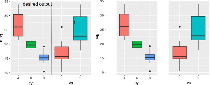
gacet_grid / facet_wrap在ggplot中完成。 - sai saran