我目前遇到了一个问题,就是使用Matplotlib在同一subplot中绘制多个带有不同y轴误差线的图时,出现了奇怪的行为。
当这样做时,第二个误差线所对应的网格总是会重叠在第一个误差线图上。使用zorder选项只能将其他网格移动到误差线下面。
我希望两个网格都在两个误差线下方。
是否有人知道解决方法,或者这是Matplotlib的一个bug?
我正在使用Python 2.7.12和Matplotlib 1.5.1。
最小工作示例:
import numpy as np
import matplotlib
matplotlib.use('Agg')
import matplotlib.pyplot as plt
import matplotlib.colors as colors

# numbers of epochs
ttimes_means_list = [251.4, 153.3, 22.0, 202.1, 46.6]
ttimes_stddevs_list = [32.1, 35.1, 12.0, 84.9, 14.7]
# numbers of times
times_means_list = [5231, 3167, 860, 3932, 1244]
times_stddevs_list = [1381, 572, 253, 1445, 215]

labels = ['x1', 'x2', 'x3', 'x4', 'x5']
linewidth=3

xvalues = np.arange(0, len(times_means_list), 1)
xvalues_s = xvalues + 0.1

fig = plt.figure()
ax1 = fig.add_subplot(111)
ax2 = ax1.twinx()
ax1.set_ylabel('Number')
ax1.xaxis.grid(False)
ax1.yaxis.grid(True, color='navy', linewidth=linewidth/2.0)
ax2.xaxis.grid(False)
ax1.set_zorder(0)
ax2.set_zorder(0)
ax2.yaxis.grid(True, color='darkorange', linewidth=linewidth/2.0)
ax2.set_ylabel('Time')
ax1.set_xticks(xvalues)
ax2.set_xticks(xvalues)
ax1.set_xticklabels(labels)
ax2.set_xticklabels(labels)
ax1.set_xlabel('x label')
errplot1 = ax1.errorbar(xvalues, ttimes_means_list, yerr=ttimes_stddevs_list,
        linestyle="None", elinewidth=linewidth, color='navy', label='Number',
        capthick=linewidth, zorder=10)
errplot2 = ax2.errorbar(xvalues_s, times_means_list, yerr=times_stddevs_list,
        linestyle="None", elinewidth=linewidth, color='darkorange',
        label='Time', capthick=linewidth, zorder=10)
ax1.set_axisbelow(True)
ax2.set_axisbelow(True)
fig.legend((errplot1, errplot2), ('number', 'time'),
        loc='upper right', numpoints=1)
plt.xlim(-0.5, len(times_means_list)-0.5)
plt.title('Some plot title')
plt.savefig('mwe_plot.pdf')
plt.clf()
输出图(橙色网格点覆盖在蓝色条形图上):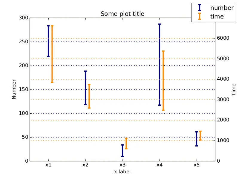
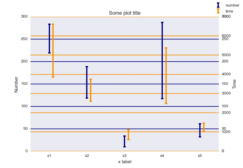
ax3.get_yaxis().set_visible(False)以便摆脱右侧的额外标签。 - ml4294