我正在尝试在我的ggplot2图表中绘制一个半透明矩形:
library(ggplot2)
min_date = min(df1$date) # dput(df1) below
max_date = max(df1$date)
ggplot(df1) +
    geom_rect(aes(xmin = min_date, xmax = max_date, ymin = -Inf, ymax = 3), fill = "palegreen", alpha = 0.2) +
    geom_line(aes(x = date, y = pb, colour = "P/B")) +
    geom_line(aes(x = date, y = return_index, colour = "return"))
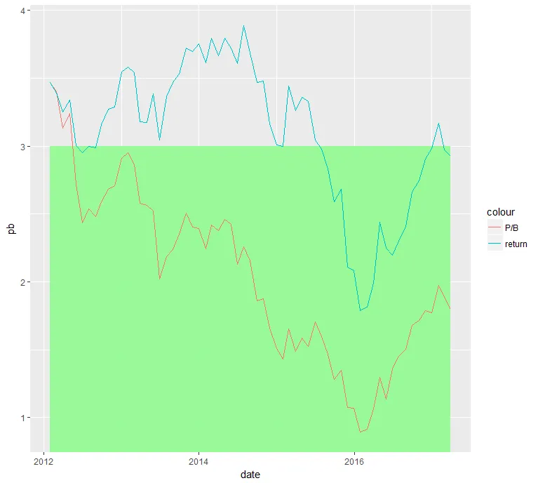
然而,与我做过的其他图表不同(从Hadley Wickham的书中复制),绿色矩形是完全不透明的:我看不到背景中浅灰色的轻微阴影线。它看起来像这样:
 此外,如果我改变层的顺序(通过在geom_line之前放置geom_rect),则矩形将隐藏线条。我的问题是什么?如何使绿色矩形离散地融入背景?以下是我的df1:
df1 = structure(list(date = structure(c(1335744000, 1380499200, 1464652800,
1356912000, 1485820800, 1490918400, 1383177600, 1461888000, 1454025600,
1367280000, 1343692800, 1401408000, 1330473600, 1391126400, 1459382400,
1404086400, 1417132800, 1477872000, 1469750400, 1443571200, 1419984000,
1438300800, 1346371200, 1369958400, 1483056000, 1440979200, 1424995200,
1377820800, 1388448000, 1375228800, 1480464000, 1359590400, 1354233600,
1412035200, 1427760000, 1385683200, 1467244800, 1472601600, 1372377600,
1475193600, 1333065600, 1435622400, 1409270400, 1396224000, 1488240000,
1364515200, 1340928000, 1406764800, 1456704000, 1430352000, 1338422400,
1348790400, 1351641600, 1432857600, 1327968000, 1448841600, 1398816000,
1446163200, 1362009600, 1422576000, 1451520000, 1414713600, 1393545600
), class = c("POSIXct", "POSIXt")), pb = c(3.24284787690623,
2.35203304295562, 1.13562266384702, 2.90837861538151, 1.97393507382208,
1.79790256367522, 2.50992970378761, 1.2966057820916, 0.892051550643623,
2.56310397446516, 2.53722570614735, 2.42427665519818, 3.40294643294178,
2.2456624603825, 1.06554620628802, 2.12883927956712, 1.65800890792078,
1.71460655379306, 1.45450176074979, 1.28199154762022, 1.51004082825039,
1.59579220438853, 2.48072865275449, 2.52511938910325, 1.77197981412129,
1.4666225767599, 1.65482654263216, 2.24097337718875, 2.39207143276774,
2.18796717170196, 1.78667497794161, 2.95189774752025, 2.70906851093917,
1.8620615761957, 1.48932926967017, 2.40482981571083, 1.3614263004647,
1.5052848414737, 2.02094466655017, 1.67901881433697, 3.13131652724628,
1.7081053507639, 2.15479184551088, 2.37902994058881, 1.88440485774789,
2.57891658188723, 2.43424745762712, 2.25929464919641, 0.913664833729333,
1.58426153545149, 2.71711735504797, 2.59023788287105, 2.68172936708349,
1.5228439100185, 3.47144812971019, 1.07692509768545, 2.46172899067256,
1.34932598268774, 2.86559619320822, 1.43158577260698, 1.06755701001995,
1.87542832179586, 2.41716851824514), return_index = c(3.33963134143023,
3.53315257934844, 2.24983743575813, 3.54713517594007, 3.17031433226149,
2.92415007661754, 3.72288287285945, 2.43858382371356, 1.78853472205546,
3.17524563672478, 2.99957813429811, 3.72169243241355, 3.39125767791388,
3.614770311344, 1.98808399128776, 3.61004165944114, 3.16597358572951,
2.74562414401218, 2.30169956340851, 2.58899122167033, 3.00735830908446,
2.97573979012093, 2.9863799905072, 3.38703452069432, 2.98242176129961,
2.83290428019513, 3.44566574584198, 3.47136232987663, 3.75521536603366,
3.36372318786495, 2.90514490677928, 3.58331595473466, 3.28803779749728,
3.46781820411579, 3.2620117615886, 3.69607811617486, 2.19921609345358,
2.40895876306335, 3.04629884791247, 2.66358570431915, 3.25119873581604,
3.04330107396291, 3.68720702192003, 3.66737118374507, 2.97502296939418,
3.18097138521817, 2.95437617876303, 3.88945888388189, 1.81411076858085,
3.36085071796473, 3.00333046534821, 3.15899275395851, 3.27461188875339,
3.32892263614407, 3.47144812971019, 2.10766875686013, 3.79609591229452,
2.68219490565046, 3.54425781082805, 2.99623108334085, 2.08090136364801,
3.4771813132669, 3.79370144175553)), class = c("tbl_df", "tbl",
"data.frame"), row.names = c(NA, -63L), .Names = c("date", "pb",
"return_index"))
fill在aes内部,并且使用变量来为多个矩形着色。 - ricoderks