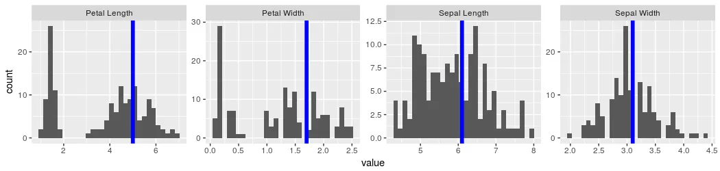
生成一个包含每列标题和副标题的综合图表,以及每个图表的垂直线的分离图表:
我已经使用柱状图为一列创建了带有垂直线的图表。
下面的代码只是其他三列的重复。 (您可以忽略它)。
它的结果是下面的图表:
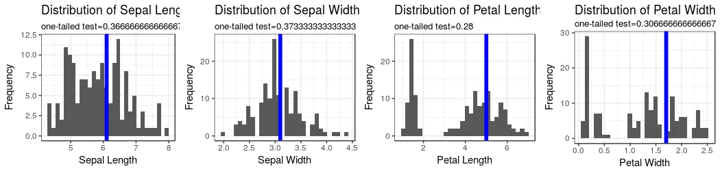
我已经使用柱状图为一列创建了带有垂直线的图表。
library(ggplot2)
library(gridExtra)
library(tidyr)

actualIris <- data.frame(Sepal.Length=6.1, Sepal.Width=3.1, Petal.Length=5.0, Petal.Width=1.7)

# Sepal Length
oneTailed <- sum(actualIris$Sepal.Length < iris$Sepal.Length)/nrow(iris)

plot1SL <- ggplot(iris, aes(x=Sepal.Length)) + geom_histogram() +
  geom_vline(xintercept = actualIris$Sepal.Length, col = "blue", lwd = 2) +
  labs(title='Distribution of Sepal Length', x='Sepal Length', y='Frequency',
       subtitle=paste('one-tailed test=', oneTailed, sep='')) + theme_bw()
下面的代码只是其他三列的重复。 (您可以忽略它)。
# Sepal Width
oneTailed <- sum(actualIris$Sepal.Width < iris$Sepal.Width)/nrow(iris)

plot1SW <- ggplot(iris, aes(x=Sepal.Width)) + geom_histogram() +
  geom_vline(xintercept = actualIris$Sepal.Width, col = "blue", lwd = 2) +
  labs(title='Distribution of Sepal Width', x='Sepal Width', y='Frequency',
       subtitle=paste('one-tailed test=', oneTailed, sep='')) + theme_bw()

# Petal Length
oneTailed <- sum(actualIris$Petal.Length < iris$Petal.Length)/nrow(iris)

plot1PL <- ggplot(iris, aes(x=Petal.Length)) + geom_histogram() +
  geom_vline(xintercept = actualIris$Petal.Length, col = "blue", lwd = 2) +
  labs(title='Distribution of Petal Length', x='Petal Length', y='Frequency',
       subtitle=paste('one-tailed test=', oneTailed, sep='')) + theme_bw()

# Petal Width
oneTailed <- sum(actualIris$Petal.Width < iris$Petal.Width)/nrow(iris)

plot1PW <- ggplot(iris, aes(x=Petal.Width)) + geom_histogram() +
  geom_vline(xintercept = actualIris$Petal.Width, col = "blue", lwd = 2) +
  labs(title='Distribution of Petal Width', x='Petal Width', y='Frequency',
       subtitle=paste('one-tailed test=', oneTailed, sep='')) + theme_bw()

# Combine the plots
grid.arrange(plot1SL, plot1SW, plot1PL, plot1PW, nrow=1)
它的结果是下面的图表:
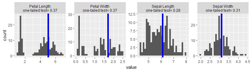
facet_wrap来创建单一图形,而不是组合多个单一图形。tmp <- iris[,-5] %>% gather(Type, value)
#actualIris <- data.frame(Sepal.Length=6.1, Sepal.Width=3.1, Petal.Length=5.0, Petal.Width=1.7)
actuals <- data.frame(col1=colnames(actualIris), col2=as.numeric(actualIris[1,]))
tmp$Actual <- actuals$col2[match(tmp$Type, actuals$col1)]
tmp$Type <- factor(tmp$Type, levels = c('Petal.Length', 'Petal.Width', 'Sepal.Length', 'Sepal.Width'),
labels = c('Petal Length', 'Petal Width', 'Sepal Length', 'Sepal Width'))
ggplot(tmp, aes(value)) + facet_wrap(~Type, scales="free", nrow = 1) + geom_histogram() +
geom_vline(aes(xintercept=Actual), colour="blue", lwd=2)
我尝试使用labeller选项更改面板标签,但它没有起作用。(然而,这不是主要问题。)
ggplot(tmp, aes(value)) + geom_histogram() +
  facet_wrap(~Type, scales="free", nrow = 1,
             labeller = as_labeller(paste('Distribution of ', levels(~Type), sep=''))) +
  geom_vline(aes(xintercept=Actual), colour="blue", lwd=2)

tmp创建类似于第一个图表的情节?