hist
函数的CDF类似物。我能想到的一种方法是:
from scipy.stats import cumfreq
a = array([...]) # my array of numbers
num_bins = 20
b = cumfreq(a, num_bins)
plt.plot(b)
hist
函数的CDF类似物。from scipy.stats import cumfreq
a = array([...]) # my array of numbers
num_bins = 20
b = cumfreq(a, num_bins)
plt.plot(b)
如果你喜欢使用 linspace
,并且更倾向于使用一行代码,那么可以这样写:
plt.plot(np.sort(a), np.linspace(0, 1, len(a), endpoint=False))
根据我的口味,我几乎总是这样做:
# a is the data array
x = np.sort(a)
y = np.arange(len(x))/float(len(x))
plt.plot(x, y)
即使有超过 >O(1e6)
的数据值,这对我也有效。
如果你真的需要下采样,我会设置
x = np.sort(a)[::down_sampling_step]
编辑以回应评论/编辑关于为什么我使用endpoint=False
或上方定义的 y
。以下是一些技术细节。
经验分布函数通常被正式定义为
CDF(x) = "number of samples <= x"/"number of samples"
为了完全匹配这个形式定义,你需要使用y = np.arange(1,len(x)+1)/float(len(x))
,以便我们得到y = [1/N, 2/N ... 1]
。这个估计器是一个无偏估计器,在样本数量趋于无穷时会收敛到真实的CDF 维基百科参考资料。y = [0, 1/N, 2/N ... (N-1)/N]
,因为:
(a) 这更容易编码/更符合惯例,
(b) 但仍然在形式上是合理的,因为可以在收敛证明中始终交换CDF(x)
和1-CDF(x)
,
(c) 并且适用于上述简单的下采样方法。y = (arange(len(x))+0.5)/len(x)
这种方法在这两种习惯用法之间处于中间。实际上,它表明“在我的样本中,有1/(2N)
的机会出现比我看到的最小值更小的值,以及1/(2N)
的机会出现比我目前看到的最大值更大的值。”
请注意,选择这种约定与plt.step
中使用的where
参数相互作用,如果将CDF显示为分段常数函数似乎更有用。为了完全匹配上面提到的正式定义,需要使用建议的y=[0,1/N..., 1-1/N]
约定和where=pre
或者y=[1/N, 2/N ... 1]
约定和where=post
,但不能反过来。
然而,对于大样本和合理的分布,主体答案中给出的约定易于编写,是真实CDF的无偏估计,并且可以使用下采样方法。
ECDF
函数:import numpy as np
import scikits.statsmodels as sm
import matplotlib.pyplot as plt
sample = np.random.uniform(0, 1, 50)
ecdf = sm.tools.ECDF(sample)
x = np.linspace(min(sample), max(sample))
y = ecdf(x)
plt.step(x, y)
在版本0.4中,scicits.statsmodels
被重命名为statsmodels
。ECDF
现在位于distributions
模块中(而statsmodels.tools.tools.ECDF
已过时)。
import numpy as np
import statsmodels.api as sm # recommended import according to the docs
import matplotlib.pyplot as plt
sample = np.random.uniform(0, 1, 50)
ecdf = sm.distributions.ECDF(sample)
x = np.linspace(min(sample), max(sample))
y = ecdf(x)
plt.step(x, y)
plt.show()
import scikits.statsmodels.tools as smtools
和ecdf = smtools.tools.EDCF(...)
。 - alexeix = np.linspace(…)
强制进行分箱处理。您可以通过使用 plt.step(ecdf.x, ecdf.y)
来规避这个问题。 - Wrzlprmftfrom statsmodels.distributions.empirical_distribution import ECDF
获取 ECDF(经验累积分布函数)(https://www.statsmodels.org/stable/generated/statsmodels.distributions.empirical_distribution.ECDF.html)。 - eagle33322看起来这几乎正是你想要的。有两点需要注意:
首先,结果是一个包含四个项目的元组。第三个是bin的大小,第二个是最小bin的起始点,第一个是每个bin中的点数(或以下的点数)。 (最后一个是超出限制之外的点数,但由于您没有设置任何限制,因此所有点都将被分组成bin)。
其次,你需要重新调整结果使得最终值为1,以遵循CDF的通常约定,但其他方面是正确的。
这是它在内部执行的操作:
def cumfreq(a, numbins=10, defaultreallimits=None):
# docstring omitted
h,l,b,e = histogram(a,numbins,defaultreallimits)
cumhist = np.cumsum(h*1, axis=0)
return cumhist,l,b,e
该函数实现了直方图,并对每个bin中的计数进行累加。因此,结果的第i个值就是小于或等于第i个bin的最大值的数组值的数量。因此,最终的值只是初始数组的大小。
最后,为了绘制它,您需要使用bin的初始值和bin的大小来确定需要的x轴值。
另一种选择是使用numpy.histogram
函数进行规范化并返回bin的边缘。您需要自己对生成的计数进行累加。
a = array([...]) # your array of numbers
num_bins = 20
counts, bin_edges = numpy.histogram(a, bins=num_bins, normed=True)
cdf = numpy.cumsum(counts)
pylab.plot(bin_edges[1:], cdf)
(bin_edges[1:]
是每个箱子的上边缘。)
numpy.sort
在不进行分箱的情况下绘制累积分布函数。 - hans_meine您尝试过在pyplot.hist中使用cumulative=True参数吗?
scikits.statsmodels
的答案。 - alexei基于戴夫的回答的一行代码:
plt.plot(np.sort(arr), np.linspace(0, 1, len(arr), endpoint=False))
编辑:评论中 hans_meine 也提出了这个建议。
y = numpy.arange(0, 101)
x = numpy.percentile(vals, y)
plot(x, y)
要将其缩放在0和1之间,只需将y除以100。
matplotlib
的step
函数,它生成阶梯状图,这就是经验CDF的定义:import numpy as np
from matplotlib import pyplot as plt
data = np.random.randn(11)
levels = np.linspace(0, 1, len(data) + 1) # endpoint 1 is included by default
plt.step(sorted(list(data) + [max(data)]), levels)
max(data)
处是手动添加的,否则绘图只会停留在水平线1 - 1/len(data)
。另外,我们可以使用step()
函数的where='post'
选项来实现同样的效果。levels = np.linspace(1. / len(data), 1, len(data))
plt.step(sorted(data), levels, where='post')
如果是这种情况,则不会绘制从零开始的初始垂直线。
虽然这里有很多好的答案,但我会包括一个更加定制化的ECDF图
生成经验累积分布函数的值
import matplotlib.pyplot as plt
def ecdf_values(x):
"""
Generate values for empirical cumulative distribution function
Params
--------
x (array or list of numeric values): distribution for ECDF
Returns
--------
x (array): x values
y (array): percentile values
"""
# Sort values and find length
x = np.sort(x)
n = len(x)
# Create percentiles
y = np.arange(1, n + 1, 1) / n
return x, y
def ecdf_plot(x, name = 'Value', plot_normal = True, log_scale=False, save=False, save_name='Default'):
"""
ECDF plot of x
Params
--------
x (array or list of numerics): distribution for ECDF
name (str): name of the distribution, used for labeling
plot_normal (bool): plot the normal distribution (from mean and std of data)
log_scale (bool): transform the scale to logarithmic
save (bool) : save/export plot
save_name (str) : filename to save the plot
Returns
--------
none, displays plot
"""
xs, ys = ecdf_values(x)
fig = plt.figure(figsize = (10, 6))
ax = plt.subplot(1, 1, 1)
plt.step(xs, ys, linewidth = 2.5, c= 'b');
plot_range = ax.get_xlim()[1] - ax.get_xlim()[0]
fig_sizex = fig.get_size_inches()[0]
data_inch = plot_range / fig_sizex
right = 0.6 * data_inch + max(xs)
gap = right - max(xs)
left = min(xs) - gap
if log_scale:
ax.set_xscale('log')
if plot_normal:
gxs, gys = ecdf_values(np.random.normal(loc = xs.mean(),
scale = xs.std(),
size = 100000))
plt.plot(gxs, gys, 'g');
plt.vlines(x=min(xs),
ymin=0,
ymax=min(ys),
color = 'b',
linewidth = 2.5)
# Add ticks
plt.xticks(size = 16)
plt.yticks(size = 16)
# Add Labels
plt.xlabel(f'{name}', size = 18)
plt.ylabel('Percentile', size = 18)
plt.vlines(x=min(xs),
ymin = min(ys),
ymax=0.065,
color = 'r',
linestyle = '-',
alpha = 0.8,
linewidth = 1.7)
plt.vlines(x=max(xs),
ymin=0.935,
ymax=max(ys),
color = 'r',
linestyle = '-',
alpha = 0.8,
linewidth = 1.7)
# Add Annotations
plt.annotate(s = f'{min(xs):.2f}',
xy = (min(xs),
0.065),
horizontalalignment = 'center',
verticalalignment = 'bottom',
size = 15)
plt.annotate(s = f'{max(xs):.2f}',
xy = (max(xs),
0.935),
horizontalalignment = 'center',
verticalalignment = 'top',
size = 15)
ps = [0.25, 0.5, 0.75]
for p in ps:
ax.set_xlim(left = left, right = right)
ax.set_ylim(bottom = 0)
value = xs[np.where(ys > p)[0][0] - 1]
pvalue = ys[np.where(ys > p)[0][0] - 1]
plt.hlines(y=p, xmin=left, xmax = value,
linestyles = ':', colors = 'r', linewidth = 1.4);
plt.vlines(x=value, ymin=0, ymax = pvalue,
linestyles = ':', colors = 'r', linewidth = 1.4)
plt.text(x = p / 3, y = p - 0.01,
transform = ax.transAxes,
s = f'{int(100*p)}%', size = 15,
color = 'r', alpha = 0.7)
plt.text(x = value, y = 0.01, size = 15,
horizontalalignment = 'left',
s = f'{value:.2f}', color = 'r', alpha = 0.8);
# fit the labels into the figure
plt.title(f'ECDF of {name}', size = 20)
plt.tight_layout()
if save:
plt.savefig(save_name + '.png')
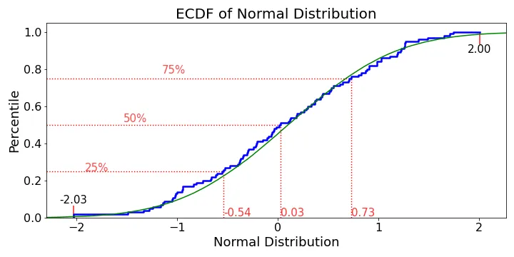
ecdf_plot(np.random.randn(100), name='Normal Distribution', save=True, save_name="ecdf")
额外资源:
如果您想显示实际真实的ECDF(正如David B所指出的那样,它是一个阶梯函数,每个n数据点增加1/n),我的建议是编写代码为每个数据点生成两个“绘图”点:
a = array([...]) # your array of numbers
sorted=np.sort(a)
x2 = []
y2 = []
y = 0
for x in sorted:
x2.extend([x,x])
y2.append(y)
y += 1.0 / len(a)
y2.append(y)
plt.plot(x2,y2)
这样做可以得到具有ECDF特征的n步图,对于数据集足够小以至于步骤可见而言尤为美好。此外,无需使用直方图进行任何分箱(这可能会在绘制ECDF时引入偏差)。
n_counts,bin_edges = np.histogram(myarray,bins=11,normed=True)
cdf = np.cumsum(n_counts) # cdf not normalized, despite above
scale = 1.0/cdf[-1]
ncdf = scale * cdf
将直方图归一化可以使其积分为1,这意味着累积分布函数不会被归一化。你需要自己进行缩放。
yvals=linspace(0,1,len(sorted))
,会产生不是真实 CDF 的无偏估计的yvals
。 - Daveendpoint = False
的linspace,对吗? - hans_meinewhere
参数的选择与y
参数的定义之间的关系。对我来说最有意义的是使用where=pre
和建议的y=np.arange(0,len(x))/len(x)
,或者您可以使用y=np.arange(1,len(x)+1)/len(x)
并使用where=post
,但在它们之间切换“where”会(稍微)错误地表示CDF。 - Dave