在matplotlib颜色图例中添加垂直标签

15

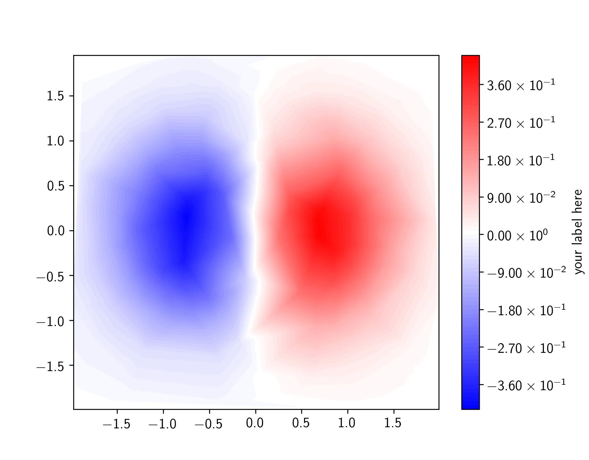
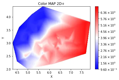
这段代码使我能够绘制一个“3D”数组[X,Y,Z]的颜色图(它们是由元素构成的3个简单np.array)。但是我无法成功地在色条图例的右侧添加垂直书写的标签。

import numpy as np
import matplotlib.pyplot as plt

fig = plt.figure("Color MAP 2D+")

contour = plt.tricontourf(X, Y, Z, 100, cmap="bwr")

plt.xlabel("X")
plt.ylabel("Y")
plt.title("Color MAP 2D+")

#Legend
def fmt(x, pos):
    a, b = '{:.2e}'.format(x).split('e')
    b = int(b)
    return r'${} \times 10^{{{}}}$'.format(a, b)
import matplotlib.ticker as ticker
plt.colorbar(contour, format=ticker.FuncFormatter(fmt))

plt.show()

在这里输入图片描述

无法从Google得到简单的答案很烦人...有人可以帮我吗?


你的代码在我这里使用 matplotlib 2.1.0 版本可以正常工作。 - Scott Boston
你忘记提供问题描述了。你展示的代码有什么问题?结果是什么?它与你期望的有何不同之处。请参见[ask]和[mcve]。 - ImportanceOfBeingErnest
我通过一张图片进行了澄清。 - Agape Gal'lo
2个回答

20

你想给 colorbar 对象添加一个 label。幸运的是,colorbar 有一个名为 set_label 的函数。

简而言之:

cbar = plt.colorbar(contour, format=ticker.FuncFormatter(fmt))
cbar.set_label('your label here')

在最小的脚本中:

import numpy as np
import matplotlib.pyplot as plt
import matplotlib.ticker as ticker

X = np.random.uniform(-2, 2, 200)
Y = np.random.uniform(-2, 2, 200)
Z = X*np.exp(-X**2 - Y**2)

contour = plt.tricontourf(X, Y, Z, 100, cmap="bwr")

def fmt(x, pos):
    a, b = '{:.2e}'.format(x).split('e')
    b = int(b)
    return r'${} \times 10^{{{}}}$'.format(a, b)

cbar = plt.colorbar(contour, format=ticker.FuncFormatter(fmt))
cbar.set_label('your label here')

plt.show()

在此输入图片描述


我有一个额外的问题:如何更改色条右侧数字的大小?@tom - Agape Gal'lo
1
@AgapeGal'lo LMGTFY: https://dev59.com/iWUp5IYBdhLWcg3wY25V 简而言之:cbar.ax.tick_params(labelsize=20) - tmdavison

0

我相信你的代码是有效的。看这个例子:

import numpy as np
import matplotlib.pyplot as plt
from sklearn import datasets

iris = datasets.load_iris().data
X = iris[:,0]
Y = iris[:,1]
Z = iris[:,2]

fig = plt.figure("Color MAP 2D+")

contour = plt.tricontourf(X, Y, Z, 100, cmap="bwr")

plt.xlabel("X")
plt.ylabel("Y")
plt.title("Color MAP 2D+")

#Legend
def fmt(x, pos):
    a, b = '{:.2e}'.format(x).split('e')
    b = int(b)
    return r'${} \times 10^{{{}}}$'.format(a, b)

import matplotlib.ticker as ticker
plt.colorbar(contour, format=ticker.FuncFormatter(fmt))

plt.show()

输出:

enter image description here


OP代码的效果和你的一样好,但是你的和他们的都没有将图例添加到彩色地图的右侧(请查看OP在最近的编辑中发布的图片)。 - gboffi
谢谢,但我想在侧边添加一个图例。 - Agape Gal'lo
你想让图例显示什么?颜色条是图表中Z值的图例。 - Scott Boston
抱歉,正确的词应该是“标签”。顺便问一下,你知道如何更改色条中图形的大小吗?@ScottBoston - Agape Gal'lo

网页内容由stack overflow 提供, 点击上面的
可以查看英文原文,
原文链接