在交互式ggvis图表上叠加图例

10

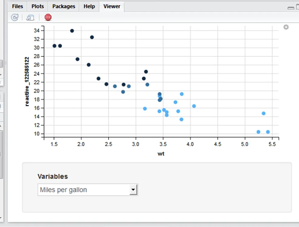
我希望将我的图例放在图内,就像这个问题中所回答的那样,但是针对一个交互式图。

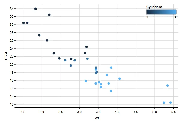
在第一个代码块中,图例离开了绘图区域,但是当我去掉交互时它正常工作。

library(ggvis)
library(dplyr)

# With drop down list it doesn't work
mtcars %>% 
  ggvis(x = ~wt, y = input_select(c("Miles per gallon" = "mpg", "Horse power" = "hp", "Displacement"="disp", "Carbohydrates" = "carb"), map = as.name, selected = "mpg", label = "Variables"), fill=~cyl) %>% 
  layer_points() %>% 
  add_relative_scales() %>%
  add_legend("fill", title = "Cylinders",
             properties = legend_props(
               legend = list(
                 x = scaled_value("x_rel", 0.8),
                 y = scaled_value("y_rel", 1)
               )))

enter image description here

# Remove interaction and it works
mtcars %>% 
  ggvis(x = ~wt, y = ~mpg, fill = ~cyl) %>% 
  layer_points() %>% 
  add_relative_scales() %>%
  add_legend("fill", title = "Cylinders",
             properties = legend_props(
               legend = list(
                 x = scaled_value("x_rel", 0.8),
                 y = scaled_value("y_rel", 1)
               )))

enter image description here

如何在交互式图中叠加图例?


1
通过你的第一段代码,当我选择“马力”时,图例出现了。但是当我选择“每加仑英里数”时,它就消失了。由于y轴的值取决于用户的选择,我想知道这个y-lim变化是否有关系。我认为图例位置是根据最大的y值设置的。“马力”超过了300,而“每加仑英里数”只有34。所以当一个人选择后者时,图例就消失了...这只是我的猜测。 - jazzurro
@jazzurro 很有趣!感谢您的猜测。不过,它似乎是任意选择每隔一个。我在下拉菜单中添加了两个选项,如果您选择“马力”,然后选择“排量”,然后选择“每加仑英里数”,它就会出现。 - Tom
这个看起来很有 bug。我想知道这个问题是否已经在 Github 上报告了。值得考虑一下是否要报告这个情况。 - jazzurro
1个回答

2
似乎这是一个未解决的问题。我在https://github.com/rstudio/ggvis/issues/347上找到了一个简短的解决方法:添加代码。
%>% set_options(duration=0)

故事情节的结尾:

mtcars %>% 
  ggvis(x = ~wt, y = ~mpg, fill = ~cyl) %>% 
  layer_points() %>% 
  add_relative_scales() %>%
  add_legend("fill", title = "Cylinders",
         properties = legend_props(
           legend = list(
             x = scaled_value("x_rel", 0.8),
             y = scaled_value("y_rel", 1)
           ))) %>% set_options(duration=0)

它不会重新绘制图例,因此不会消失。

网页内容由stack overflow 提供, 点击上面的
可以查看英文原文,
原文链接