我正在尝试使用ggvis重现一个ggplot2图表。
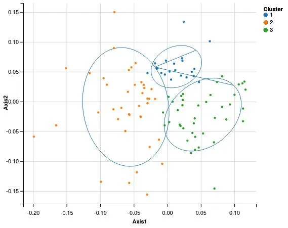
该图表旨在表示点的坐标(来自对应分析)以及它们的聚类(hclust)标准离散度椭圆。
我可以通过ggplot2绘制这个图表:
我可以绘制2个不同的层:
简述
我想基于多个数据集创建一个包含多个图层的ggvis图表。 因此,函数/管道方法阻止我对其中一个图层进行分组而不对其他图层进行分组。
整个(简要注释)代码在这里:https://gist.github.com/RCura/a135446cda079f4fbc10
这是创建数据的代码:
 a <- rnorm(n = 100, mean = 50, sd = 5)

 b <- rnorm(n = 100, mean = 50, sd = 5)

 c <- rnorm(n = 100, mean = 50, sd = 5)

 mydf <- data.frame(A = a, B = b, C = c, row.names = c(1:100))

 library(ade4)

 myCA <- dudi.coa(df = mydf,scannf = FALSE,  nf = 2)

 myDist <- dist.dudi(myCA, amongrow = TRUE)

 myClust <- hclust(d = myDist, method = "ward.D2")

 myClusters <- cutree(tree = myClust, k = 3)

 myCAdata <- data.frame(Axis1 = myCA$li$Axis1, Axis2 = myCA$li$Axis2, Cluster = as.factor(myClusters))

 library(ellipse) # Compute Standard Deviation Ellipse

 df_ellipse <- data.frame()

 for(g in levels(myCAdata$Cluster)){
   df_ellipse <- rbind(df_ellipse,
                 cbind(as.data.frame(
                 with(myCAdata[myCAdata$Cluster==g,],
                 ellipse(cor(Axis1, Axis2),
                 level=0.7,
                 scale=c(sd(Axis1),sd(Axis2)),
                 centre=c(mean(Axis1),mean(Axis2))))),
                 Cluster=g))
 }
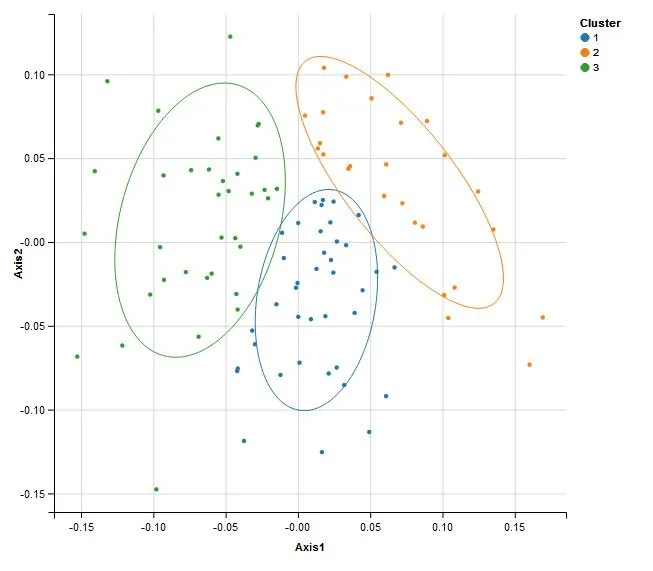
我可以通过ggplot2绘制这个图表:
library(ggplot2)

myPlot <- ggplot(data=myCAdata, aes(x=Axis1, y=Axis2,colour=Cluster)) +
  geom_point(size=1.5, alpha=.6) +
  geom_vline(xintercept = 0, colour="black",alpha = 0.5, linetype = "longdash" ) +
  geom_hline(xintercept = 0, colour="black", alpha = 0.5, linetype = "longdash" ) +
  geom_path(data=df_ellipse, aes(x=x, y=y,colour=Cluster), size=0.5, linetype=1)
myPlot
我可以绘制2个不同的层:
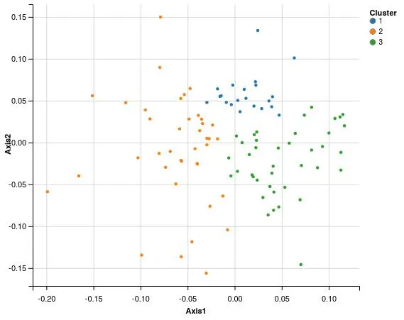
library(ggvis)
all_values <- function(x) { paste0(names(x), ": ", format(x), collapse = "<br />")}
ggDF <- myCAdata
ggDF$name <- row.names(ggDF)
## Coordinates plot
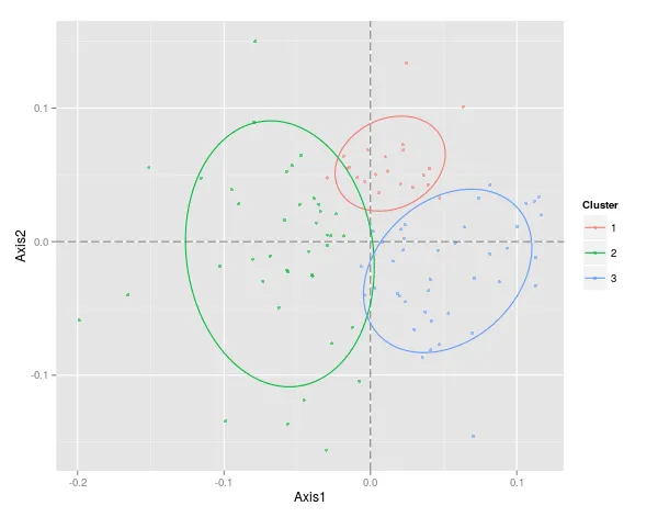
myCoordPlot <- ggvis(x = ~Axis1, y = ~Axis2, key := ~name, data = ggDF) %>%
layer_points(size := 15, fill= ~Cluster, data = ggDF) %>%
add_tooltip(all_values, "hover")
myCoordPlot
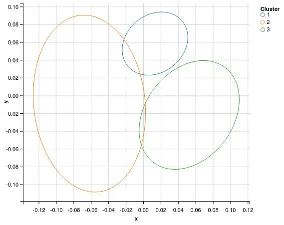
省略号图(未请求工具提示)
 myEllPlot <- ggvis(data = df_ellipse, x = ~x,  y = ~ y) %>%

  group_by(Cluster) %>%

  layer_paths(x= ~x, y= ~y, stroke = ~Cluster, strokeWidth := 1)

 myEllPlot
 myFullPlot <- ggvis(data = df_ellipse, x = ~x,  y = ~ y) %>%

 layer_paths(x= ~x, y= ~y, stroke = ~Cluster, strokeWidth := 1) %>%

 layer_points(x = ~Axis1, y= ~Axis2, size := 15, fill= ~Cluster, data = ggDF) %>%

 add_tooltip(all_values, "hover")

 myFullPlot
这些椭圆没有被分组,所以颜色不匹配,而且椭圆也没有分离。 如果我尝试将我的椭圆分组,它不起作用:group_by只需要在layer_paths中使用,这会弄乱layer_points。
有什么办法可以让这个工作? 对于这篇非常长的帖子感到抱歉,但我已经尝试了几个小时 :/