seaborn.distplot在seaborn 0.11中已被弃用,并被以下函数替代:
displot(),一个图形级别的函数,具有类似的绘图类型的灵活性。这是一个FacetGrid,没有ax参数,所以它不能与matplotlib.pyplot.subplots一起使用。histplot(),一个轴级别的函数,用于绘制直方图,包括核密度平滑。它有ax参数,所以可以与matplotlib.pyplot.subplots一起使用。
- 对于任何没有
ax参数的seaborn FacetGrid绘图,都可以使用相应的轴级别绘图。
- 因为需要绘制两个不同列的直方图,所以使用
histplot更容易。
- 参见如何在多个子图中绘制,了解在
maplotlib.pyplot.subplots中绘制的多种不同方法。
- 还请查看seaborn histplot和displot输出不匹配
- 在
seaborn 0.11.1和matplotlib 3.4.2中进行了测试
fig, (ax1, ax2) = plt.subplots(1, 2)

sns.histplot(x=X_train['Age'], hue=y_train, ax=ax1)
sns.histplot(x=X_train['Fare'], hue=y_train, ax=ax2)
导入和DataFrame示例
import seaborn as sns
import matplotlib.pyplot as plt
penguins = sns.load_dataset("penguins", cache=False)
species island bill_length_mm bill_depth_mm flipper_length_mm body_mass_g sex
0 Adelie Torgersen 39.1 18.7 181.0 3750.0 MALE
1 Adelie Torgersen 39.5 17.4 186.0 3800.0 FEMALE
2 Adelie Torgersen 40.3 18.0 195.0 3250.0 FEMALE
3 Adelie Torgersen NaN NaN NaN NaN NaN
4 Adelie Torgersen 36.7 19.3 193.0 3450.0 FEMALE
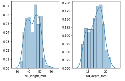
坐标轴级别绘图
- 使用宽格式的数据,使用
sns.histplot
.ravel、.flatten 和 .flat 都将 axes 数组转换为1维。
cols = ['bill_length_mm', 'bill_depth_mm']
fig, axes = plt.subplots(1, 2)
axes = axes.ravel()
for col, ax in zip(cols, axes):
sns.histplot(data=penguins[col], kde=True, stat='density', ax=ax)
fig.tight_layout()
plt.show()
图表级别绘图
dfl = penguins.melt(id_vars='species', value_vars=['bill_length_mm', 'bill_depth_mm'], var_name='bill_size', value_name='vals')
species bill_size vals
0 Adelie bill_length_mm 39.1
1 Adelie bill_depth_mm 18.7
2 Adelie bill_length_mm 39.5
3 Adelie bill_depth_mm 17.4
4 Adelie bill_length_mm 40.3
sns.displot(data=dfl, x='vals', col='bill_size', kde=True, stat='density', common_bins=False, common_norm=False, height=4, facet_kws={'sharey': False, 'sharex': False})
多个数据框
- 如果有多个数据框,可以使用
pd.concat将它们合并,并使用.assign创建一个标识性的'source'列,该列可以用于row=、col=或hue=
lod = [df1, df2, df3]
df = pd.concat((d.assign(source=f'df{i}') for i, d in enumerate(lod, 1)), ignore_index=True)
请参考
将多个csv文件导入pandas并合并为一个DataFrame,以了解如何将多个文件读入单个数据框,并添加一个标识列。
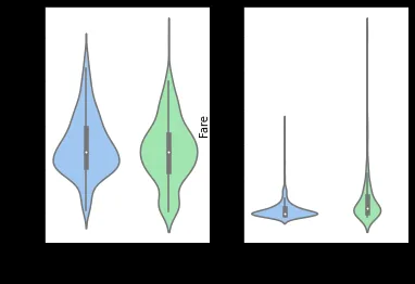
 如果我使用violinplot尝试相同的代码,则返回预期的结果。