这个问题来自于这篇教程,您可以在这里找到。
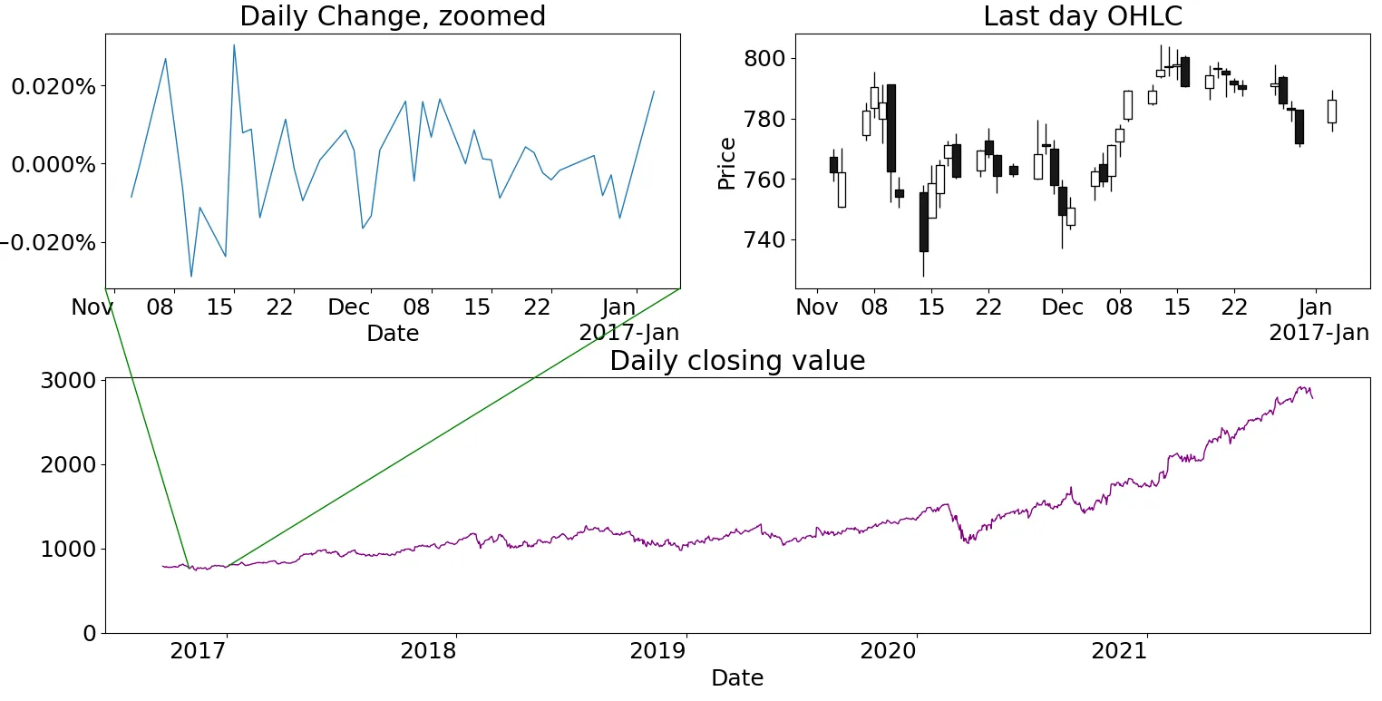
我希望我的图表看起来像下面这张,但是使用时间序列数据,缩放的数据不是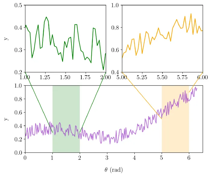 因此,在上面的绘图中,我想要来自另一个数据源的日内数据,下面的绘图将是某只股票每日的数据。但由于它们都有不同的数据源,我无法使用限制进行缩放。为此,我将使用雅虎数据读取器获取每日数据,使用yfinance获取日内数据。
代码:
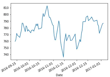
我所做的是将x值设置为日期
x_lim, y_lim的数据,而是来自于另一个数据源。
因此,在上面的绘图中,我想要来自另一个数据源的日内数据,下面的绘图将是某只股票每日的数据。但由于它们都有不同的数据源,我无法使用限制进行缩放。为此,我将使用雅虎数据读取器获取每日数据,使用yfinance获取日内数据。代码:
import pandas as pd
from pandas_datareader import data as web
from matplotlib.patches import ConnectionPatch

df = web.DataReader('goog', 'yahoo')
df.Close = pd.to_numeric(df['Close'], errors='coerce')

fig = plt.figure(figsize=(6, 5))
plt.subplots_adjust(bottom = 0., left = 0, top = 1., right = 1)
sub1 = fig.add_subplot(2,2,1)
sub1 = df.Close.plot()

sub2 = fig.add_subplot(2,1,2) # two rows, two columns, second cell
df.Close.pct_change().plot(ax =sub2)
sub2.plot(theta, y, color = 'orange')
con1 = ConnectionPatch(xyA=(df[1:2].index, df[2:3].Close), coordsA=sub1.transData,
                       xyB=(df[4:5].index, df[5:6].Close), coordsB=sub2.transData, color = 'green')
fig.add_artist(con1)
我在处理xy坐标时遇到了问题。使用上述代码,我得到了以下错误:
类型错误:无法将数组数据从dtype('O')转换为dtype('float64'),根据规则“safe”
xyA=(df[1:2].index, df[2:3].Close)
我所做的是将x值设置为日期
df[1:2].index,将y值设置为价格df[2:3].Close
是否将df转换为数组并绘制图形是我的唯一选择?如果有其他方法可以让ConnectionPatch正常工作,请指导一下。
df.dtypes

High         float64
Low          float64
Open         float64
Close        float64
Volume         int64
Adj Close    float64
dtype: object