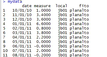
我正在尝试使用 ggplot2 生成一个时间序列箱线图。
我有许多个体的月度值。
我需要根据月份制作我的数据的时间序列箱线图。
我认为我的问题是如何使用我的数据创建一个因子(月份)。
p <- ggplot(mydata, aes(factor(date), measure))
我正在尝试使用 ggplot2 生成一个时间序列箱线图。
我有许多个体的月度值。
我需要根据月份制作我的数据的时间序列箱线图。
我认为我的问题是如何使用我的数据创建一个因子(月份)。
p <- ggplot(mydata, aes(factor(date), measure))
在不必更改日期格式、排序等的情况下,另一种方法是将日期作为分组因素添加,例如:
ggplot(mydata) + geom_boxplot(aes(x = date, y = measure, group = date))
更新:根据提问者的澄清,需要单独处理多年份。
library(ggplot2)

#generate dummy data
date_range <- as.Date("2010/06/01") + 0:400
measure <- runif(401)
mydata <- data.frame(date_range, measure)

# create new columns for the months and years, and
# and a year_month column for x-axis labels
mydata$month <- format(date_range, format="%b")
mydata$year <- as.POSIXlt(date_range)$year + 1900
mydata$year_month <- paste(mydata$year, mydata$month)
mydata$sort_order <- mydata$year *100 + as.POSIXlt(date_range)$mon

#plot it
ggplot(mydata) + geom_boxplot(aes(x=reorder(year_month, sort_order), y=measure))
这会产生以下结果:
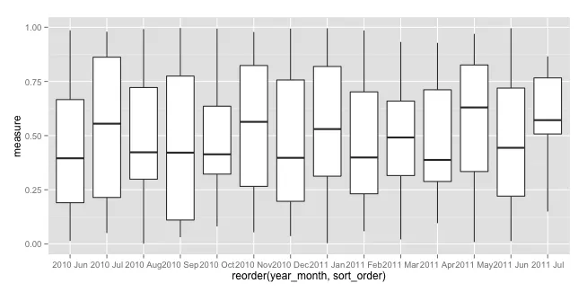
希望这能帮助您前进。
我创建了一个函数以创建您所需的图表。
该函数如下:
ts_plot_season <- function(x = x) {
season <- cycle(x)
season.factor <- factor(season)
ggplot() +
  geom_boxplot(mapping = aes(x = season.factor,
                             y = x)) +
  labs(x = "Periodo", y =  "Serie")
}
ts_plot_season(AirPassengers)
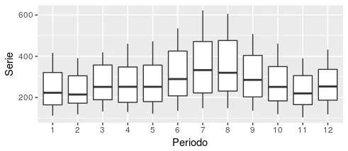
希望这能有所帮助。我知道这个问题已经很老了,但是我在网上找不到什么好的答案。因此我认为这会对某些人有所帮助。