我刚看到了下面这个图:
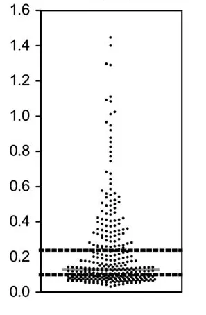
我想知道怎样在R(或其他软件)中实现它?
更新 10.03.11: 感谢所有参与回答这个问题的人 - 你们提供了很棒的解决方案!我在我的博客文章中总结了这里提出的所有解决方案(以及我在网上找到的一些其他方案)。
我刚看到了下面这个图:
我想知道怎样在R(或其他软件)中实现它?
更新 10.03.11: 感谢所有参与回答这个问题的人 - 你们提供了很棒的解决方案!我在我的博客文章中总结了这里提出的所有解决方案(以及我在网上找到的一些其他方案)。
Make.Funny.Plot基本上实现了我所期望的功能。可以根据您自己的需要进行调整,并且可能需要进行一些优化,但这应该是一个不错的开始。
Make.Funny.Plot <- function(x){
    unique.vals <- length(unique(x))
    N <- length(x)
    N.val <- min(N/20,unique.vals)

    if(unique.vals>N.val){
      x <- ave(x,cut(x,N.val),FUN=min)
      x <- signif(x,4)
    }
    # construct the outline of the plot
    outline <- as.vector(table(x))
    outline <- outline/max(outline)

    # determine some correction to make the V shape,
    # based on the range
    y.corr <- diff(range(x))*0.05

    # Get the unique values
    yval <- sort(unique(x))

    plot(c(-1,1),c(min(yval),max(yval)),
        type="n",xaxt="n",xlab="")

    for(i in 1:length(yval)){
        n <- sum(x==yval[i])
        x.plot <- seq(-outline[i],outline[i],length=n)
        y.plot <- yval[i]+abs(x.plot)*y.corr
        points(x.plot,y.plot,pch=19,cex=0.5)
    }
}

N <- 500
x <- rpois(N,4)+abs(rnorm(N))
Make.Funny.Plot(x)
编辑:已更正为始终有效。
cut2 而不是 cut? - chlx.plot <- sample(seq(-outline[i],outline[i],outline[i]/25), n, replace=T) - nico我最近发现了蜂群图包,它与之相似。
蜂群图是一种一维散点图,类似于“stripchart”,但具有紧密排列、不重叠的点。
以下是一个示例:
  library(beeswarm)
  beeswarm(time_survival ~ event_survival, data = breast,
    method = 'smile',
    pch = 16, pwcol = as.numeric(ER),
    xlab = '', ylab = 'Follow-up time (months)',
    labels = c('Censored', 'Metastasis'))
  legend('topright', legend = levels(breast$ER),
    title = 'ER', pch = 16, col = 1:2)
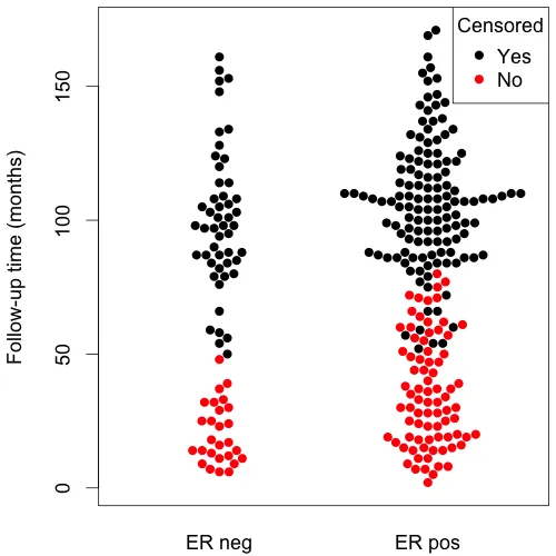
(source: eklund at www.cbs.dtu.dk)
我想到了与Joris相似的代码,但我认为这不仅仅是一个茎叶图;在这里,我指的是每个系列中的y值是到内部均值的绝对距离,而x值更多的是关于该值是否低于或高于均值。
示例代码(有时会引发警告,但可以正常工作):
px<-function(x,N=40,...){
x<-sort(x);

#Cutting in bins
cut(x,N)->p;

#Calculate the means over bins
sapply(levels(p),function(i) mean(x[p==i]))->meansl;
means<-meansl[p];

#Calculate the mins over bins
sapply(levels(p),function(i) min(x[p==i]))->minl;
mins<-minl[p];

#Each dot is one value.
#X is an order of a value inside bin, moved so that the values lower than bin mean go below 0
X<-rep(0,length(x));
for(e in levels(p)) X[p==e]<-(1:sum(p==e))-1-sum((x-means)[p==e]<0);
#Y is a bin minum + absolute value of a difference between value and its bin mean
plot(X,mins+abs(x-means),pch=19,cex=0.5,...);
}
Hmisc包中的bpplot)。 - chlstripchart() 或抖动程序不会太难。 - chl它添加了另一个几何图形到ggplot中,可以用来替代geom_jitter或类似的东西。
特别是geom_quasirandom(见下面的第二个例子),产生了非常好的效果,事实上我已经将其作为默认图表进行了调整。
值得注意的是,还有一个名为vipor(VIolin POints in R)的包,它使用标准的R图形绘制图表,并且实际上也被ggbeeswarm在幕后使用。
set.seed(12345)
install.packages('ggbeeswarm')
library(ggplot2)
library(ggbeeswarm)

ggplot(iris,aes(Species, Sepal.Length)) + geom_beeswarm()

ggplot(iris,aes(Species, Sepal.Length)) + geom_quasirandom()

#compare to jitter
ggplot(iris,aes(Species, Sepal.Length)) + geom_jitter()
