我希望在ggplot上添加来自GLM的拟合函数。默认情况下,它会自动创建交互作用图。我想知道是否可以绘制模型中没有交互作用的拟合函数。例如:
dta <- read.csv("http://www.ats.ucla.edu/stat/data/poisson_sim.csv")
dta <- within(dta, {
  prog <- factor(prog, levels=1:3, labels=c("General", "Academic", "Vocational"))
  id <- factor(id)
})

plt <- ggplot(dta, aes(math, num_awards, col = prog)) +
    geom_point(size = 2) +
    geom_smooth(method = "glm", , se = F,
        method.args = list(family = "poisson"))

print(plt)
提供与交互的情节,
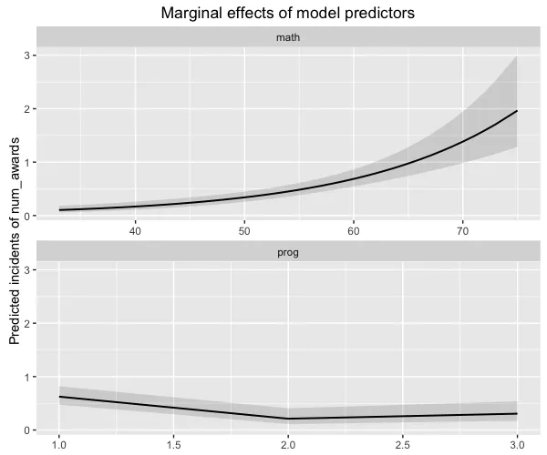
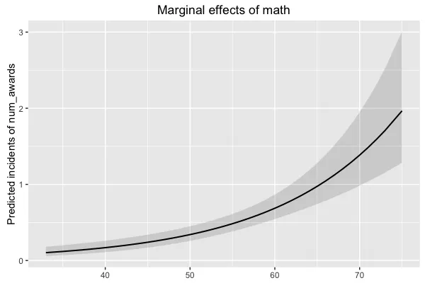
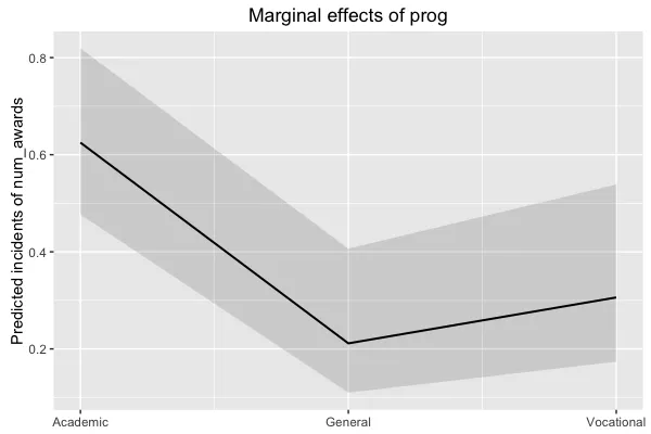
然而,我想要来自模型的图表,
`num_awards` = ß0 + ß1*`math` + ß2*`prog` + error
我曾试图通过这种方式获取它,
mod <- glm(num_awards ~ math + prog, data = dta, family = "poisson")

fun.gen <- function(awd) exp(mod$coef[1] + mod$coef[2] * awd)
fun.acd <- function(awd) exp(mod$coef[1] + mod$coef[2] * awd + mod$coef[3])
fun.voc <- function(awd) exp(mod$coef[1] + mod$coef[2] * awd + mod$coef[4])

ggplot(dta, aes(math, num_awards, col = prog)) +
    geom_point() +
    stat_function(fun = fun.gen, col = "red") +
    stat_function(fun = fun.acd, col = "green") +
    stat_function(fun = fun.voc, col = "blue") +
    geom_smooth(method = "glm", se = F,
        method.args = list(family = "poisson"), linetype = "dashed")
输出的图表是 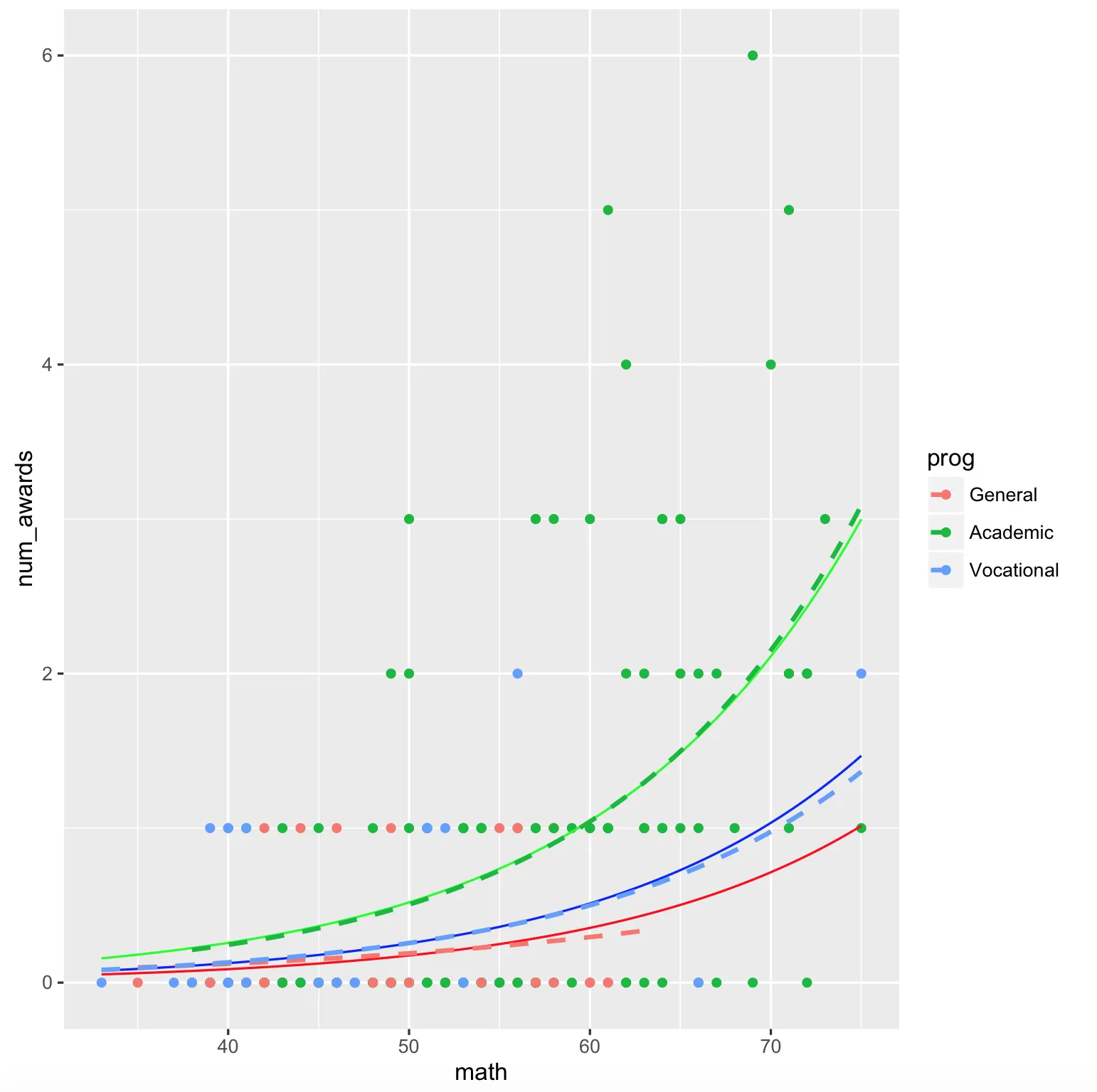
在 ggplot 中有没有简单的方法来高效地完成这个操作?
~math+prog)模型的预测... - Ben Bolkernum_awards = ß0 + ß1*math + ß2*prog + error似乎像OP正在寻找的边际效应。 - Danielsjp.glm(mod,type="y.pc",axisLabels="math"),这应该是OP想要的,使用的是sjPlot版本1.9.4.2(直接从Github获取,除非我搞砸了),但是得到了一个空白图和一个警告信息... - Ben Bolkernrow的值。我不知道如何以一种通用的方式处理响应预测。如果模型有更多的协变量,或者只有连续的协变量,那该怎么办?那我就不知道应该选择哪些术语作为分组因子了。老实说,当前的y.pc选项并没有做太多有用的事情。 - Daniel