我打算为模拟时间序列构建自定义的
ACF和PACF图。ts <- arima.sim(n=5300,list(order=c(2,0,1), ar=c(0.4,0.3), ma=-0.2))
以下是我编写的代码,通过ggplot2生成图表:
library(gridExtra)
theme_setting <- theme(
panel.background = element_blank(),
panel.grid.major.y = element_line(color="grey90", size=0.5),
panel.grid.major.x = element_blank(),
panel.border = element_rect(fill=NA, color="grey20"),
axis.text = element_text(family="Times"),
axis.title = element_text(family="Times"),
plot.title = element_text(size=10, hjust=0.5, family="Times"))
acf_ver_conf <- acf(ts, plot=FALSE)$acf %>%
as_tibble() %>% mutate(lags = 1:n()) %>%
ggplot(aes(x=lags, y = V1)) + scale_x_continuous(breaks=seq(0,41,4)) +
labs(y="Autocorrelations", x="Lag", title= "Time Series, ACF") +
geom_segment(aes(xend=lags, yend=0)) +geom_point() + theme_setting
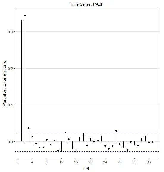
pacf_ver_conf <- pacf(ts, main=NULL,plot=FALSE)$acf %>%
as_tibble() %>% mutate(lags = 1:n()) %>%
ggplot(aes(x=lags, y = V1)) +
geom_segment(aes(xend=lags, yend=0)) +geom_point() + theme_setting +
scale_x_continuous(breaks=seq(0,41,4))+
labs(y="Partial Autocorrelations", x="Lag", title= "Time Series, PACF")
grid.arrange(acf_ver_conf, pacf_ver_conf, ncol=2)
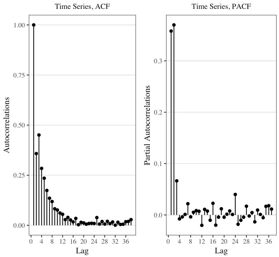
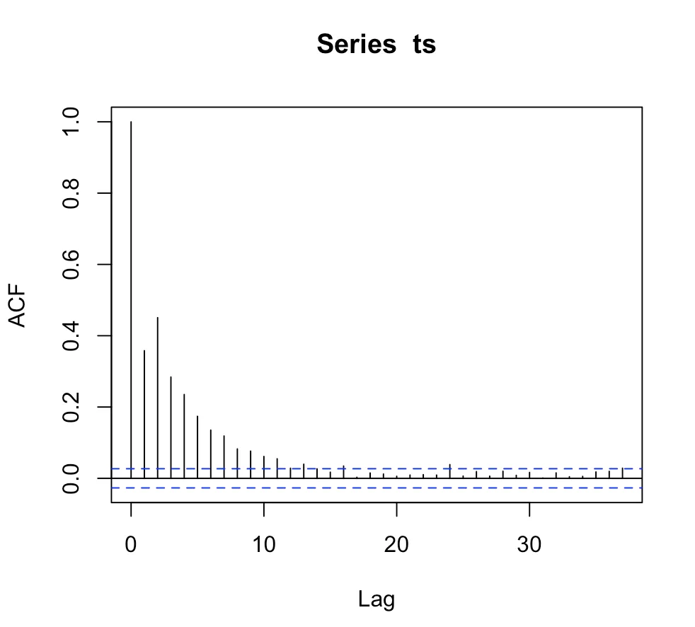
虽然这正是我想要的,但我不确定如何在acf(ts)和pacf(ts)中生成置信区间:
所以,我的问题有两个部分:
- 如何在R中从统计上推导出自相关函数和偏自相关函数的上下置信区间?
- 您将如何将其绘制到第一张图上? 我正在考虑
geom_ribbon,但非常感谢任何其他建议!
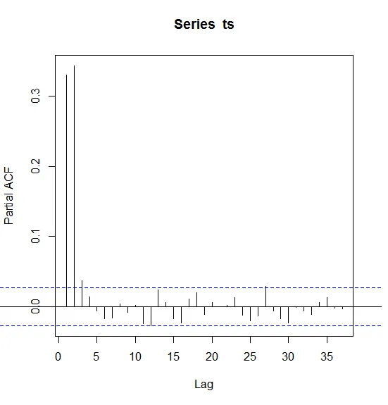
geom_hline或geom_rect。 - yeedle