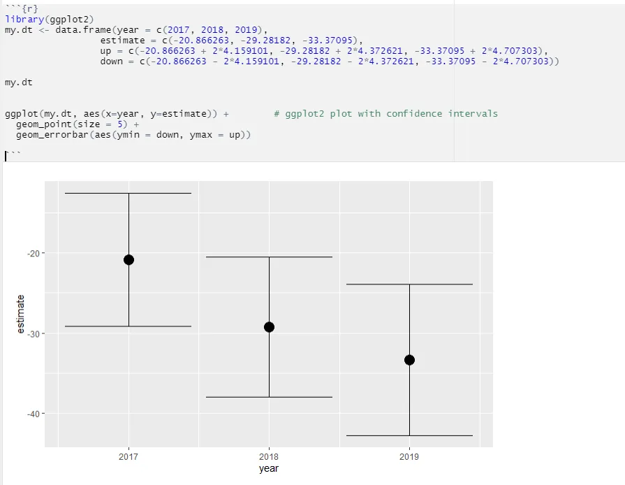
使用ggplot2手动绘制置信区间

3

我有一个包含四个变量的数据框。

(1) 表示时间段的变量

(2) 估计值

(3) (1) 的置信区间上限临界点

(4) (1) 的置信区间下限临界点

具体来说,我手动制作了以下数据框:

> my.dt <- data.frame(year = c(2017, 2018, 2019),
                 estimate = c(-20.866263, -29.28182, -33.37095),
                 up = c(-20.866263 + 2*4.159101, -29.28182 + 2*4.372621, -33.37095 + 2*4.707303),
                 down = c(-20.866263 - 2*4.159101, -29.28182 - 2*4.372621, -33.37095 - 2*4.707303))

> my.dt
  year  estimate        up      down
1 2017 -20.86626 -12.54806 -29.18446
2 2018 -29.28182 -20.53658 -38.02706
3 2019 -33.37095 -23.95634 -42.78556

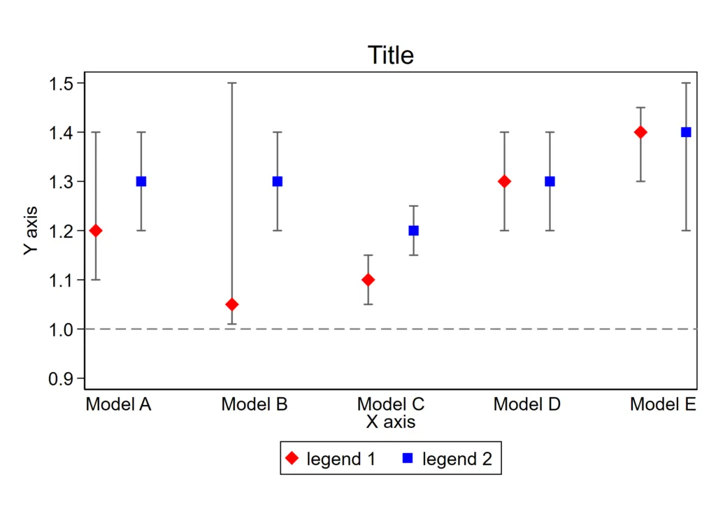
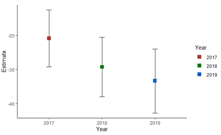
在这里,我该如何绘制(逐点)置信区间,就像下面这样:enter image description here
2个回答

4
这可以通过以下代码来完成。您需要使用geom_errorbar :-)
ggplot(my.dt, aes(x=year, y=estimate)) +         
       geom_point(size = 5) +
       geom_errorbar(aes(ymin = down, ymax = up))

enter image description here


1
相同的逻辑:稍作修改:

library(ggplot2)
ggplot(my.dt, aes(x = factor(year), y=estimate, color=factor(year))) +
  geom_errorbar(aes(ymin = down, ymax = up), colour="black", width=.1, position=position_dodge(0.1)) +
  geom_point(position=position_dodge(0.1), size=3, shape=15, fill="white") +
  xlab("Year") +
  ylab("Estimate") +
  scale_colour_hue(name="Year",    
                   breaks=c("2017", "2018", "2019"),
                   labels=c("2017", "2018", "2019"),
                   l=40) + 
  theme_classic() +
  theme(aspect.ratio=2/3)

enter image description here


感谢您的额外贡献! - M.C. Park

网页内容由stack overflow 提供, 点击上面的
可以查看英文原文,
原文链接