我尽力使标题尽可能清晰,但我不确定它是否完全清晰。我有三个数据系列(随时间变化的事件数量)。我想做一个子图,其中表示这三个时间序列。您将找到我能想到的最好的附件。最后一个时间序列明显较短,因此在此处不可见。
我还添加了相应的代码,以便您更好地理解我正在尝试做什么,并就正确/明智的方法向我提供建议。
这是我目前为止能够达到的结果: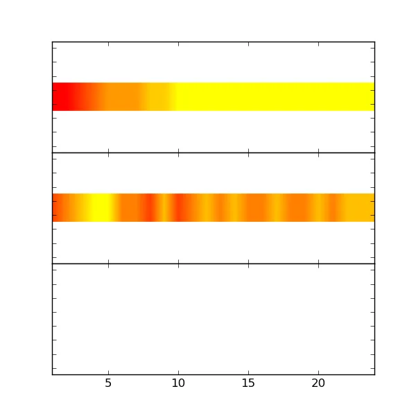 以下是我希望拥有的方案,因为我在网上找不到它。简而言之,我想删除两个上图中绘制数据周围的空白空间。作为一个更一般的问题,我想知道imshow是否是获得这样的绘图的最佳方法(参见下面的预期结果)。
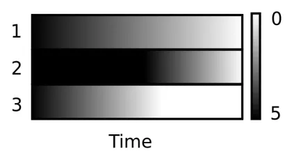
我还添加了相应的代码,以便您更好地理解我正在尝试做什么,并就正确/明智的方法向我提供建议。
import numpy as np
import matplotlib.pyplot as plt

x=np.genfromtxt('nbr_lig_bound1.dat')
x1=np.genfromtxt('nbr_lig_bound2.dat')
x2=np.genfromtxt('nbr_lig_bound3.dat')
# doing so because imshow requieres a 2D array
# best way I found and probably not the proper way to get it done
x=np.expand_dims(x, axis=0)
x=np.vstack((x,x))
x1=np.expand_dims(x1, axis=0)
x1=np.vstack((x1,x1))
x2=np.expand_dims(x2, axis=0)
x2=np.vstack((x2,x2))
# hoping that this would compensate for sharex shrinking my X range to
# the shortest array
ax[0].set_xlim(1,24)
ax[1].set_xlim(1,24)
ax[2].set_xlim(1,24)


fig, ax = plt.subplots(nrows=3, ncols=1, figsize=(6,6), sharex=True)
fig.subplots_adjust(hspace=0.001) # this seem to have no effect

p1=ax[0].imshow(x1[:,::10000], cmap='autumn_r')
p2=ax[1].imshow(x2[:,::10000], cmap='autumn_r')
p3=ax[2].imshow(x[:,::10000], cmap='autumn')
这是我目前为止能够达到的结果:
以下是我希望拥有的方案,因为我在网上找不到它。简而言之,我想删除两个上图中绘制数据周围的空白空间。作为一个更一般的问题,我想知道imshow是否是获得这样的绘图的最佳方法(参见下面的预期结果)。