我有一个 data.frame,大致如下:
set.seed(100)

df <- data.frame(year = rep(2011:2014, 3),
                 class = rep(c("high", "middle", "low"), each = 4),
                 age_group = rep(1:3, each = 4),
                 value = sample(1:2, 12, rep = TRUE))
我希望生产出三个类似于以下代码所生成的图形,通过对变量 age_group 进行分面(facet)处理:
library(ggplot2)
blue <- c("#bdc9e1", "#74a9cf", "#0570b0")
ggplot(df) + geom_bar(aes(x = year, y = value,
                          fill = factor(class, levels = c("high", "middle", "low"))),
                      stat = "identity") +
  scale_fill_manual(values = c(blue)) +
  guides(fill = FALSE)
然而,每个方面都有不同的颜色方案,其中所有颜色都由我指定。
我似乎想要一个更具体的版本,即ggplot2: Change color for each facet in bar chart中所示的内容。
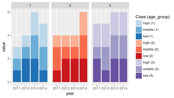
因此,使用我提供的数据,我希望获得三个分面图,按age_group拆分,其中每个图的填充由class的级别给出,并且所有颜色(总共9种)都将由我手动指定。
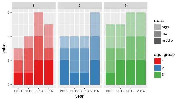
编辑:为了澄清,我最终想要的分面是以下代码提供的:
ggplot(df) + geom_bar(aes(x = year, y = value,
                          fill = factor(class, levels = c("high", "middle", "low"))),
                      stat = "identity") +
  scale_fill_manual(values = c(blue)) +
  guides(fill = FALSE) +
  facet_wrap(~ age_group)
通过 class 变量的颜色子集的附加控制级别。
+ facet_wrap(〜age_group)是否符合您的意图?也许在您的示例中包括它。 (b)您对传说有什么想法?所有年龄组/类别交互作用的单个传说?还是每个子图的单独传说? - Gregor Thomasfacet(〜age_group)。你提到的图例很有趣,我没有想到过。一个类似图例的东西,其中我可以有三种颜色的块对应于“高”,“中”和“低”级别,这将是不错的,但我想象这已经超出了ggplot的控制范围。我欢迎建议。 - Rosspaste或interaction创建新列)。我现在没有时间写一个好的答案,但如果没有其他人先回答,我会尽量找时间回答。 - Gregor Thomas