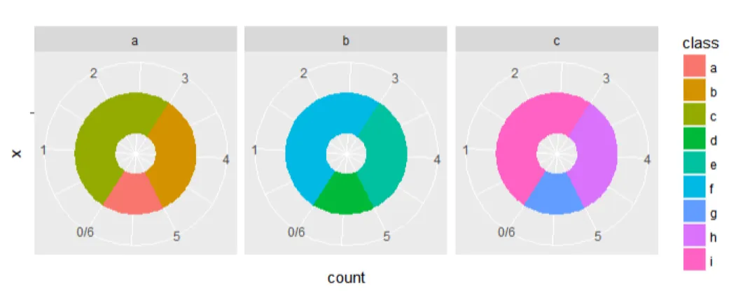
我有三个变量的频率计数,想要在饼图中展示频率计数。我尝试使用ggplot并使用以下代码:
library(ggplot2)
df = data.frame(var = rep(c('a','b','c'),each = 3),
            class = letters[1:9],
            count = rep(1:3, 3))

ggplot(df, aes(x = '', y = count, fill = class)) +
  geom_bar(width = 0.5, stat = 'identity') +
  coord_polar('y', start = 10) + facet_wrap(~var) +
  theme(legend.position = 'none')
我得到了以下图表:
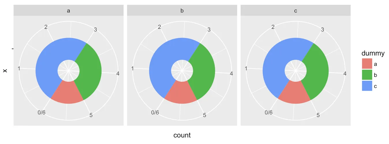
 但是,我想要像这样的效果:
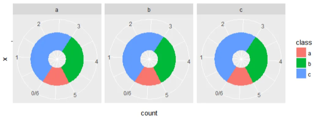 如何在每个面板中重置颜色?