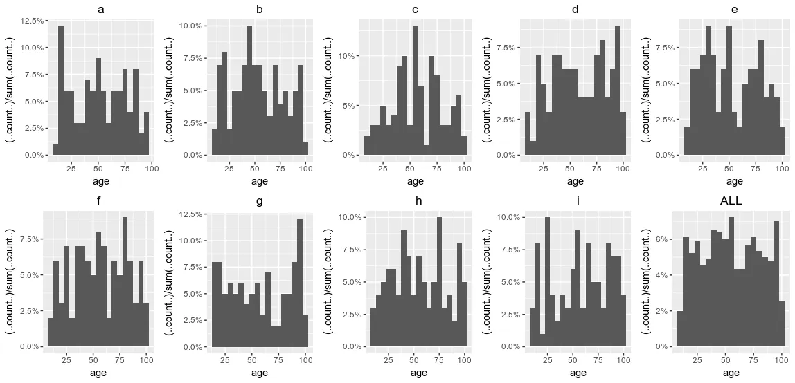
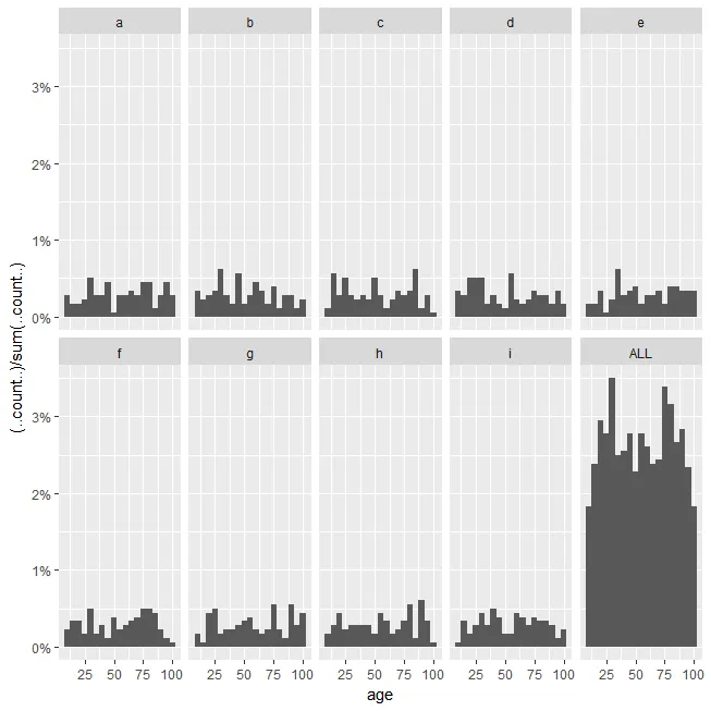
虽然看起来facet_wrap没有在每个子集中运行特殊的geom_histogram百分比计算,但考虑单独构建一系列图形并将它们排列在一起。
具体而言,调用by以在group的子集中运行您的ggplots,然后调用gridExtra::grid.arrange()(实际包方法)以某种方式模仿facet_wrap:
library(ggplot2)
library(scales)
library(gridExtra)

...

grp_plots <- by(df, df$group, function(sub){
  ggplot(sub, aes(age)) +
    geom_histogram(aes(y = (..count..)/sum(..count..)), binwidth = 5) +
    scale_y_continuous(labels = percent ) + ggtitle(sub$group[[1]]) +
    theme(plot.title = element_text(hjust = 0.5))
})

grid.arrange(grobs = grp_plots, ncol=5)
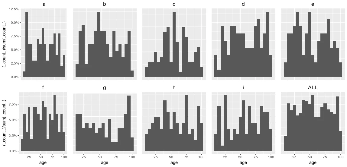
然而,为了避免重复的y轴和x轴,请考虑在by调用中有条件地设置theme,假设您事先知道您的分组,并且它们的数量合理。
grp_plots <- by(df, df$group, function(sub){
p <- ggplot(sub, aes(age)) +
geom_histogram(aes(y = (..count..)/sum(..count..)), binwidth = 5) +
scale_y_continuous(labels = percent ) + ggtitle(sub$group[[1]])
if (sub$group[[1]] %in% c("a")) {
p <- p + theme(plot.title = element_text(hjust = 0.5), axis.title.x = element_blank(),
axis.text.x = element_blank(), axis.ticks.x = element_blank())
}
else if (sub$group[[1]] %in% c("f")) {
p <- p + theme(plot.title = element_text(hjust = 0.5))
}
else if (sub$group[[1]] %in% c("b", "c", "d", "e")) {
p <- p + theme(plot.title = element_text(hjust = 0.5), axis.title.y = element_blank(),
axis.text.y = element_blank(), axis.ticks.y = element_blank(),
axis.title.x = element_blank(), axis.text.x = element_blank(),
axis.ticks.x = element_blank())
}
else {
p <- p + theme(plot.title = element_text(hjust = 0.5), axis.title.y = element_blank(),
axis.text.y = element_blank(), axis.ticks.y = element_blank())
}
return(p)
})
grid.arrange(grobs=grp_plots, ncol=5)
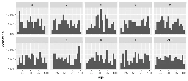
geom_histogram(aes(y = stat(width*density)))。 - Sweepy Dodo