如何使用ggplot2在直方图上显示百分比标签

4

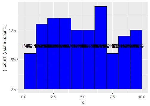
我看到很多有关将y轴计数转换为百分比的问题,但大多数都在条形图中。

我想在直方图中做类似的事情,但无法清楚地显示标签。请告诉我我做错了什么。

x = runif(100, min = 0, max = 10)
data1 <- data.frame(x = x)

ggplot(aes(x = x), data = data1)+
geom_histogram(aes(y = (..count..)/sum(..count..)), bins = 10, breaks = 
seq(0,10,1), fill = "blue", col = "black")+
geom_text(aes(y = ((..count..)/sum(..count..)), 
            label = scales::percent((..count..)/sum(..count..))), 
        stat = "count", vjust = -10)+ 
scale_y_continuous(labels = scales::percent)

输出结果:

输入图像描述

1个回答

3
使用scale_y_continuous与断点和标签一起使用可以解决您的问题。
  data1 <- data.frame (x = runif(100, min = 0, max = 10))
ggplot(aes(x=x), data1) + stat_bin(aes(y = ..count..)) 
ggplot(data1, aes(x = x)) + geom_histogram(fill = "blue", col = "black")+ scale_y_continuous(breaks = seq(0,10,1),labels = paste(seq(0, 10, by = 1) / 100, "%", sep = ""))+geom_text(aes(y = (..count..),label =  scales::percent((..count..)/sum(..count..))), stat="bin",colour="green",vjust=2) 

或者,您可以像这样指定要添加百分比的位置:
geom_text(aes(y = (..count..)+0.5))

当然,您也可以更改颜色。来自:
stat="bin",colour="your prefer color "

此外,您可以按照以下方式更改箱子的宽度:
geom_histogram(fill = "blue", col = "black", binwidth = 0.5) 

enter image description here

enter image description here

heres the graph


1
如何在每个柱状图上单独显示百分比? - Shubham Rajput
2
你仍然可以使用 geom_text,它会正常工作。只需要稍微修改一下:geom_text(aes(y = (..count..),label = 你的代码)) - user8389133
1
希望这能帮助你解决问题。 - user8389133
如何设置分箱?我在 geom_histogram() 中设置了 bin 参数,但仍然得到 stat_bin() 使用 bins=30 的结果。使用 binwidth 选择更好的值。 - Shubham Rajput
2
stat_bins() 只是一个警告信息,提示您的数据太小了。因此,请尝试使用一些 bin 值较大的大型数据进行测试。 - user8389133

网页内容由stack overflow 提供, 点击上面的
可以查看英文原文,
原文链接