在使用 facet_wrap 创建的直方图上绘制标记意味着什么?

8

我正在使用ggplot2facet_wrap创建多个直方图,希望在每个面板上绘制平均值。下面,我创建一个虚拟数据框,找到每个分面的平均值,然后使用geom_point添加平均值创建图表。

# Load libraries 
library(tidyverse)

# Toy data frame
df <- data.frame(ID = sample(letters[1:3], 100, replace = TRUE), n = runif(100))

# Mean value of each group
df_mean <- df %>% group_by(ID) %>% summarise(mean = mean(n))

# Plot histograms
ggplot(df) + 
  geom_histogram(aes(n)) + 
  facet_wrap(~ID) +
  geom_point(data = df_mean, aes(x = mean, y = Inf))

enter image description here

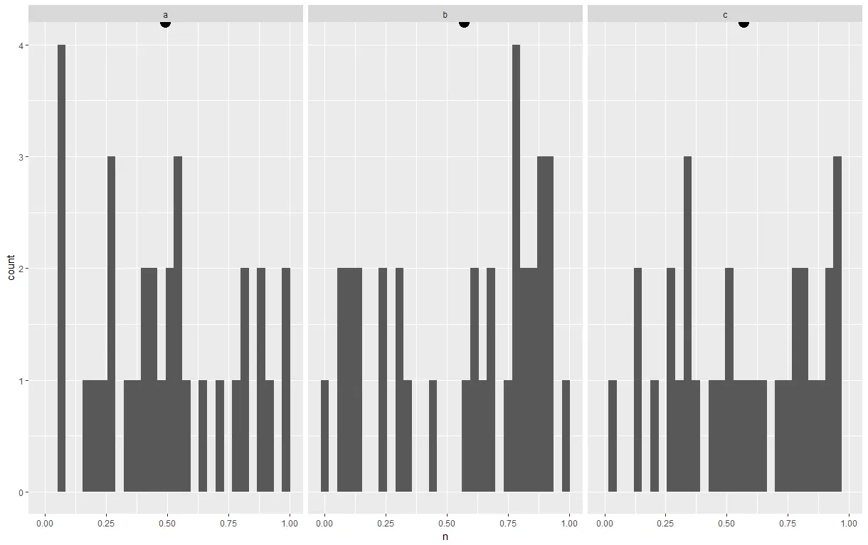
我使用了y = Inf将点放置在每个面的顶部,但是-如您所见-它被裁剪了一些。我想把它向下移动,使其完全可见。据我所知,geom_point没有nudge_yvadj参数,0.7 * Inf显然是不合理的。我还尝试将position = position_nudge(y = -5)作为geom_point的参数添加,但这似乎没有任何效果。作为解决方法,我甚至尝试使用geom_text并指定nudge_y,但像position_nudge解决方案一样,它没有任何明显的效果。在绘图时是否有简单的方法来完成这个任务,或者我只需要在绘制之前计算y值?


你真的想把它放在最上面吗?您可以使用类似于
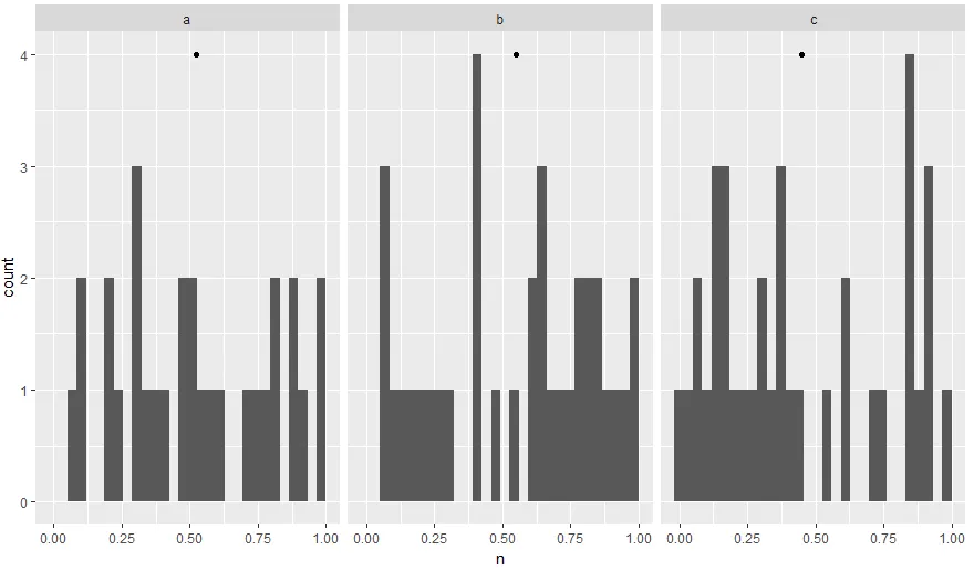
... + geom_point(data = df_mean,aes(x = mean,y = 0),col =“red”)这样的东西,以不同的颜色将其放置在x轴上。 - AntoniosK
@AntoniosK 是的,我真的想要在顶部。:) 那里有很多空间,所以它比在其他数据上绘图更清洁。 - Dan
2个回答

4
# Load libraries 
library(tidyverse)

# Toy data frame
df <- data.frame(ID = sample(letters[1:3], 100, replace = TRUE), n = runif(100))

# Mean value of each group
df_mean <- df %>% group_by(ID) %>% summarise(mean = mean(n))

# Get max count using the dataframe that stores ggplot info
ggplot(df) + 
  geom_histogram(aes(n)) + 
  facet_wrap(~ID) -> p

# Plot histograms and plot mean in the right place
p + geom_point(data = df_mean, aes(x = mean, y = max(ggplot_build(p)$data[[1]]$count)))

enter image description here

关键在于知道最大计数值,因为这将是您直方图顶部y轴值。您可以使用ggplot_build函数获取该信息,并使用它将点绘制在正确的位置。
当然,如果点落在柱子上,您可以稍微高于最大计数值,例如:y = 0.2 + max(ggplot_build(p)$data[[1]]$count))

4

如果你使用geom_text/label(),你可以使用vjust参数来实现这个目的:

ggplot(df) + 
    geom_histogram(aes(n)) + 
    facet_wrap(~ID) +
    geom_text(data = df_mean, aes(x = mean, y = Inf),
              label = "Mean", vjust = 1)

我经常用它来显示一个面板顶部的百分比浮动或者p值。你无需计算任何东西,ggplot能为你解决问题。

输入图片描述


我采用了这个解决方案,使用 label = "\U2022" 来生成一个点。 - Dan

网页内容由stack overflow 提供, 点击上面的
可以查看英文原文,
原文链接