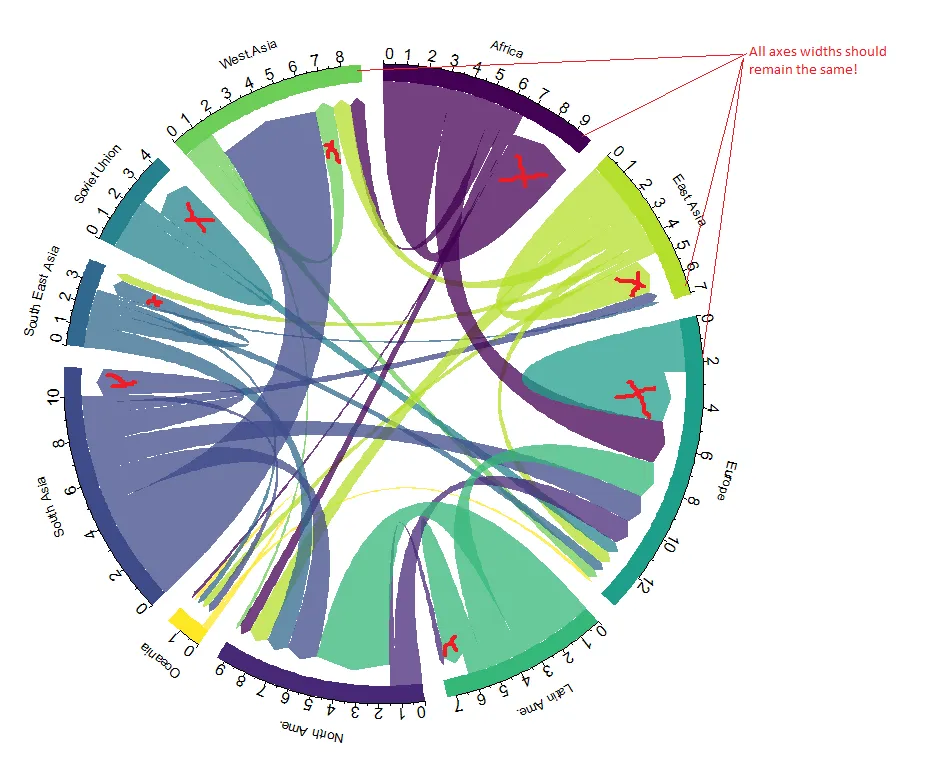
有没有办法隐藏那些指向同一和弦图区域的箭头?也就是说,和弦图仅显示迁移到其他大陆的迁移,但包括一个非箭头区域,表示大陆内部的迁移。
这些箭头应该被删除或隐藏。
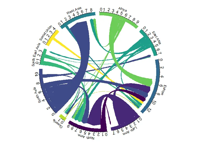
代码
该代码来自于这里:https://www.data-to-viz.com/graph/chord.html
    # Libraries
library(tidyverse)
library(viridis)
library(patchwork)
library(hrbrthemes)
library(circlize)
library(chorddiag)  #devtools::install_github("mattflor/chorddiag")

    # Load dataset from github
data <- read.table("https://raw.githubusercontent.com/holtzy/data_to_viz/master/Example_dataset/13_AdjacencyDirectedWeighted.csv", header=TRUE)

# short names
colnames(data) <- c("Africa", "East Asia", "Europe", "Latin Ame.",   "North Ame.",   "Oceania", "South Asia", "South East Asia", "Soviet Union", "West.Asia")
rownames(data) <- colnames(data)

# I need a long format
data_long <- data %>%
  rownames_to_column %>%
  gather(key = 'key', value = 'value', -rowname)

# parameters
circos.clear()
circos.par(start.degree = 90, gap.degree = 4, track.margin = c(-0.1, 0.1), points.overflow.warning = FALSE)
par(mar = rep(0, 4))

# color palette
mycolor <- viridis(10, alpha = 1, begin = 0, end = 1, option = "D")
mycolor <- mycolor[sample(1:10)]

# Base plot
chordDiagram(
  x = data_long,
  grid.col = mycolor,
  transparency = 0.25,
  directional = 1,
  direction.type = c("arrows", "diffHeight"),
  diffHeight  = -0.04,
  annotationTrack = "grid",
  annotationTrackHeight = c(0.05, 0.1),
  link.arr.type = "big.arrow",
  link.sort = TRUE,
  link.largest.ontop = TRUE)

# Add text and axis
circos.trackPlotRegion(
  track.index = 1,
  bg.border = NA,
  panel.fun = function(x, y) {

    xlim = get.cell.meta.data("xlim")
    sector.index = get.cell.meta.data("sector.index")

    # Add names to the sector.
    circos.text(
      x = mean(xlim),
      y = 3.2,
      labels = sector.index,
      facing = "bending",
      cex = 0.8
      )

    # Add graduation on axis
    circos.axis(
      h = "top",
      major.at = seq(from = 0, to = xlim[2], by = ifelse(test = xlim[2]>10, yes = 2, no = 1)),
      minor.ticks = 1,
      major.tick.percentage = 0.5,
      labels.niceFacing = FALSE)
  }
)
编辑:添加了一个注意事项,轴宽度应保持不变。
%>% filter(rowname != key)- zx8754