在R中绘制nls模型的导数

3
我使用了nls函数来拟合以下方程。
y ~ (C + (A1*exp(-x/h1)) + (A2*exp(-x/h2)))

我的代码如下所示

f <- as.formula(y ~ (C + (A1*exp(-x/h1)) + (A2*exp(-x/h2))))
nls_b <- nls(f, data = df, start = list(C = 0.140, A1 = 0.051, h1 = 586.772, A2 = 0.166, h2 = 33.323))
summary(nls_b)
b_opt <- predict(nls_b, newdata=df)

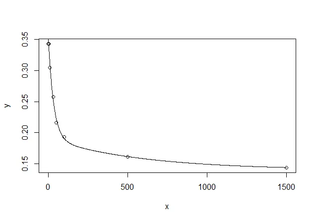
现在,我已经将模型预测的值和观测值绘制在x轴上。

plot(y=df$y, x=df$x)
lines(y=b_opt, x=df$x, type='l')
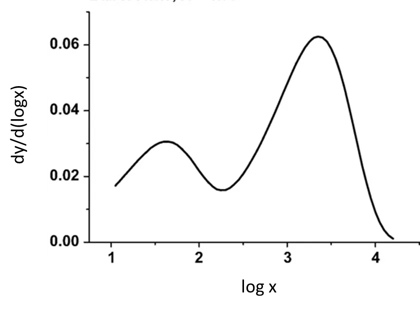
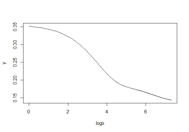
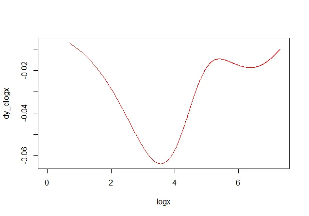
现在我该如何得到以下的图表:

enter image description here

数据

df = structure(list(x = c(2L, 5L, 10L, 33L, 50L, 100L, 500L, 1500L
), y = c(0.34272, 0.34256, 0.30483, 0.25772, 0.21584, 0.19295, 
0.16144, 0.144)), class = "data.frame", row.names = c(NA, -8L
))

我们能看到 dput(df) 的输出,或是它的一大部分吗? - Allan Cameron
1
@AllanCameron 对不起,现在我已经以dput()格式提供了数据。请查看一下。 - UseR10085
谢谢你提供这个。有一个可重现的例子真好。 - Allan Cameron
1个回答

3
我们可以通过在 x 中创建平滑数值范围并将其传递给 newdata 来首先得到您模型预测的良好图表:
newdata <- data.frame(x = seq(1, 1500, 1))
newdata$y <- predict(nls_b, newdata)

plot(df)
lines(newdata)

enter image description here

接下来,我们对x轴取对数,并计算dy / dlog(x)的简单近似数值导数(请注意,通过更改newdatax序列的密度,可以使其任意精确)。
newdata$logx <- log(newdata$x)
newdata$dlogx <- c(0, diff(newdata$logx))
newdata$dy <- c(0, diff(newdata$y))
newdata$dy_dlogx <- newdata$dy / newdata$dlogx

现在我们可以在对数刻度上绘制您拟合的曲线:

with(newdata, plot(logx, y, type = "l"))

enter image description here

并且导数是这样的:

with(newdata, plot(logx, dy_dlogx, type = "l", col = "red"))

enter image description here


谢谢您的回答。您能告诉我为什么导数是负数吗? - UseR10085
@BappaDas 根据您提供的数据,nls拟合到您的点的线在其范围内具有下降梯度,因此导数为负。如果您查看所提供的数据,它只能真正具有负梯度。您确定您的数据没有被反转或否定吗? - Allan Cameron
我认为nls应该使用logx而不仅仅是x。我认为这样导数图可能会变成正的。另外,我怎么能得到导数曲线最小点的方程? - UseR10085
1
@BappaDas 不,将y绘制为对数x的函数仍会得到一个向下倾斜的图形。我回答中的结果看起来像您问题中的结果,但旋转了180度。我认为也许dy / d -log(x)会给你相同的形状? - Allan Cameron

网页内容由stack overflow 提供, 点击上面的
可以查看英文原文,
原文链接