如果你不需要热图两侧的树状图,以下是可能的选项:
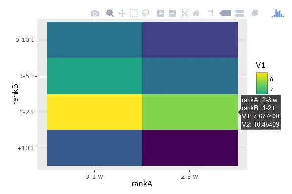
选项1. 创建ggplot对象并使用
plotly :: ggplotly进行转换:
library(ggplot2)
p <- ggplot(df,
aes(x = rankA, y = rankB, fill = V1, label = V2)) +
geom_tile() +
geom_label(fill = "white") +
viridis::scale_fill_viridis()
plotly::ggplotly(p)
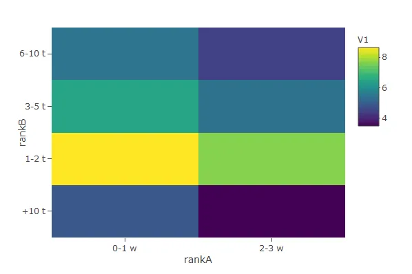
选项2. 创建plotly对象:
plotly::plot_ly(
  data = df,
  x = ~rankA, y = ~rankB, z = ~V1, text = ~paste('V2: ', V2),
  hoverinfo = "text",
  type = "heatmap"
)
(此版本在悬停时显示“V2:/ V2的值/”,但未被导出的截图捕获。)
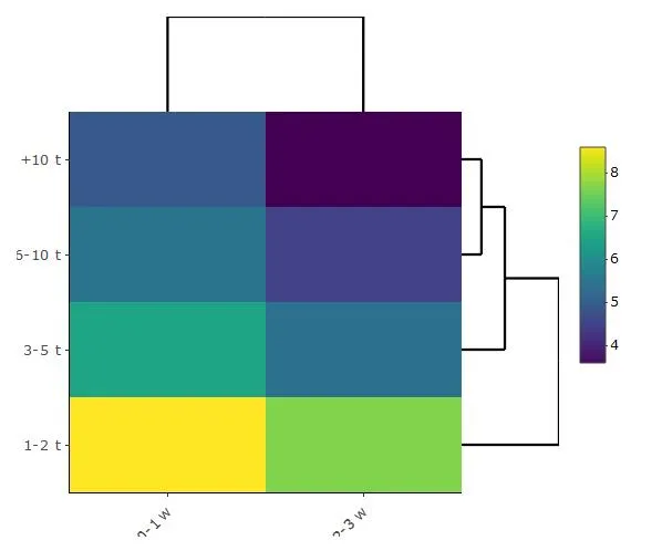
如果您确实需要树状图,恐怕我还没有找到一种方法将其输入到heatmaply的参数中。但是,如果情况危急,您可以考虑以下选项...
选项3。使用heatmaply库创建plotly对象并更改基础代码。
hm <- heatmaply::heatmaply(long_data = df %>%
select(rankB, rankA, V1) %>%
rename(name = rankB, variable = rankA, value = V1))
str(hm)
> hm$x$data[4][[1]]$text
[,1] [,2]
[1,] "value: 8.636042<br />column: 0-1 w<br />row: 1-2 t" "value: 7.677400<br />column: 2-3 w<br />row: 1-2 t"
[2,] "value: 6.495266<br />column: 0-1 w<br />row: 3-5 t" "value: 5.420535<br />column: 2-3 w<br />row: 3-5 t"
[3,] "value: 5.480639<br />column: 0-1 w<br />row: 6-10 t" "value: 4.499810<br />column: 2-3 w<br />row: 6-10 t"
[4,] "value: 4.897840<br />column: 0-1 w<br />row: +10 t" "value: 3.496508<br />column: 2-3 w<br />row: +10 t"
attr(,"apiSrc")
[1] TRUE
df %>%
select(-V1) %>%
mutate(V2 = paste("V2:", V2)) %>%
tidyr::spread(rankA, V2) %>%
arrange(factor(rankB, levels = c("1-2 t", "3-5 t", "6-10 t", "+10 t"))) %>%
select(-rankB) %>% as.matrix() -> hm$x$data[4][[1]]$text
hm
和之前一样,这个版本在悬停时显示“V2:/ V2的值/”。但它没有被导出的截图捕获。
数据:
df <- read.table(header = T, stringsAsFactors = F,
                 text = '      rankA      rankB     V1       V2
                 1     "0-1 w"     "1-2 t"     8.636042 10.43002
                 2     "0-1 w"      "3-5 t"     6.495266 10.52126
                 3     "0-1 w"      "6-10 t"    5.480639 10.56230
                 4     "0-1 w"      "+10 t"     4.897840 10.64759
                 5     "2-3 w"      "1-2 t"     7.677400 10.45409
                 6     "2-3 w"      "3-5 t"     5.420535 10.47965
                 7     "2-3 w"      "6-10 t"    4.499810 10.51640
                 8     "2-3 w"      "+10 t"     3.496508 10.44883')