(这个问题可以独立阅读,但是它是从CSV数据中读取时间和事件的续集。)
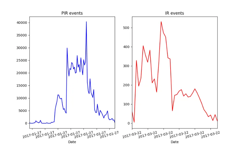
我想用Python的Pandas模块(见下面的链接)将2个文件的CSV数据可视化成如下的时间序列表示。
df1的示例数据:
             TIMESTAMP  eventid
0  2017-03-20 02:38:24        1
1  2017-03-21 05:59:41        1
2  2017-03-23 12:59:58        1
3  2017-03-24 01:00:07        1
4  2017-03-27 03:00:13        1
“eventid”列始终包含值1,我试图显示数据集中每天事件的总数。第二个数据集df0具有类似的结构,但仅包含零:
df0的示例数据:
             TIMESTAMP  eventid
0  2017-03-21 01:38:24        0
1  2017-03-21 03:59:41        0
2  2017-03-22 11:59:58        0
3  2017-03-24 01:03:07        0
4  2017-03-26 03:50:13        0
x轴标签只显示相同的日期,我的问题是:如何显示不同的日期?(是什么导致在x轴标签上多次显示相同的日期?)
到目前为止的脚本:
import pandas as pd
import matplotlib.pyplot as plt
import matplotlib.ticker as ticker

df1 = pd.read_csv('timestamp01.csv',  parse_dates=True, index_col='TIMESTAMP')
df0 = pd.read_csv('timestamp00.csv',  parse_dates=True, index_col='TIMESTAMP')

f, (ax1, ax2) = plt.subplots(1, 2)
ax1.plot(df0.resample('D').size())

ax1.set_xlim([pd.to_datetime('2017-01-27'), pd.to_datetime('2017-04-30')])

ax1.xaxis.set_major_formatter(ticker.FixedFormatter
(df0.index.strftime('%Y-%m-%d')))

plt.setp(ax1.xaxis.get_majorticklabels(), rotation=15)

ax2.plot(df1.resample('D').size())
ax2.set_xlim([pd.to_datetime('2017-03-22'), pd.to_datetime('2017-04-29')])
ax2.xaxis.set_major_formatter(ticker.FixedFormatter(df1.index.strftime
('%Y-%m-%d')))
plt.setp(ax2.xaxis.get_majorticklabels(), rotation=15)
plt.show()
输出: (https://www.dropbox.com/s/z21koflkzglm6c3/figure_1.png?dl=0)
我尝试过的链接:
非常感谢您的帮助。