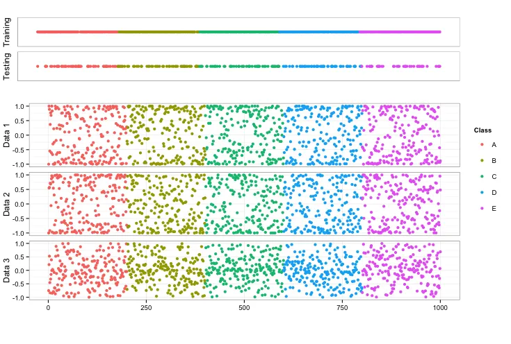
我想将几个不同的ggplot图形放入单个图像中。经过大量探索,我发现如果数据格式正确,ggplot在生成单个图或一系列图方面非常出色。然而,当您想要组合多个图时,有许多不同的选项可以将它们组合在一起,这会让人感到困惑并很快变得复杂。我对我的最终图有以下要求:
- 所有单独图的左轴都对齐,以便图可以共享由最下面的图呈现的公共x轴
- 在图的右侧有一个单一的共同图例(最好位于图的顶部附近)
- 顶部的两个指示器图没有任何y轴刻度或数字
- 图之间有最少的空间
- 指示器图(isTraining和isTesting)占用较小的垂直空间,以便其余三个图可以根据需要填充空间
- 我找到的将图的左侧对齐的代码由于某种原因无法正常工作
- 我目前使用的在同一页上获取多个图的方法似乎很难使用,最可能有更好的技术(我愿意听取建议)
- x轴标题未显示在结果中
- 图例未与图的顶部对齐(我不知道如何轻松地做到这一点,因此我没有尝试。欢迎提出建议)
自包含代码示例
(它有点长,但对于这个问题,我认为可能会有奇怪的交互)
# Load needed libraries ---------------------------------------------------

library(ggplot2)
library(caret)
library(grid)

rm(list = ls())

# Genereate Sample Data ---------------------------------------------------

N = 1000
classes = c('A', 'B', 'C', 'D', 'E')
set.seed(37)
ind   = 1:N
data1 = sin(100*runif(N))
data2 = cos(100*runif(N))
data3 = cos(100*runif(N)) * sin(100*runif(N))
data4 = factor(unlist(lapply(classes, FUN = function(x) {rep(x, N/length(classes))})))
data = data.frame(ind, data1, data2, data3, Class = data4)
rm(ind, data1, data2, data3, data4, N, classes)

# Sperate into smaller datasets for training and testing ------------------

set.seed(1976)
inTrain <- createDataPartition(y = data$data1, p = 0.75, list = FALSE)
data_Train = data[inTrain,]
data_Test  = data[-inTrain,]
rm(inTrain)

# Generate Individual Plots -----------------------------------------------

data1_plot = ggplot(data) + theme_bw() + geom_point(aes(x = ind, y = data1, color = Class))
data2_plot = ggplot(data) + theme_bw() + geom_point(aes(x = ind, y = data2, color = Class))
data3_plot = ggplot(data) + theme_bw() + geom_point(aes(x = ind, y = data3, color = Class))
isTraining = ggplot(data_Train) + theme_bw() + geom_point(aes(x = ind, y = 1, color = Class))
isTesting = ggplot(data_Test) + theme_bw() + geom_point(aes(x = ind, y = 1, color = Class))


# Set the desired legend properties before extraction to grob -------------

data1_plot = data1_plot + theme(legend.key = element_blank())

# Extract the legend from one of the plots --------------------------------

getLegend<-function(a.gplot){
  tmp <- ggplot_gtable(ggplot_build(a.gplot))
  leg <- which(sapply(tmp$grobs, function(x) x$name) == "guide-box")
  legend <- tmp$grobs[[leg]]
  return(legend)}

leg = getLegend(data1_plot)


# Remove legend from other plots ------------------------------------------

data1_plot = data1_plot + theme(legend.position = 'none')
data2_plot = data2_plot + theme(legend.position = 'none')
data3_plot = data3_plot + theme(legend.position = 'none')
isTraining = isTraining + theme(legend.position = 'none')
isTesting = isTesting + theme(legend.position = 'none')


# Remove the grid from the isTraining and isTesting plots -----------------

isTraining = isTraining + theme(panel.grid.minor=element_blank(), panel.grid.major=element_blank())
isTesting = isTesting + theme(panel.grid.minor=element_blank(), panel.grid.major=element_blank())


# Remove the y-axis from the isTraining and the isTesting Plots -----------

isTraining = isTraining + theme(axis.ticks = element_blank(), axis.text = element_blank())
isTesting = isTesting + theme(axis.ticks = element_blank(), axis.text = element_blank())


# Remove the margin from the plots and set the XLab to null ---------------

tmp = theme(panel.margin = unit(c(0, 0, 0, 0), units = 'cm'), plot.margin = unit(c(0, 0, 0, 0), units = 'cm'))
data1_plot = data1_plot + tmp + labs(x = NULL, y = 'Data 1')
data2_plot = data2_plot + tmp + labs(x = NULL, y = 'Data 2')
data3_plot = data3_plot + tmp + labs(x = NULL, y = 'Data 3')
isTraining = isTraining + tmp + labs(x = NULL, y = 'Training')
isTesting = isTesting + tmp + labs(x = NULL, y = 'Testing')


# Add the XLabel back to the bottom plot ----------------------------------

data3_plot = data3_plot + labs(x = 'Index')

# Remove the X-Axis from all the plots but the bottom one -----------------
# data3 is to the be last plot...

data1_plot = data1_plot + theme(axis.ticks.x = element_blank(), axis.text.x = element_blank())
data2_plot = data2_plot + theme(axis.ticks.x = element_blank(), axis.text.x = element_blank())
isTraining = isTraining + theme(axis.ticks.x = element_blank(), axis.text.x = element_blank())
isTesting = isTesting + theme(axis.ticks.x = element_blank(), axis.text.x = element_blank())


# Store plots in a list for ease of processing ----------------------------

plots = list()
plots[[1]] = isTraining
plots[[2]] = isTesting
plots[[3]] = data1_plot
plots[[4]] = data2_plot
plots[[5]] = data3_plot

# Fix the widths of the plots so that the left side of the axes align ----
# Note: This does not seem to function correctly....
# I tried to adapt from:
#   https://dev59.com/ImYr5IYBdhLWcg3w6eQ3

plotGrobs = lapply(plots, ggplotGrob)
plotGrobs[[1]]$widths[2:5]
maxWidth = plotGrobs[[1]]$widths[2:5]
for(i in length(plots)) {
  maxWidth = grid::unit.pmax(maxWidth, plotGrobs[[i]]$widths[2:5])
}
for(i in length(plots)) {
  plotGrobs[[i]]$widths[2:5] = as.list(maxWidth)
}

plotAtPos = function(x = 0.5, y = 0.5, width = 1, height = 1, obj) {
  pushViewport(viewport(x = x + 0.5*width, y = y + 0.5*height, width = width, height = height))
  grid.draw(obj)
  upViewport()
}

grid.newpage()
plotAtPos(x = 0, y = 0.85, width = 0.9, height = 0.1, plotGrobs[[1]])
plotAtPos(x = 0, y = 0.75, width = 0.9, height = 0.1, plotGrobs[[2]])
plotAtPos(x = 0, y = 0.5, width = 0.9, height = 0.2, plotGrobs[[3]])
plotAtPos(x = 0, y = 0.3, width = 0.9, height = 0.2, plotGrobs[[4]])
plotAtPos(x = 0, y = 0.1, width = 0.9, height = 0.2, plotGrobs[[5]])
plotAtPos(x = 0.9, y = 0, width = 0.1, height = 1, leg)
上述代码的可视化结果如下图所示: