在Axeman的帮助下,我已经能够绘制一个具有平均数/中位数hlines的数据。为了完成注释,我想把平均数/中位数值放入图例标签中。我的代码:
require(data.table)
require(ggplot2)
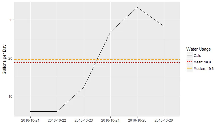
wf <- data.table::fread('Date Gals Days GpD GpM
2016-10-21 6.0 1 6.0 186.0
2016-10-22 6.0 1 6.0 186.0
2016-10-23 12.4 1 12.4 384.4
2016-10-24 26.8 1 26.8 830.8
2016-10-25 33.3 1 33.3 1032.3
2016-10-26 28.3 1 28.3 877.3')
nmu <- mean(wf$Gals)
textmu <- paste("Mean:", round(nmu, 2))
nmed <- median(wf$Gals)
textmed <- paste("Median:", round(nmed, 2))
p <- ggplot(wf, aes(Date, Gals)) +
geom_line(aes(lty = "Gals", color = "Gals", group = 1)) +
geom_hline(aes(yintercept = nmu, linetype = textmu, color = textmu),
color='red',size=1)+
geom_hline(aes(yintercept = nmed, linetype = textmed, color = textmed),
color='orange',size=1)+
#scale_linetype('Water Usage') +
scale_color_manual('Water Usage',
values=c('Gals'='black',textmu='red', textmed='orange')) +
xlab("") +
ylab("Gallons per Day")
print(p)
产生的结果:
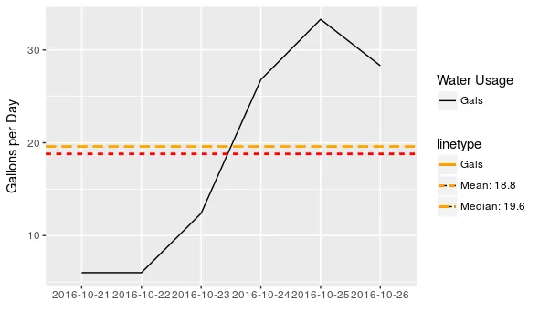 我该如何纠正这个问题?