我有一个看起来像这样的图例:

有点令人困惑的是,“color-a”标签恰好位于其左侧和右侧的点之间。为了使每个标签都清晰地与相应的点相关联,我希望该标签距离其左侧的点更近。
我已经尝试使用legend.key.width、legend.title.align和legend.spacing.x,但目前还没有成功...
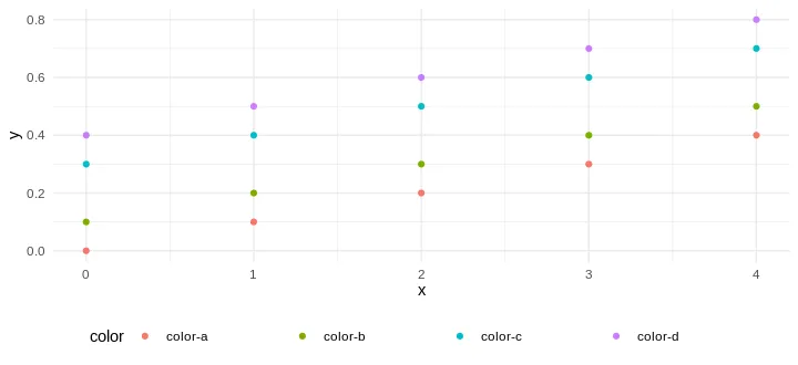
下面是一个最简可复现的示例:
library(tidyverse)

# Test data, it does not matter.
data <- tibble(
  color = c(rep('color-a', 5), rep('color-b', 5), rep('color-c', 5), rep('color-d', 5)),
  x = rep(seq(0, 4, 1), 4),
  y = c(seq(0, .4, 0.1), seq(0, .4, 0.1) + 0.1, seq(0, .4, 0.1) + 0.3, seq(0, .4, 0.1) + 0.4)
)

# Plot
ggplot(data, aes(x = x, y = y, color = color)) +
  scale_color_discrete(guide="legend") +
  geom_point() +
  theme_minimal() +
  theme(legend.position = "bottom")
data$color <- paste(data$color, ' ')。 - rawr