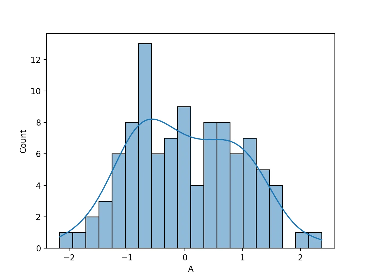
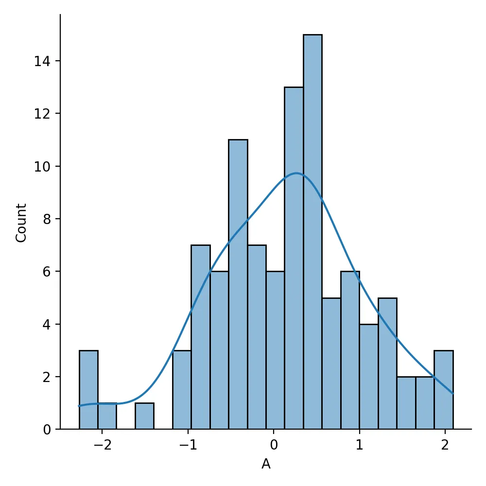
我能够用Python制作直方图,但我无法添加密度曲线,我看到许多代码都使用不同的方法在直方图上添加密度曲线,但我不确定如何在我的代码中实现。
我已经添加了density = true,但是无法在直方图上获得密度曲线。
我已经添加了density = true,但是无法在直方图上获得密度曲线。
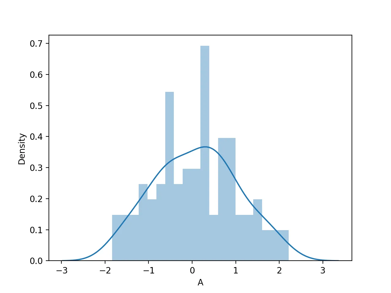
df = pd.DataFrame(np.random.randn(100, 4), columns=list('ABCD'))
X=df['A']

hist, bins = np.histogram(X, bins=10,density=True)
width = 0.7 * (bins[1] - bins[0])
center = (bins[:-1] + bins[1:]) / 2
plt.bar(center, hist, align='center', width=width)
plt.show()
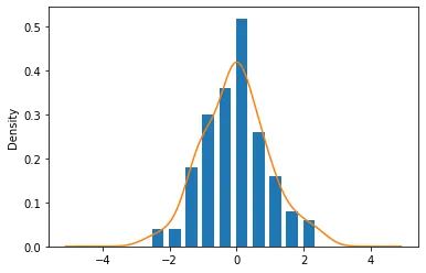
distplot()或者histplot()方法。在最新版本(0.11)中,这些方法名和参数有所变化。注意,np.histogram(..., density=True)表示直方图将被归一化为总面积等于 1,因此可以共享 y 轴与 kdeplot。 - JohanC