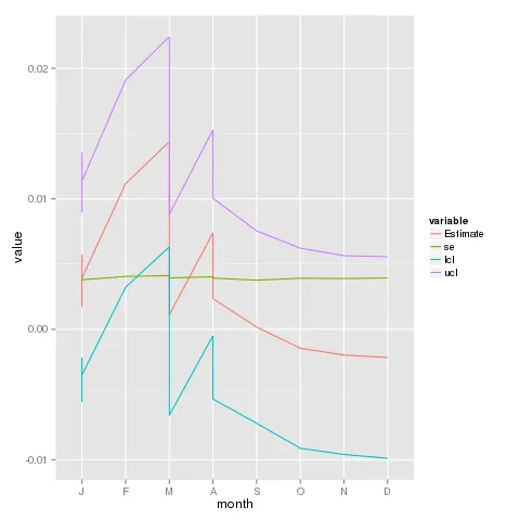
使用以下代码,我无法在X轴上绘制以月份缩写为标签的折线图:
yrange<-range(c(Estimate, lcl,ucl))
plot(nmonth, Estimate, type = "b", pch = 20, ylim = yrange,
xlab = "Months",  ylab = expression(hat(beta) * " estimates" * " & " * "   confidence "  * " levels "))
lines(nmonth, ucl, lty = 2)
lines(nmonth, lcl, lty = 2)
abline(h = 0, lty = 3)
并且也可以使用这种方式。
ggplot(data=df1, aes(x=nmonth, y=Estimate)) + geom_line() + geom_point() + geom_line(size=0.1) + geom_line(aes(y = ucl)) + geom_line(aes(y = lcl))
使用数字月份(nmonth)可以生成一个图表,但标签不是我所希望的。 如何在x轴上绘制所有月份的首字母缩写?
数据如下:
structure(list(Estimate = c(0.00571942142644563, 0.0111649330056159,
0.0143761435860972, 0.00739757934210567, 0.00110764672100624,
0.00168566337236168, 0.00392476757483504, 0.00234423892025447,
0.000166724737089459, -0.0014580012873366, -0.00197786373686253,
-0.00216289530501664), se = c(0.004018593736177, 0.0040534199847734,
0.0041113846550833, 0.00402501059422328, 0.00393358629717884,
0.00370406599461686, 0.003796651550619, 0.00392460643968604,
0.00376380927915926, 0.00391408378704714, 0.00388845564349082,
0.00394365265230613), nmonth = 1:12, month = structure(c(1L,
2L, 3L, 4L, 3L, 1L, 1L, 4L, 5L, 6L, 7L, 8L), .Label = c("J",
"F", "M", "A", "S", "O", "N", "D"), class = "factor"), lcl = c(-0.00215702229646129,
0.00322022983546004, 0.00631782966213393, -0.000491441422571959,
-0.00660218242146429, -0.00557430597708737, -0.0035166694643782,
-0.00534798970153017, -0.00721034145006269, -0.00912960550994899,
-0.00959923679810454, -0.00989245450353666), ucl = c(0.0135958651493525,
0.0191096361757718, 0.0224344575100605, 0.0152866001067833, 0.00881747586347677,
0.00894563272181073, 0.0113662046140483, 0.0100364675420391,
0.00754379092424161, 0.00621360293527579, 0.00564350932437948,
0.00556666389350337)), .Names = c("Estimate", "se", "nmonth",
"month", "lcl", "ucl"), class = "data.frame", row.names = c(NA,
-12L))