我有下面这张表格,但在多次尝试后,无法绘制数据,使得 x 轴刻度线与 年份 对齐。我已经找到了箱线图的解决方案,但是没有找到适用于 geom_line() 的解决方案。
我该如何为年份创建离散标签?
以下解决方案都没有起作用。
g + scale_x_discrete(limits=c("2013","2014","2015"))
g + scale_x_discrete(labels=c("2013","2014","2015"))
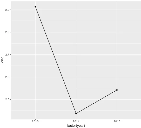
distance_of_moves
  平均移动距离 年份
1     2.914961 2013
2     2.437516 2014
3     2.542500 2015
ggplot(data = distance_of_moves, aes(x = 年份, y = `平均移动距离`, group = 1)) +
 geom_line(color = "red", linetype = "dashed", size = 1.5) +
 geom_point(color = "red", size = 4, shape = 21, fill = "white") +
 ylab("平均移动距离") +
 xlab("年份")

aes()中使用as.factor(year)。 - mtoto+ scale_x_continuous(breaks = 2013:2015)。 - Gregor Thomas