在离散的x轴上绘制geom_vline

3
我在绘制图表的x轴上以离散(因子)级别绘制垂直线方面遇到了问题。在这个解决方案中,它似乎可以正常工作 使用ggplot2绘制具有因子级别的垂直线 但是,用 geom_tile 这个方法无法实现?
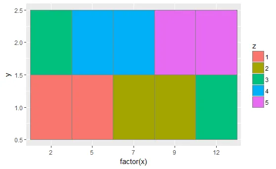
基本上,为了消除 geom_tile 中的空白间隔,我需要将数值 x 值转换为因子级别。但同时,我也想用数值绘制 geom_vline
这就是问题所在。
 df <- data.frame(
  x = rep(c(2, 5, 7, 9, 12), 2),
  y = rep(c(1, 2), each = 5),
  z = factor(rep(1:5, each = 2)))


 library(ggplot2)
 ggplot(df, aes(x, y)) +
  geom_tile(aes(fill = z), colour = "grey50")+
   geom_vline(aes(xintercept=6),linetype="dashed",colour="red",size=1)

enter image description here

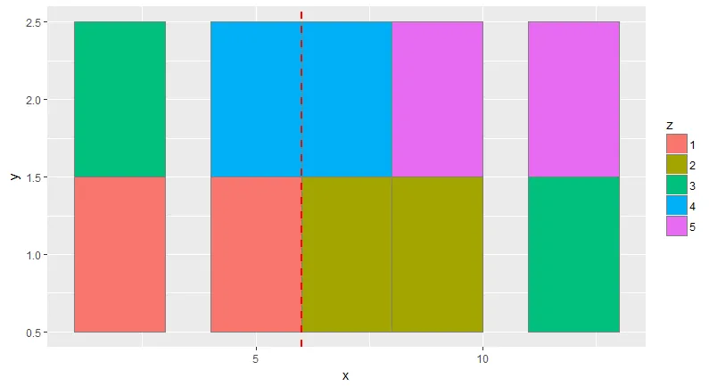
要在geom_tile中去除空白需要将x转换为factor(x),但是这样做会导致geom_vline消失!

enter image description here

1个回答

4
一种解决方案是修改您的数据 - 将其转换为伪因子
# Get rank of each x element within group
df$xRank <- ave(df$x, df$y, FUN = rank)

    x y z xRank
1   2 1 1      1
2   5 1 1      2
3   7 1 2      3
4   9 1 2      4
5  12 1 3      5
6   2 2 3      1
7   5 2 4      2
8   7 2 4      3
9   9 2 5      4
10 12 2 5      5

将值的排名绘制出来,用原始值标记x轴元素:

library(ggplot2)
ggplot(df, aes(xRank, y)) +
    geom_tile(aes(fill = z), colour = "grey50") +
    # On x axis put values as labels
    scale_x_continuous(breaks = df$xRank, labels = df$x) +
    # draw line at 2.5 (between second and third element)
    geom_vline(aes(xintercept = 2.5), 
               linetype = "dashed", colour = "red",size = 1)

enter image description here


这是一个很棒的解决方案。但为什么它要这么复杂呢?我的意思是,在这个帖子中,它可以工作,但在使用
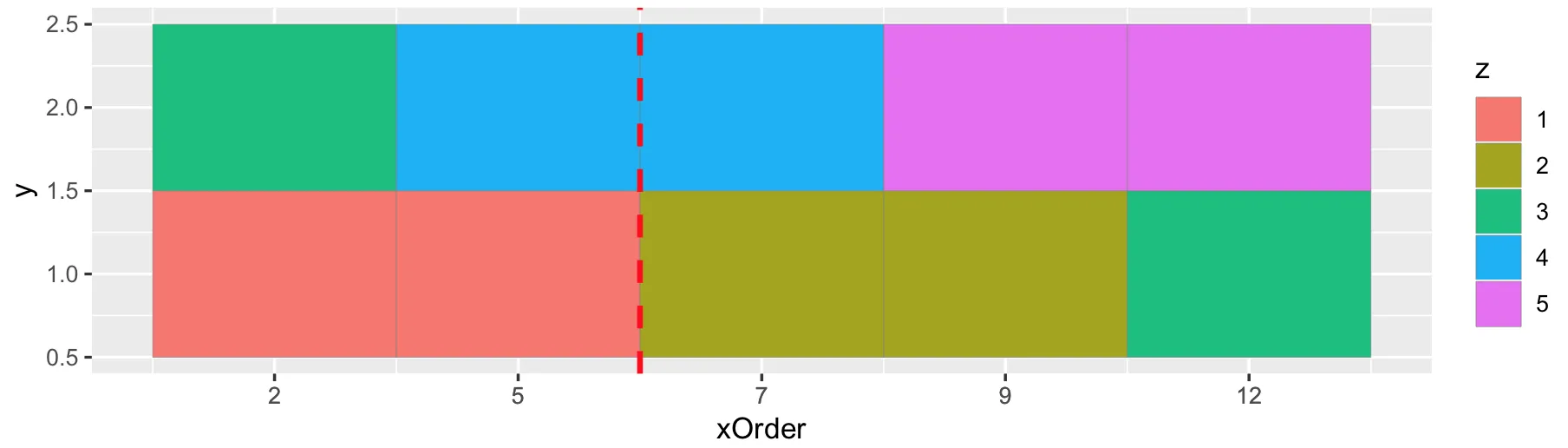
geom_tile时却不行?正如@Len所提到的,没有x=6,但我认为应该有更简单的方法?我只是好奇。 - Alexander
这个解决方案在y轴和“2”区块开头之间增加了一堆空白。当您设置panel.background = element_blank()时,这个额外的空白与x轴相比看起来很奇怪。 有没有办法去掉这个空白? - nad7wf

网页内容由stack overflow 提供, 点击上面的
可以查看英文原文,
原文链接