使用`geom_line()`函数时,X轴为因子变量的方法。

69

假设我有一个数据框:

hist <- data.frame(date=Sys.Date() + 0:13,
                   counts=1:14)

我想绘制每周总计数,并使用线连接这些点。以下代码将在每个值上放置:

hist <- transform(hist, weekday=factor(weekdays(date),
                                       levels=c('Monday', 'Tuesday', 'Wednesday', 'Thursday', 'Friday', 'Saturday', 'Sunday')))
ggplot(hist, aes(x=weekday, y=counts)) + geom_point(stat='summary', fun.y=sum)
当我想用线连接它们时(geom_line()),ggplot会抱怨每组只有一个数据观察值,因此无法在点之间绘制一条线。我理解这一点-它试图为每个工作日(factor level)绘制一条线。我该如何让ggplot假装(仅用于线的目的)工作日是数值?也许我必须有另一列day_of_week,对于星期一为0,星期二为1等。
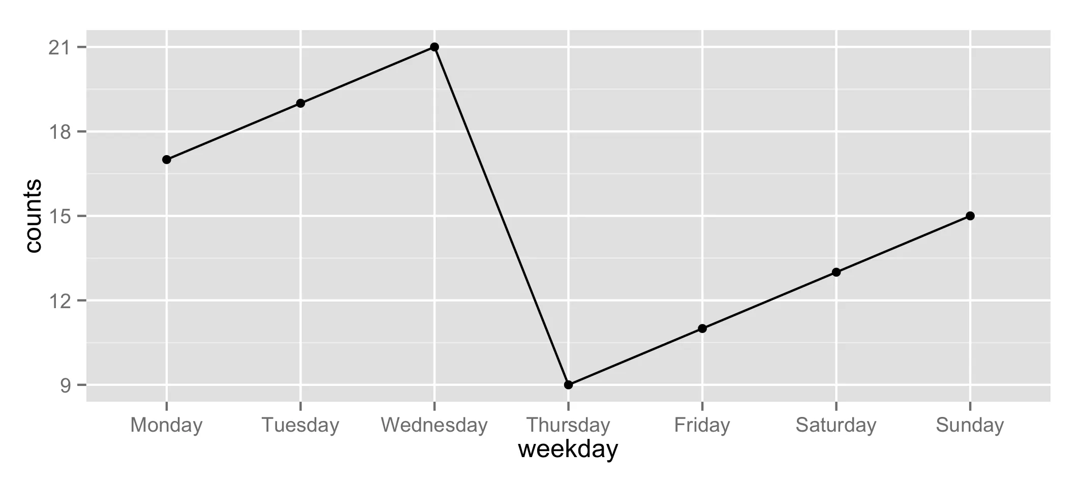
2个回答

76

如果我正确地理解了问题,那么指定group=1并添加一个stat_summary()图层应该可以解决问题:

ggplot(hist, aes(x=weekday, y=counts, group=1)) +
geom_point(stat='summary', fun.y=sum) +
stat_summary(fun.y=sum, geom="line")

在此输入图片描述


4
太棒了!group=1 的目的是什么(为什么是1?它有什么作用)? - mathematical.coffee
3
哦,我想我找到了。在这里(ggplot2文档):http://docs.ggplot2.org/current/aes_group_order.html - mathematical.coffee
23
如果您想一次绘制多条线,请指定“group=定义线条的变量”。 - sheß

2
我很容易找到的解决方案是:
ggplot(data.frame, aes(X, Y)) + 
       geom_point() +
       geom_path(group=1) +   
       theme(axis.text.x = element_text(angle=90, hjust = 1, vjust = 0.5))

group = 1 表示你希望将所有的观测值视为同一组,因此会绘制出一条线。 theme 行只是为了使图表更加整洁,如果您愿意,可以删除它。


网页内容由stack overflow 提供, 点击上面的
可以查看英文原文,
原文链接