如何在matplotlib imshow中应用对数坐标轴标签,而不需要对图像进行对数缩放。

5
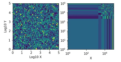
我有一个数据集,其分布呈对数形态。我想制作一个热图,因此我做了一个2D直方图,并将其传递给implot。由于数据是对数的,所以我将数据的对数传递给了直方图。然而,当我制作图表时,我希望轴被还原(即10^hist bin values)并且是对数轴。如果我将轴设置为对数样式,那么图像看起来就会歪曲。数据已经从我传递给直方图时进行了“对数化”,因此我不希望影响图像,只是轴。因此,在下面的示例中,我希望左侧是图像,右侧是轴。
我猜我可以用一个虚假的叠加轴来实现它,但如果有更好的方法,我不喜欢这样做...

enter image description here

import numpy as np
import matplotlib.pyplot as plt

x=10**np.random.random(10000)*5
y=10**np.random.random(10000)*5

samps, xedges, yedges = np.histogram2d(np.log10(y), np.log10(x),     bins=50)    

ax = plt.subplot(121)

plt.imshow(samps, extent=[0,5,0,5])
plt.xlabel('Log10 X')
plt.ylabel('Log10 Y')

ax = plt.subplot(122)    
plt.imshow(samps, extent=[10**0,10**5,10**0,10**5])
plt.xlabel('X')
plt.ylabel('Y')
plt.xscale('log')
plt.yscale('log')
plt.show()

你尝试过在使用matplotlib之前不应用对数函数,而是使用对数刻度吗? - forayer
1
相关内容请参见:https://matplotlib.org/users/prev_whats_new/whats_new_2.0.0.html#non-linear-scales-on-image-plots - ImportanceOfBeingErnest
3个回答

8
你需要使用自定义格式化程序。这里有一个来自 Matplotlib 文档的例子:https://matplotlib.org/examples/pylab_examples/custom_ticker1.html 我倾向于像示例中使用 FuncFormatter。主要的技巧是你的函数需要接受两个参数 xpos。我不确定 pos 的作用,或许它甚至并不是有意为之,但你可以像下面这样使用 FuncFormatter 作为装饰器:
%matplotlib inline
import numpy as np
import matplotlib.pyplot as plt

@plt.FuncFormatter
def fake_log(x, pos):
    'The two args are the value and tick position'
    return r'$10^{%d}$' % (x)

x=10**np.random.random(10000)*5
y=10**np.random.random(10000)*5

samps, xedges, yedges = np.histogram2d(np.log10(y), np.log10(x), bins=50)    

fig, (ax1) = plt.subplots()
ax1.imshow(samps, extent=[0, 5, 0, 5])
ax1.xaxis.set_major_formatter(fake_log)
ax1.yaxis.set_major_formatter(fake_log)
ax1.set_xlabel('X')
ax1.set_ylabel('Y')

enter image description here


这很有用,因为我可以将其应用于所有图形,而不必在每个图形上进行手动编辑步骤,谢谢! - Alex

1
如果您只想更改标签,您可以直接访问它们,方法是使用plt.gca().set_xticklabelsplt.gca().set_yticklabels。以下是一个简单的示例,更改这些标签的_text属性。
import numpy as np
import matplotlib.pyplot as plt

x = 10 ** np.random.random(10000) * 5
y = 10 ** np.random.random(10000) * 5

samps, xedges, yedges = np.histogram2d(np.log10(y), np.log10(x), bins=50)

plt.subplot(121)

p = plt.imshow(samps, extent=[0, 5, 0, 5])
plt.xlabel('Log10 X')
plt.ylabel('Log10 Y')

plt.subplot(122)

p = plt.imshow(samps, extent=[0, 5, 0, 5])

# The label handling stuff starts here
plt.pause(0.5)  # Needed to make sure the drawing finished being created
plt.xlabel('X')
plt.ylabel('Y')
plt.draw()

ax = plt.gca()
lbx = ax.get_xticklabels()
lby = ax.get_yticklabels()
for i in range(len(lbx)):
    lbx[i]._text = r'$10^' + lbx[i]._text + '$'
for i in range(len(lby)):
    lby[i]._text = r'$10^' + lby[i]._text + '$'
ax.set_xticklabels(lbx)
ax.set_yticklabels(lby)

plt.show()

0
如果您需要在原始坐标上绘制图像,可以像下面所示覆盖两个轴。当然,您可以微调ax [1]以匹配原始刻度的数量等。
基于此图像的示例,请查看此处的结果。
from matplotlib import pyplot as plt
img = plt.imread("noticks.jpg")
fig, ax = plt.subplots(1,2)
ax[1].set_yscale('log')
ax[1].set_xscale('log')
ax[1].set_xlim((5e-4, 0.2))
ax[1].set_ylim((5e-5,0.05))
ax[1].patch.set_facecolor('none')
ax[0].imshow(img)
ax[1].set_aspect(ax[0].get_aspect())
ax[0].axis('off')
ax[0].set_position(ax[1].get_position())

网页内容由stack overflow 提供, 点击上面的
可以查看英文原文,
原文链接