Python Matplotlib - 在x轴上表示抽样位置的条形图

6
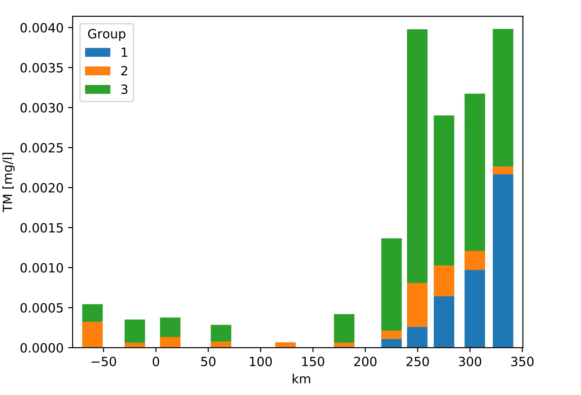
我希望您能在堆积条形图中绘制不同组的抽样数据。这些抽样是在不同的公里数下进行的,每个抽样点之间的距离不相等。通常,在使用matplotlib.pyplot.bar或pandas.DataFrame.plot.bar绘图时,条形图是一个接一个地绘制的,它们的公里值没有在x轴上表示。我该如何在其表示公里位置的x轴上绘制堆积条形图?
标准条形图的代码示例:pandas.DataFrame.plot.bar
import pandas as pd
import matplotlib.pyplot as plt

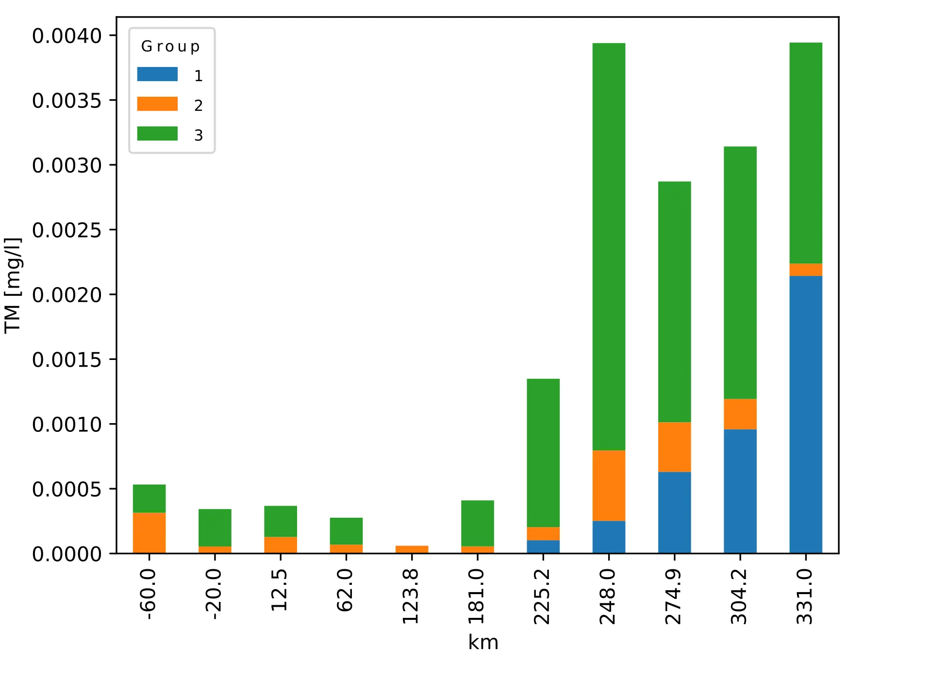
df = pd.DataFrame( {'Group 1': {-60.0:0, -20.0:0, 12.5:0, 62.0:0, 123.8:0, 181.0: 5.013532366071429e-06, 225.2: 0.00010224713604266826, 248.0: 0.0002520240051269531, 274.9: 0.0006304542296807856, 304.2: 0.0009587457616051962, 331.0: 0.0021422429744175505}, 'Group 2': {-60.0: 0.0003144776457026891, -20.0: 5.43150903588747e-05, 12.5: 0.00012757662141348495, 62.0: 6.852403753623154e-05, 123.8: 5.980538377849872e-05, 181.0: 5.000001780657088e-05, 225.2: 0.00010152032391840468, 248.0: 0.0005436288535458056, 274.9: 0.00038244130009346957, 304.2: 0.00023423789360943164, 331.0: 9.508221455006986e-05}, 'Group 3': {-60.0: 0.00021804919790451726, -20.0: 0.0002884471518114942, 12.5: 0.00024001954291413006, 62.0: 0.00020780311751064946, 123.8:0, 181.0: 0.0003548555407567293, 225.2: 0.0011448858440205976, 248.0: 0.0031436022397010425, 274.9: 0.001858462242669843, 304.2: 0.0019485330483867962, 331.0: 0.0017062062250634059}} )
ax = df.plot.bar(stacked=True)
ax.set_ylabel('TM [mg/l]')
ax.set_xlabel('km')
plt.tight_layout()

说明:

标准柱状图 enter image description here

我想要的 enter image description here


通常情况下,使用matplotlib.pyplot.bar绘图时,每个条形图代表一个类别是不正确的。默认情况下,matplotlib条形图是数值型的。您没有在此处共享任何代码,这使得无法看到问题所在。请参见[mcve]。 - ImportanceOfBeingErnest
谢谢您的提示。我已经添加了代码。 - Vaiaro
2
你正在使用pandas的条形图。它们确实是分类的。请使用
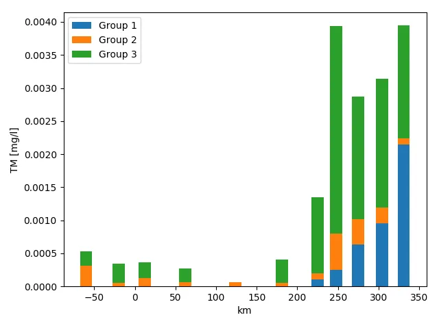
matplotlib.pyplot.bar代替。 - ImportanceOfBeingErnest
谢谢,这就是我要的东西! - Vaiaro
2个回答

6

ImportanceOfBeingErnest 的提示下,我使用了 matplotlib.pyplot.bar 而不是 pandas.DataFrame.plot.bar 来获得我想要的结果:

import pandas as pd
import matplotlib.pyplot as plt

df = pd.DataFrame({'Group 1': {-60.0:0, -20.0:0, 12.5:0, 62.0:0, 123.8:0, 181.0: 5.013532366071429e-06, 225.2: 0.00010224713604266826, 248.0: 0.0002520240051269531, 274.9: 0.0006304542296807856, 304.2: 0.0009587457616051962, 331.0: 0.0021422429744175505}, 'Group 2': {-60.0: 0.0003144776457026891, -20.0: 5.43150903588747e-05, 12.5: 0.00012757662141348495, 62.0: 6.852403753623154e-05, 123.8: 5.980538377849872e-05, 181.0: 5.000001780657088e-05, 225.2: 0.00010152032391840468, 248.0: 0.0005436288535458056, 274.9: 0.00038244130009346957, 304.2: 0.00023423789360943164, 331.0: 9.508221455006986e-05}, 'Group 3': {-60.0: 0.00021804919790451726, -20.0: 0.0002884471518114942, 12.5: 0.00024001954291413006, 62.0: 0.00020780311751064946, 123.8:0, 181.0: 0.0003548555407567293, 225.2: 0.0011448858440205976, 248.0: 0.0031436022397010425, 274.9: 0.001858462242669843, 304.2: 0.0019485330483867962, 331.0: 0.0017062062250634059}})

width = 15
bottom = 0

for i in df.columns:
    plt.bar(df.index, df[i], width=width, bottom=bottom)
    bottom += df[i]

plt.ylabel('TM [mg/l]')
plt.xlabel('km')
plt.legend(df.columns)
plt.tight_layout()

stacked bar plot with sampling x-position


1
你可以使用来自matplotlib的pyplot.plot(data = df)函数(默认值)。它会自动格式化xticks。 否则,你可以尝试使用pyplot.xticks和pyplot.set_xticks来自定义你的需求。

保留bar不变,并使用pyplot.xticks和pyplot.set_xticks。您可以在此处找到有用的文档:https://matplotlib.org/gallery/lines_bars_and_markers/bar_stacked.html#sphx-glr-gallery-lines-bars-and-markers-bar-stacked-py - Dexter
例如,当我使用ax.set_xticks(range(-20, 20))来安排x轴在-20公里和+20公里之间时,我得到了这个:链接。条形图保持在它们的0-10位置上。 - Vaiaro

网页内容由stack overflow 提供, 点击上面的
可以查看英文原文,
原文链接