我正在尝试使用ggplot2绘制此地图。
我可以使用ggplot2绘制地图,但无法绘制图例:-(。这是我的数据,命名为"data":
              countries toplot     color
1             Argentina     -1       red
2               Armenia     -1       red
3             Australia     -1       red
4               Bahrain     -1       red
5              Botswana     -1       red
6               Belgium     -1       red
7              Bulgaria     -1       red
8                Canada     -1       red
9                 Chile     -1       red
10               Taiwan     -1       red
11              Croatia     -1       red
12       Czech Republic     -1       red
13     UK:Great Britain     -1       red
14                Egypt     -1       red
15              Denmark     -1       red
16              Finland      0    yellow
17               France      0    yellow
18              Georgia      0    yellow
19              Germany      0    yellow
20      China:Hong Kong      0    yellow
21              Hungary      0    yellow
22            Indonesia      0    yellow
23                 Iran      0    yellow
24              Ireland      0    yellow
25               Israel      0    yellow
26                Italy      0    yellow
27                Japan      0    yellow
28               Jordan      0    yellow
29           Kazakhstan      1 darkgreen
30                Korea      1 darkgreen
31               Kuwait      1 darkgreen
32              Lebanon      1 darkgreen
33            Lithuania      1 darkgreen
34             Malaysia      1 darkgreen
35                Malta      1 darkgreen
36              Morocco      1 darkgreen
37          Netherlands      1 darkgreen
38          New Zealand      1 darkgreen
39  UK:Northern Ireland      1 darkgreen
40               Norway      1 darkgreen
41                 Oman      1 darkgreen
42            Palestine      1 darkgreen
43               Poland      1 darkgreen
44             Portugal      1 darkgreen
45                Qatar      1 darkgreen
46               Russia      1 darkgreen
47         Saudi Arabia      0    yellow
48               Serbia      0    yellow
49            Singapore      0    yellow
50      Slovak Republic      0    yellow
51             Slovenia     -1       red
52         South Africa     -1       red
53                Spain     -1       red
54               Sweden     -1       red
55             Thailand      1 darkgreen
56               Turkey      1 darkgreen
57 United Arab Emirates      0    yellow
58                  USA      1 darkgreen
这是我正在使用的代码:
    library(maps)
    library(ggplot2)

    map <- map_data("world")

    # create a blank ggplot theme
    theme_opts <- list(theme(panel.grid.minor = element_blank(),
                             panel.grid.major = element_blank(),
                             panel.background = element_blank(),
                             plot.background = element_blank(),
                             panel.border = element_blank(),
                             axis.line = element_blank(),
                             axis.text.x = element_blank(),
                             axis.text.y = element_blank(),
                             axis.ticks = element_blank(),
                             axis.title.x = element_blank(),
                             axis.title.y = element_blank(),
                             legend.position="bottom",
                             plot.title = element_text(size=16)))

   mapplot<-ggplot() +
      geom_polygon(data = map, aes(x=long, y = lat, group = group), fill = NA, colour="darkgray", size=0.25)+
      geom_map(data=data,map=map,aes(map_id=country, x=lon, y=lat),fill = data$color, colour = "gray") +
      coord_equal() +
      theme_opts

    mapplot + theme(legend.position = "bottom")
我离预期的图例越近,就越需要将 fill 传递到 aes中:
aes(map_id=country, x=lon, y=lat, fill = data$color)
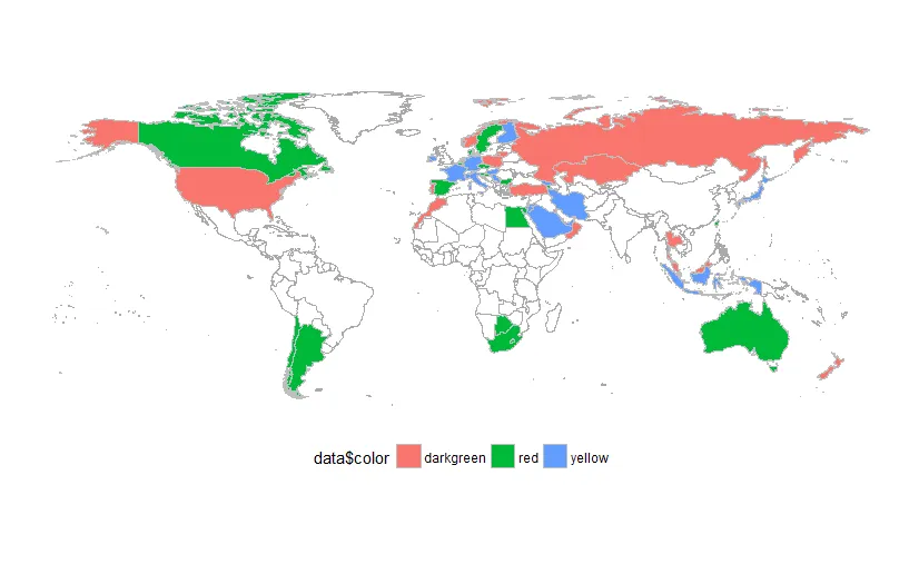 但是我得到了错误的颜色和错误的文本...
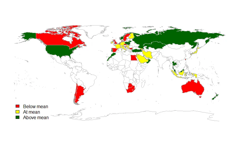
我想知道是否可以在ggplot中添加一个图例框?有些如下:
但是我得到了错误的颜色和错误的文本...
我想知道是否可以在ggplot中添加一个图例框?有些如下:
legdtxt<-c("Below mean", "At mean", "Above mean")
ggplot()+
legend("bottomleft", legdtxt, horiz = F, fill = plotclr, box.lty=0)
Thanks!...
scale_fill_identity(),而且在aes中不要使用$,只需写成fill = color即可。 - erc