我已经自定义了使用plotly绘制的数据点的颜色。数据点的颜色是基于与其相关联的标签分配的。
但是,在设置
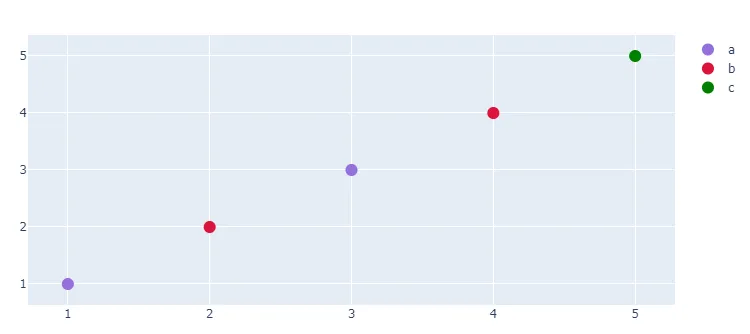
我希望:
任何关于如何在图中显示自定义图例的建议?
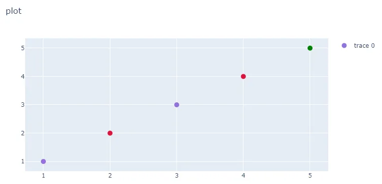
这是代码片段生成的图形:
legend=True之后,字典中定义的三种颜色都没有在图中显示。我希望:
'a': 'rgb(147,112,219)(the actual color in here)',
'b': 'rgb(220,20,60)',
'c': 'rgb(0,128,0)'
将显示在绘图的右上角。
import pandas as pd
import plotly  as plotly
import plotly.graph_objs as go
from plotly.offline import download_plotlyjs, init_notebook_mode, plot, iplot


label = ['a', 'b', 'a', 'b', 'c']
label_df = pd.DataFrame({'color': label})

color = {'a': 'rgb(147,112,219)',
         'b': 'rgb(220,20,60)',
         'c': 'rgb(0,128,0)'
        }

cols = label_df['color'].map(color)

data = [
    go.Scatter(
        x=[1, 2, 3, 4, 5],
        y=[1, 2, 3, 4, 5],
        mode='markers',
        marker=dict(size=10, color=cols)
    )
]
layout = go.Layout(
    hovermode='y',
    showlegend=True,
    barmode='stack',
    title='plot'
)

fig = go.Figure(data=data, layout=layout)
plot(fig, filename='plot.html')
任何关于如何在图中显示自定义图例的建议?
这是代码片段生成的图形: