Plotly图例标题

26

我希望在下面的代码中能够添加一个标题到图例中。然而,查看文档后,我认为没有相应的方法可以实现。

import plotly.plotly as py
import plotly.graph_objs as go

trace0 = go.Scatter(
    x=[1, 2, 3, 4, 5],
    y=[1, 2, 3, 4, 5],
)

trace1 = go.Scatter(
    x=[1, 2, 3, 4, 5],
    y=[5, 4, 3, 2, 1],
)

data = [trace0, trace1]
fig = go.Figure(data=data)

py.iplot(fig, filename='default-legend')
7个回答

19

更新:

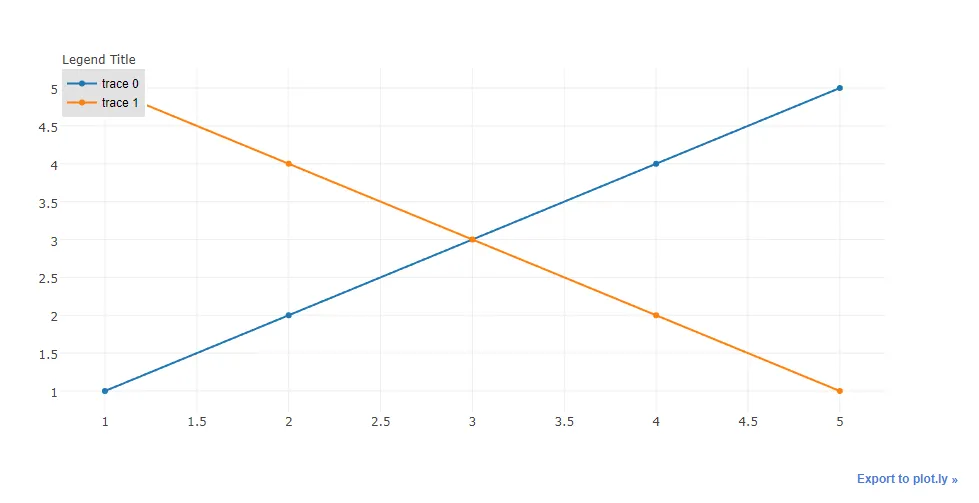
如果未定义图例但具有注释定位属性,请使用以下代码。

import plotly.offline as py_offline
import plotly.graph_objs as go
py_offline.init_notebook_mode()

trace0 = go.Scatter(
    x=[1, 2, 3, 4, 5],
    y=[1, 2, 3, 4, 5],
)

trace1 = go.Scatter(
    x=[1, 2, 3, 4, 5],
    y=[5, 4, 3, 2, 1],
)

data = [trace0, trace1]
layout = go.Layout(
    annotations=[
        dict(
            x=1.12,
            y=1.05,
            align="right",
            valign="top",
            text='Legend Title',
            showarrow=False,
            xref="paper",
            yref="paper",
            xanchor="center",
            yanchor="top"
        )
    ]
)
fig = go.Figure(data=data, layout = layout)

py_offline.iplot(fig)

注意:

  1. 对于不同的图例,您需要使用此方法定义注释的 xy 位置。

  2. 您可以在 text 属性中使用 HTML(例如:text='图例标题<br>有点长',)。

以前的尝试:

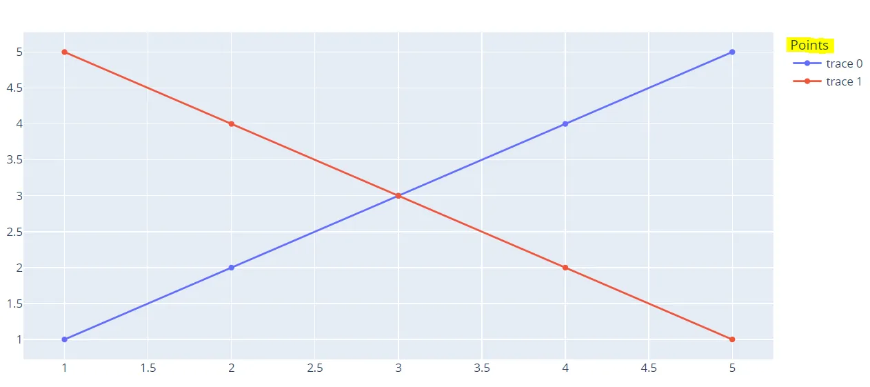
另一种方法是创建图例并使用注释添加标题到图例中。只要不将图表设置为可编辑模式即可。因此,在下面的示例中,图例设置为 x=0 和 y=1,因为我希望我的图例标题在实际图例之上,所以我将注释位置设置为 x=0,y=1.5。x-ref 和 y-ref 需要设置为 paper。这将得到一个很好的注释,如下所示: plotly legend title

代码:

import plotly.plotly as py
import plotly.graph_objs as go

trace0 = go.Scatter(
    x=[1, 2, 3, 4, 5],
    y=[1, 2, 3, 4, 5],
)

trace1 = go.Scatter(
    x=[1, 2, 3, 4, 5],
    y=[5, 4, 3, 2, 1],
)

data = [trace0, trace1]
layout = go.Layout(
    legend=dict(
        x=0,
        y=1,
        traceorder='normal',
        font=dict(
            family='sans-serif',
            size=12,
            color='#000'
        ),
        bgcolor='#E2E2E2',
        bordercolor='#FFFFFF',
        borderwidth=2
    ),
    annotations=[
        dict(
            x=0,
            y=1.05,
            xref='paper',
            yref='paper',
            text='Legend Title',
            showarrow=False
        )
    ]
)
fig = go.Figure(data=data, layout = layout)

py.iplot(fig)

@blueprince13 这个问题可以关闭吗? - Naren Murali
请问您能否建议如何在不特别设置图例的情况下完成此操作?我希望图例出现在通常的位置。 - bluprince13
@blueprince13 如果其他解决方案不能满足您的问题,请查看我的更新答案! - Naren Murali

12

我以前做过类似的事情,方法是创建一个没有数据的追踪。

import plotly.plotly as py
import plotly.graph_objs as go

dummy_trace = go.Scatter(
    x=[None], y=[None],
    name='<b>Legend Heading</b>',
    # set opacity = 0
    line={'color': 'rgba(0, 0, 0, 0)'}
)

trace0 = go.Scatter(
    x=[1, 2, 3, 4, 5],
    y=[1, 2, 3, 4, 5],
)

trace1 = go.Scatter(
    x=[1, 2, 3, 4, 5],
    y=[5, 4, 3, 2, 1],
)

data = [dummy_trace, trace0, trace1]
fig = go.Figure(data=data)

py.iplot(fig)

4

从plotly v4.5开始,添加了图例标题。

您可以通过以下方式为图例添加标题:

fig.update_layout(legend_title_text='Legend title')

在文档这里找到一个例子。


3
< p>只需将属性name稍微添加到已提出的解决方案中即可。

import plotly
import plotly.plotly as py
import plotly.graph_objs as go

plotly.offline.init_notebook_mode(connected=True)

trace0 = go.Scatter(
x=[1, 2, 3, 4, 5],
y=[1, 2, 3, 4, 5],
name="Data1")

data = [trace0]
layout = go.Layout(
legend=dict(
    x=0,
    y=1,
    traceorder='normal',
    font=dict(
        family='sans-serif',
        size=12,
        color='#000'
    ),
    bgcolor='#E2E2E1',
    bordercolor='#FFFFFF',
    borderwidth=2
),
annotations=[
    dict(
        x=0,
        y=1.05,
        xref='paper',
        yref='paper',
        text='Legend Title',
        showarrow=False
    )
])
fig = go.Figure(data=data, layout = layout)
plotly.offline.iplot(fig)
< p > name 属性有助于添加自定义名称到已定义的图例中。


2

目前使用最新版本的plotly 5.5.0,你所需要的只有:

trace0 = go.Scatter(
    x=[1, 2, 3, 4, 5],
    y=[1, 2, 3, 4, 5],
)

trace1 = go.Scatter(
    x=[1, 2, 3, 4, 5],
    y=[5, 4, 3, 2, 1],
)

data = [trace0, trace1]
fig = go.Figure(data=data)

fig.update_layout(legend={"title":"Points"})  #<--- add only this line

fig.show()

enter image description here


0
另一个(现在可能已经无用的)离散数据选项是使用数据框架的列标题之一作为图例标题。以下是由三个(Geo)数据框架组成的区域分布图的示例。
df1['Legend'] = 'Label1'
df2['Legend'] = 'Label2'
df3['Legend'] = 'Label3'
merged = df1.append(df2)
merged = df2.append(df3)

fig = px.choropleth(merged, geojson=merged.geometry, locations=merged.index, color=merged['Legend'], color_discrete_map={
    'Label1':'red',
    'Label2':'lightgrey',
    'Label3':'lightblue'})

这里是使用 Mapbox Choropleth 的示例 使用列名制作的即兴 Choropleth 地图图例


0

通过包装器cufflinks,使用jupyter绘制plotly非常容易。

安装以下依赖项:

!pip install pandas cufflinks plotly

从你的数据创建数据帧。

import pandas as pd

加载数据

x=[1, 2, 3, 4, 5]
y=[1, 2, 3, 4, 5]

将第二个 y 列表命名为 y1

x=[1, 2, 3, 4, 5]
y1=[5, 4, 3, 2, 1]

从您的数据列表创建数据框

data = pd.DataFrame({"x": x, "y": y, "y1": y1}).set_index("x")

加载cufflinks及其配置

import cufflinks as cf
cf.set_config_file(offline=True) 

绘制数据框

data.iplot()

你将在 x 轴上,y 和 y1 在 y 轴上。你可以通过从右侧的图例中单击来显示和隐藏线条。

参考资料:


网页内容由stack overflow 提供, 点击上面的
可以查看英文原文,
原文链接