我更喜欢当统计数据出现在分面标签中时的图表外观。我制作了以下脚本,允许选择显示标准差、平均值或计数。基本上,它计算汇总统计信息,然后将其与名称合并,使您拥有格式为
类别(汇总统计 = 值)的结果。
AddNameStat <- function(df, category, count_col, stat = c("sd","mean","count"), dp= 0){
temp <- data.frame(ref = df[[category]], comp = df[[count_col]])
agg_stats <- plyr::ddply(temp, .(ref), summarize,
sd = sd(comp),
mean = mean(comp),
count = length(comp))
labelName <- mapvalues(stat, from=c("sd","mean","count"), to=c("\u03C3", "x", "n"))
agg_stats$join <- paste0(agg_stats$ref, " \n (", labelName," = ",
round(agg_stats[[stat]], dp), ")")
name_map <- setNames(agg_stats$join, as.factor(agg_stats$ref))
return(name_map[as.character(df[[category]])])
}
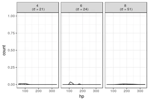
使用这个脚本来回答你的问题:
library(datasets)
data(mtcars)
mtcars$cyl <- AddNameStat(mtcars, "cyl", "hp", stat = "sd")
ggplot(data = mtcars, aes(x = hp)) +
geom_dotplot(binwidth = 1) +
geom_density() +
facet_grid(. ~ cyl) +
theme_bw()
脚本应该易于更改以包含其他摘要统计信息。我也确信它可以在某些部分重写,使其更加清晰!