将标签移到饼图中间。

6

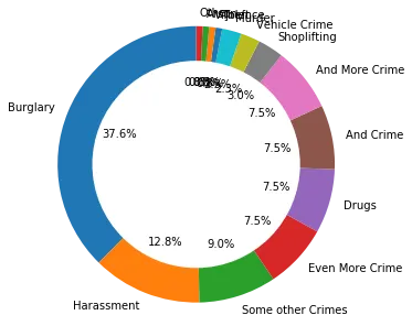
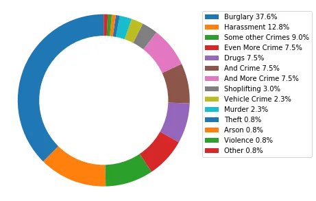
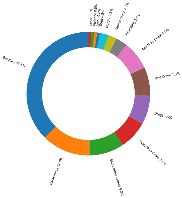
我已经让我的饼图工作了,但是我注意到实际图表的文本框似乎没有正确地工作。它们只是聚集在一起,所以我想知道是否有办法将标签移动到白色圆圈中间,并在旁边放置匹配的颜色?

crimeTypes = dict(crimeData["Crime type"].value_counts())

crimeType = []
totalAmount = []
numberOfCrimes = 14

for key in sorted(crimeTypes, key=crimeTypes.get, reverse=True):
    crimeType.append(key)
    totalAmount.append(crimeTypes.get(key))

crimeType_sample = crimeType[0:numberOfCrimes]
totalAmount_sample = totalAmount[0:numberOfCrimes]

fig1, ax1 = plt.subplots()
ax1.pie(totalAmount_sample, labels=crimeType_sample, autopct='%1.1f%%', shadow=False, startangle=90)
ax1.axis('equal')  # Equal aspect ratio ensures that pie is drawn as a circle.
fig1 = plt.gcf()
fig1.set_size_inches(10,10)
circle = plt.Circle(xy=(0,0), radius=0.75, facecolor='white')
plt.gca().add_artist(circle)
plt.show();

enter image description here


我会从标题中删除pandas,因为这是一个matplotlib问题,但是问题很好 :) - roganjosh
没问题,抱歉,我不太确定我需要添加哪个东西! - ComSci Student
3
不用道歉,这是一个新用户提出的耳目一新的问题。我感觉知道谁能/会回答这个问题(但我不能),如果你可以提供一些数据来制作一个可重复的示例供他们测试,那就更好了。不一定要使用真实数据,只需要提供一个最小化的示例即可。 - roganjosh
1个回答

3

我将提供一些样本数据以重现您的问题:

样本数据:

import pandas as pd

data = (['Burglary']*50 + ['Arson', 'Theft', 'Violence'] + ['Drugs']*10 + ['Other'] + 
        ['Shoplifting']*4 + ['Harassment']*17 + ['Murder', 'Vehicle Crime']*3 + 
        ['Some other Crimes']*12 + ['Even More Crime', 'And Crime', 'And More Crime']*10)
crimeData = pd.DataFrame(data, columns=['Crime type'])

这将导致生成以下图表:

enter image description here


使用图例

绘制图表时不要显示百分比或标签,然后创建一个放置在侧面的图例:

fig1, ax1 = plt.subplots()

ax1.pie(totalAmount_sample, shadow=False, startangle=90)  # No labels or %s
ax1.axis('equal')  # Equal aspect ratio ensures that pie is drawn as a circle.
fig1 = plt.gcf()
fig1.set_size_inches(5,5)
circle = plt.Circle(xy=(0,0), radius=0.75, facecolor='white')
plt.gca().add_artist(circle)

plt.legend(labels=[f'{x} {np.round(y/sum(totalAmount_sample)*100,1)}%' for x,y in crimeTypes.items()], 
           bbox_to_anchor=(1,1))

plt.show();

enter image description here

旋转标签:

创建您的标签并使用rotatelabels=True。尽管在许多情况下仍可能显得拥挤。

fig1, ax1 = plt.subplots()

labels=[f'{x} {np.round(y/sum(totalAmount_sample)*100,1)}%' for x,y in crimeTypes.items()]
ax1.pie(totalAmount_sample, labels=labels, shadow=False, startangle=90,
        rotatelabels=True)  # No %

ax1.axis('equal')  # Equal aspect ratio ensures that pie is drawn as a circle.
fig1 = plt.gcf()
fig1.set_size_inches(7,7)
circle = plt.Circle(xy=(0,0), radius=0.75, facecolor='white')
plt.gca().add_artist(circle)

plt.show();

enter image description here


网页内容由stack overflow 提供, 点击上面的
可以查看英文原文,
原文链接